


-
DannileeAsked on July 13, 2015 at 4:04 PM
Hi
My form http://www.lm-lakeland-design.co.uk/Contact_Us.html
Is not displaying correctly on my phone, it is not adjusting and is therefore over runiing the footer.
Please can yu advise how to fix this?
Thanks
D
-
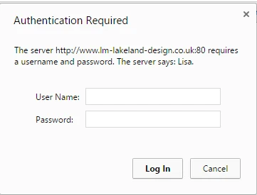
David JotForm Support ManagerReplied on July 13, 2015 at 5:10 PM
The page is password protected:
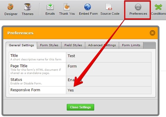
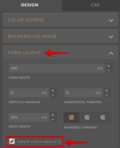
Make sure to enable both responsive options as explained on this guide: https://www.jotform.com/help/322-How-To-Make-Mobile-Friendly-Forms-on-JotForm
Let us know what happens, we will be glad to assist you.
-
DannileeReplied on July 27, 2015 at 4:04 PM
Hi
Sorry I forgot about that, my site is now live and I have 3 forms, not of which are adjusting on mobiles.
This is one
Thanks
D
PS I have responsive checked in both those places
-
BenReplied on July 27, 2015 at 6:12 PM
Looking at your website, it seems that it is not mobile responsive, so I presume that you have a mobile and desktop versions of your website.
Could you please give us the link to the mobile version of the same page so that we can check it out?
Also, I am mentioning this since it might be connected due to the browsers on mobile not being as strong as the desktop browsers. Please note that the page you have linked to has a lot of HTML bugs, which will turn your website to be rendered in quirks mode.
Doing so it means that even the browser will not guarantee the layout, it will only try to do as much as possible, so this might be the reason why you are experiencing these issues.
To check what I mean, do take a look at the source and see the head stopping pre-maturely since the footer element (part of a body gets written in it (head):
<div style="position:absolute; height:400px; width:100%; top:1143px; left:0px; z-index:1; background:#24005d url('Footer.png') repeat-x;"></div>
The comment before the doctype could also cause issues.
Can you please correct these and see if the same issue is still present? If it is, it would be great if you could:
1. give us the screenshot of the issue as you see it
2. let us know the phone that you are using so that we can see if we can match the same during our tests
3. let us know the URL for the mobile version of your page so that we can access it over mobile and non mobile devices. -
DannileeReplied on July 27, 2015 at 6:26 PM
Hi
I am not looking at the form on my site, I am using jotform preview and selecting the first phone icon and it is not responsive there.
-
Jeanette JotForm SupportReplied on July 28, 2015 at 12:21 AM
Are you using a Mobile Browser to test the preview? The best way would be to fully open the form using a mobile browser.
- Templates
- Integrations
- INTEGRATIONS
- See 100+ integrations
- FEATURED INTEGRATIONS
 PayPal
- Slack
- Google Sheets
- Mailchimp
- Zoom
- Dropbox
- Google Calendar
- Hubspot
- Salesforce
- See more Integrations
- Products
- PRODUCTS
- Form Builder
- Jotform Enterprise
- Jotform Apps
- Store Builder
- Jotform Tables
- Jotform Inbox
- Jotform Mobile App
- Jotform Approvals
- Report Builder
- Smart PDF Forms
- PDF Editor
- Jotform Sign
- Jotform for Salesforce Discover Now
- Support


