


-
kcgrl1124Asked on August 21, 2015 at 11:24 AM
I'm trying to embed my form on a page in Shopify, and for some reason it looks like this:
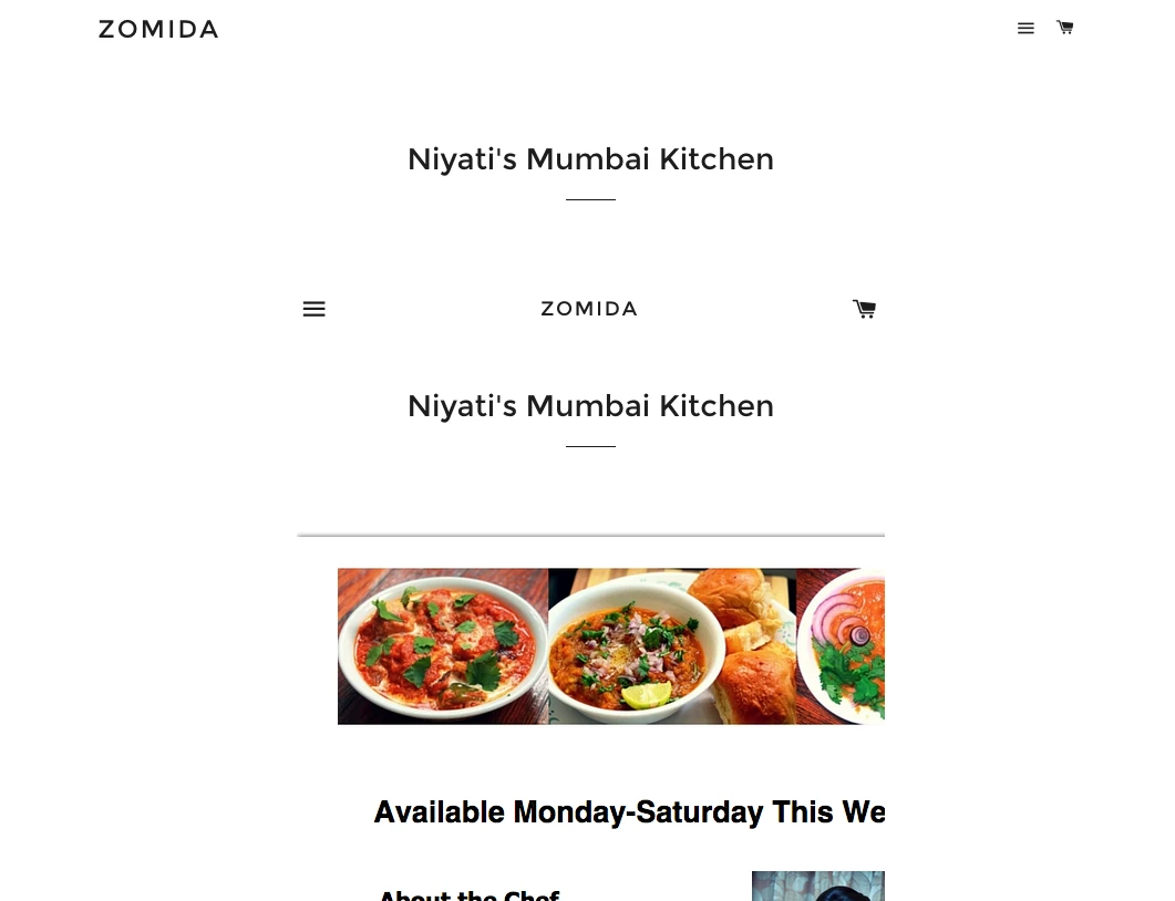
So a couple of things:
1. The top of the form is repeating the website design for some reason.
2. The margins are cutting off the form
-
BorisReplied on August 21, 2015 at 1:30 PM
Could you please let us know the link to the page where this form is embedded, so that we can take a closer look into what might be wrong?
I believe that this is the form: http://www.jotform.us/form/52314117153141
We also need to see the page where it is embedded, in order to troubleshoot the issue. Judging from the screenshot, it looks like the form wasn't embedded properly. I would advise you to please embed the form by following our guide:
http://www.jotform.com/help/217-Adding-Form-to-Shopify-Store-Frontpage
If the issue persists after embedding that way, please do let us know the link to the page where it is happening, and we will be happy to take a look into what might be wrong. Thank you.
-
kcgrl1124Replied on August 21, 2015 at 1:47 PM
Yes that is the form. This is where the page was embedded:
http://www.zomida.com/pages/zomida-custom-order-homemade-food-from-niyati
-
BenReplied on August 21, 2015 at 3:10 PM
Thank you for the link. I can see the issue and unfortunately it is caused by your form not being mobile responsive.
Please do follow the steps here: How to make forms Mobile Responsive or add a Mobile Responsive widget to your form. This should force the images to go one under the other, otherwise they will continue to do as they are currently - going one over the other.
Also, do let us know if when viewed over mobile device - can the images go one under the other? I ask this since I see that you have set them two by two and to be best viewed on the mobile device, they might need a bit more adjustments - which would set them one under the other.
-
kcgrl1124Replied on August 21, 2015 at 3:21 PM
Sorry I have no idea why my title is "my shopify form is not looking good on mobile devices"....I want to change the look on a regular web browser. I don't want the images to go one under the other- I don't want to change the design of the form at all. I just want the integration to be exactly how it is previewed on JotForm
-
BenReplied on August 21, 2015 at 3:45 PM
I have hanged the title of the thread to give us a closer insight into the issue.
I understand that you do not wish to change the design of the form, but on the mobile phone, it is requiring more width than it has, causing the form to appear as if it is cut off.
I did create a CSS style that will show the images as they are now, but the downside of this is that they are a bit smaller than if you would view the form on desktop screen - to compensate for the space.
However as the meals on it look so delicious, I am under the impression that you would like to have the images in their original size.
You can test it out by going to this form over your mobile device: http://form.jotformpro.com/form/52325784611960
If you like the way it looks, you can apply the following CSS code to your form to have the exact same look:
@media screen and (max-width:360px)
{
#id_49 .form-image {
height: auto;
max-width: 100%;
}
#id_86 .form-image, #id_83 .form-image, #id_88 .form-image, #id_89 .form-image {
height: auto;
max-width: 100%;
}
.form-description {
display: none;
}
}I do want to add a note that the CSS above will keep the descriptions hidden on mobile phones because:
1. there is no on hover action on it as on desktops
2. if it was kept, it would cover all the space so the form would not be usable for the users of smaller mobile devices.
You can apply the CSS to your form, by following the steps here: Inject Custom CSS Codes
- Templates
- Integrations
- INTEGRATIONS
- See 100+ integrations
- FEATURED INTEGRATIONS
 PayPal
- Slack
- Google Sheets
- Mailchimp
- Zoom
- Dropbox
- Google Calendar
- Hubspot
- Salesforce
- See more Integrations
- Products
- PRODUCTS
- Form Builder
- Jotform Enterprise
- Jotform Apps
- Store Builder
- Jotform Tables
- Jotform Inbox
- Jotform Mobile App
- Jotform Approvals
- Report Builder
- Smart PDF Forms
- PDF Editor
- Jotform Sign
- Jotform for Salesforce Discover Now
- Support
