


-
peternasserAsked on October 20, 2015 at 2:57 AM
I have moved the potion of the form to fit my need with this CSS code
.form-all {
position : relative;
right : 30%;
top : 170px;
}but when I view it in mobile device, it is not responsive, how can I change the way that it fits in the mobile device.
Thanks
Page URL: https://form.jotform.com/52872331473961 -
Aytekin JotForm FounderReplied on October 20, 2015 at 3:11 AM
I have assigned your request to one of our developers. Thanks.
-
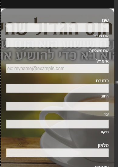
Elton Support Team LeadReplied on October 20, 2015 at 3:19 AM
Please append the following CSS codes. This should restore the position of the form when viewed on mobile.
@media screen and (max-width: 768px) {
.form-all {position: initial !important;}
}
Guide: https://www.jotform.com/help/117-How-to-Inject-Custom-CSS-Codes-to-your-Form (paste the CSS code at the bottom part)
Result:
- Templates
- Integrations
- INTEGRATIONS
- See 100+ integrations
- FEATURED INTEGRATIONS
 PayPal
- Slack
- Google Sheets
- Mailchimp
- Zoom
- Dropbox
- Google Calendar
- Hubspot
- Salesforce
- See more Integrations
- Products
- PRODUCTS
- Form Builder
- Jotform Enterprise
- Jotform Apps
- Store Builder
- Jotform Tables
- Jotform Inbox
- Jotform Mobile App
- Jotform Approvals
- Report Builder
- Smart PDF Forms
- PDF Editor
- Jotform Sign
- Jotform for Salesforce Discover Now
- Support

