


-
yuno89Asked on November 4, 2015 at 6:06 AM
Hello, this is one of my forms: https://form.jotform.me/52916287625464
Iv'e embedded it in my site and it seems well from desktop view:

However, fields overlap each other when viewing from mobile:

Look, my site is not mobile-responsive, so the form doesn't have to be resposive either, but it has to be correct viewed.
Thanks for your help
-
beril JotForm UI DeveloperReplied on November 4, 2015 at 10:29 AM
Hi.
We are sorry for the confusion. I checked your website on my mobile phone. I am able to replicate the issue you are having on my side.

Let me try to figure out the cause of this issue. I will get back to you on this soon.
I will inform you as soon as possible when I solve the problem.
Thank you.
-
beril JotForm UI DeveloperReplied on November 4, 2015 at 1:05 PM
Hi again,
Can you add the CSS code?
.form-section.page-section {
width : 750px !important;
}

I hope ıt will work.
Looking forward to your reply.
Thank you.
-
yuno89Replied on November 5, 2015 at 4:42 AM
Thanks Beril for your answer, but no luck. Just added the code and it's stayed the same.
Anyway else?
-
beril JotForm UI DeveloperReplied on November 5, 2015 at 6:26 AM
Hi.
You are welcome=)
I hope I found a solution at that time.
Please, uncheck Make this form responsive.

In addition to that can you add the CSS code below?
@media (max-width: 480px) { .form-textarea, .form-textbox, .form-dropdown{ width: 100% !important; -webkit-box-sizing: border-box; -moz-box-sizing: border-box; box-sizing: border-box; } .form-label-left, .form-label-right{ width: auto; } .form-buttons-wrapper{ margin-left:0 !important; } .form-input { width: 100%; } .form-all{ width: 98%; } .form-sub-label-container { width: 100%; display:block; } /*--for the address table--*/ span.form-sub-label-container + span.form-sub-label-container { margin-right: 0; } .form-address-table select, .form-address-postal, .form-address-city, .form-address-state, .form-address-table, .form-address-line, .form-address-table .form-sub-label-container { width: 100%; } .form-address-table td, .form-address-table th { padding-bottom: 10px; padding: 0 1px 10px 1px; } }

I hope, it will work.
I look forward to hearing from you soon.
If you have any question or issues, please do not hesitate contacting us. We will be glad to assist you.
-
yuno89Replied on November 5, 2015 at 1:24 PM
Done, but still no luck...
-
victorReplied on November 5, 2015 at 3:24 PM
Could you please indicate if you are still having this issue. I have just tried your form in my mobile device and was able to view your form properly.
If you still require our assistance, please let us know and we will take another look.
-
yuno89Replied on November 6, 2015 at 5:01 AM
Thanks Victor, actually the issue still persists, Iv'e checked it from multiple phone devices. here's a screenshot:

Form URL and embedded-page's URL are in the first post. Thanks for your help
-
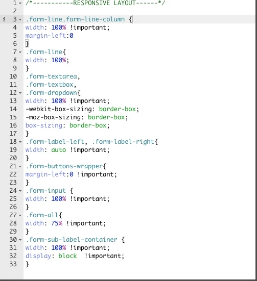
beril JotForm UI DeveloperReplied on November 6, 2015 at 7:34 AM
Hi,
We are really sorry for the confusion. I added Mobile Responsive widget but nothing changed.=(
Can you try to add that CSS code.
/*-----------RESPONSIVE LAYOUT-----------*/
.form-line.form-line-column {
width: 100% !important;
margin-left:0
}
.form-line{
width: 100%;
}
.form-textarea,
.form-textbox,
.form-dropdown{
width: 100% !important;
-webkit-box-sizing: border-box;
-moz-box-sizing: border-box;
box-sizing: border-box;
}
.form-label-left, .form-label-right{
width: auto !important;
}
.form-buttons-wrapper{
margin-left:0 !important;
}
.form-input {
width: 100% !important;
}
.form-all{
width: 75% !important;
}
.form-sub-label-container {
width: 100% !important;
display: block !important;
}
I hope it will work now.
I will wait for your answer.
Thank you for your patience and understanding.
-
yuno89Replied on November 6, 2015 at 10:31 AM
This "responsive layout" code messed up my form layout in all media:

Iv'e created a clone form for testing: https://form.jotform.me/53094281764460
You can modify here all the CSS, I will be thankful if you can perform all testing there and update me when you find a working fix for this.
Thank you very much.
-
CharlieReplied on November 6, 2015 at 1:15 PM
Hi,
The problem is that the website itself is not responsive. Would you like to have it that way? In that case, please check this test website that I did: https://shots.jotform.com/charlie/test%20website%20thread697243/custom_website_test_form.html
This is how it looks like:

Here is my cloned form: https://form.jotform.com/53094508411956. You can clone my form and see the custom CSS code that I used, here's how to clone my form: https://www.jotform.com/help/42-How-to-Clone-an-Existing-Form-from-a-URL.
If you wish to make your actual website mobile responsive, then you can configure a viewport on it. Here's a guide: https://developers.google.com/speed/docs/insights/ConfigureViewport?hl=en.
I hope that helps.
-
yuno89Replied on November 6, 2015 at 2:35 PM
Oh it's working now and it's great - thanks! (I don't want it responsive only good view no overlapping - and it's fine now :)
Well done.
- Templates
- Integrations
- INTEGRATIONS
- See 100+ integrations
- FEATURED INTEGRATIONS
 PayPal
- Slack
- Google Sheets
- Mailchimp
- Zoom
- Dropbox
- Google Calendar
- Hubspot
- Salesforce
- See more Integrations
- Products
- PRODUCTS
- Form Builder
- Jotform Enterprise
- Jotform Apps
- Store Builder
- Jotform Tables
- Jotform Inbox
- Jotform Mobile App
- Jotform Approvals
- Report Builder
- Smart PDF Forms
- PDF Editor
- Jotform Sign
- Jotform for Salesforce Discover Now
- Support


