


-
EpicStudioAsked on November 6, 2015 at 2:23 AM
Greetings.
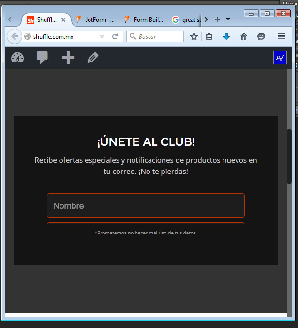
I have a pretty nice working form, but when I load my page on desktop width and change it to responsive width, the form adjusts and its cropped by the container DIV or iFrame. See image 1
When I load the page on a narrow width like a mobile phone and I then make the browser wide, the containing DIV or iFrame leaves a space at the bottom of the form.
Is there a way to avoid so? Maybe a flexible DIV/iFrame height?
Thanks again!
-
EpicStudioReplied on November 6, 2015 at 2:24 AM
Image 2

-
BorisReplied on November 6, 2015 at 3:41 AM
I have checked your website, and I do see and understand what you are asking about.
We have a script that resizes your form automatically, so that your form can always be displayed in its full height without the need for any scrollbars. The form loads fine when you first load or refresh your page, because that is when the scripts are recalculating the form's height and setting the iFrame to the desired height.
Due to both technical limitations and performance reasons, the form re-calculates its height only in certain instances - such as when the form is first loaded, when conditions to show/hide fields on the form (inside the iFrame) are triggered, when you have switched to another page of a multipage form (inside the iFrame), and similar.
The script can't resize the form based on resizing of your browser window, because the height calculation script is inside the iFrame, and the script that is afterwards setting the iFrame's height is outside the iFrame. Communication goes from inside the iFrame to outside, where the form from inside is saying "hey, this action I have performed has just changed my height; can you please resize my iFrame for me?"
The good part is that the iFrame will always be in its correct height when the form is loaded, which means that all your users will see the form correctly when opening your website. On mobile devices, iFrame will load with height for that mobile device, and on a desktop, it will load with the proper height for that desktop. Your users shouldn't be experiencing any issues with the form not being displayed.
I hope this helps. Please let us know if you need further assistance, and we'll do our best to help.
-
EpicStudioReplied on November 6, 2015 at 1:03 PM
Thanks Boris, pretty clear. I had somehow in mind that users might no have a problem to see the form, but I was concerned jsut in case they experimented visualization issues.
Very helpful and explanatory, thanks for taking the time explaining it..!
Greetings.
-
BorisReplied on November 6, 2015 at 2:36 PM
You are most welcome, I'm glad that it was helpful.
As always, if you run into any issues with the form sizing, or if you need any other assistance with your forms, please do not hesitate to let us know about it in a new thread, and we'll be happy to look for solutions. :)
Kind regards
-
EpicStudioReplied on November 6, 2015 at 3:04 PM
Thanks again! Very appreciated.
- Templates
- Integrations
- INTEGRATIONS
- See 100+ integrations
- FEATURED INTEGRATIONS
 PayPal
- Slack
- Google Sheets
- Mailchimp
- Zoom
- Dropbox
- Google Calendar
- Hubspot
- Salesforce
- See more Integrations
- Products
- PRODUCTS
- Form Builder
- Jotform Enterprise
- Jotform Apps
- Store Builder
- Jotform Tables
- Jotform Inbox
- Jotform Mobile App
- Jotform Approvals
- Report Builder
- Smart PDF Forms
- PDF Editor
- Jotform Sign
- Jotform for Salesforce Discover Now
- Support
