


-
booker12Asked on November 30, 2015 at 2:00 PM
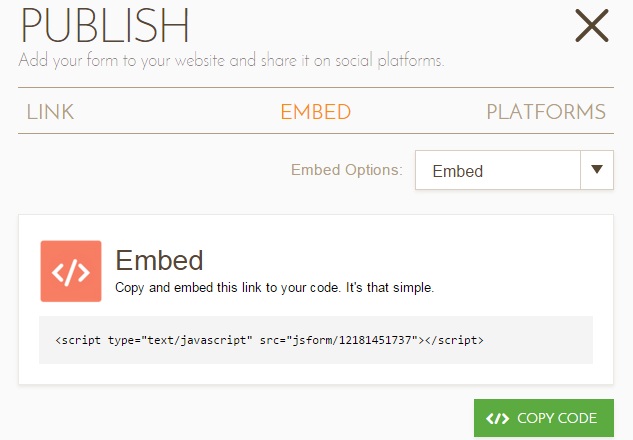
All of our forms are mobile responsive and working great. However this particular form is not responsive when viewed from a mobile device. Also when I try to get the embed code is incomplete.. Maybe that has something to do with it?
Page it is located at: http://www.curtain-and-divider.com/pvc-strip-curtains/industrial-strip-curtains/strip-curtain-quote-form/
-
BJoannaReplied on November 30, 2015 at 3:34 PM
I have tested your form on my Samsung Galaxy S4 and your form is responsive. Only Check Box options are not responsive.

You can make it responsive by Injecting Custom CSS. To do that inside of your Form Builder select Setup & Embed tab, then click on Preferences, then select Form Styles tab and inside of Inject Custom CSS field at the bottom of existing code paste this code:
.form-radio-item label, .form-checkbox-item label {
display: block !important;
margin-left: 19px;
margin-top: -17px;
}
@media only screen and (max-width: 550px){
.form-all {
width:100% !important
}
.form-radio-item label {
white-space:normal;
}
.form-checkbox-item label {
white-space:normal;
}
}

After you add this code your form will look like this.

Here is my demo form: https://form.jotform.com/53335646102954?
Feel free to clone it.
Hope this will help. Let us know if you need further assistance.
- Templates
- Integrations
- INTEGRATIONS
- See 100+ integrations
- FEATURED INTEGRATIONS
 PayPal
- Slack
- Google Sheets
- Mailchimp
- Zoom
- Dropbox
- Google Calendar
- Hubspot
- Salesforce
- See more Integrations
- Products
- PRODUCTS
- Form Builder
- Jotform Enterprise
- Jotform Apps
- Store Builder
- Jotform Tables
- Jotform Inbox
- Jotform Mobile App
- Jotform Approvals
- Report Builder
- Smart PDF Forms
- PDF Editor
- Jotform Sign
- Jotform for Salesforce Discover Now
- Support


