


-
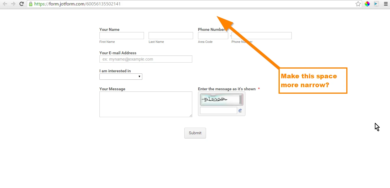
yourwebshopAsked on February 8, 2016 at 8:39 AM
I tried this and it didn't work, i want zero padding or margin on top:
.form-all {
padding-top: 0;
margin-top: -10px;
}
any help would be great. I'd suggest that being a default, as i need to do this with every form.
Thanks. -
CharlieReplied on February 8, 2016 at 9:41 AM
I checked your form directly and I see that this is how it looks like: https://form.jotform.com/60056135502141
If you still want to adjust the top spacing of your form, you can use this CSS code:
.jotform-form {
padding-top: 0px !important;
}
Paste it under your CSS tab in your Form Designer Tool.
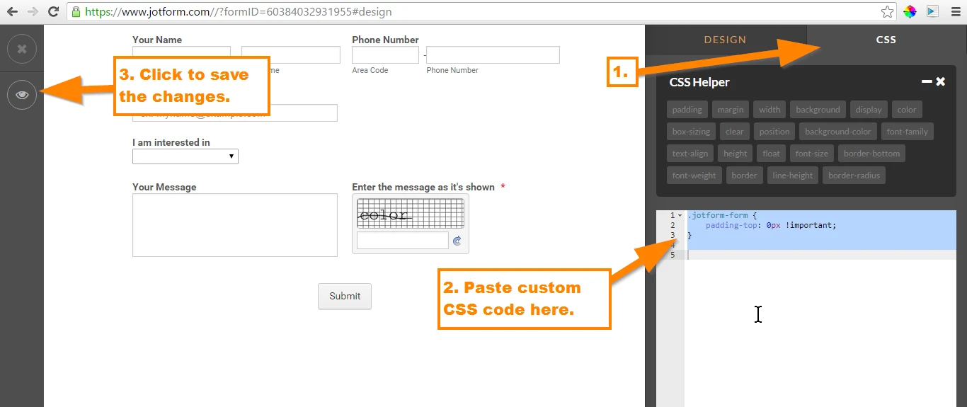
This is how it looks like: https://form.jotform.com/60384032931955
When I checked your website, I see that the form is somehow moved or positioned below the address and phone text.
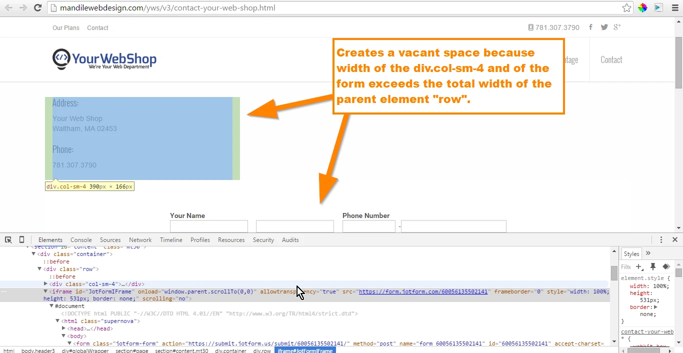
Is that the large space you are referring to? The space in your website?
If you want your website to look like this:
Just adjust the width of your iFrame embed code, change it form 100% to 50% or depending on your own preference. That will align your form on your "Address" and "Phone" texts.
Here's your iFrame embed code, the width attribute is highlighted in yellow:
<iframe id="JotFormIFrame" onDISABLEDload="window.parent.scrollTo(0,0)" allowtransparency="true" src="https://form.jotform.com/60056135502141" frameborder="0" style="width: 50%; height: 531px; border: none;" scrolling="no"> </iframe>
Let us know if any of the solutions above worked for you.
-
yourwebshopReplied on February 8, 2016 at 10:09 AM
Thanks, that is why you guys are the best out there.
-
CharlieReplied on February 8, 2016 at 10:35 AM
Thank you for the kind words :)
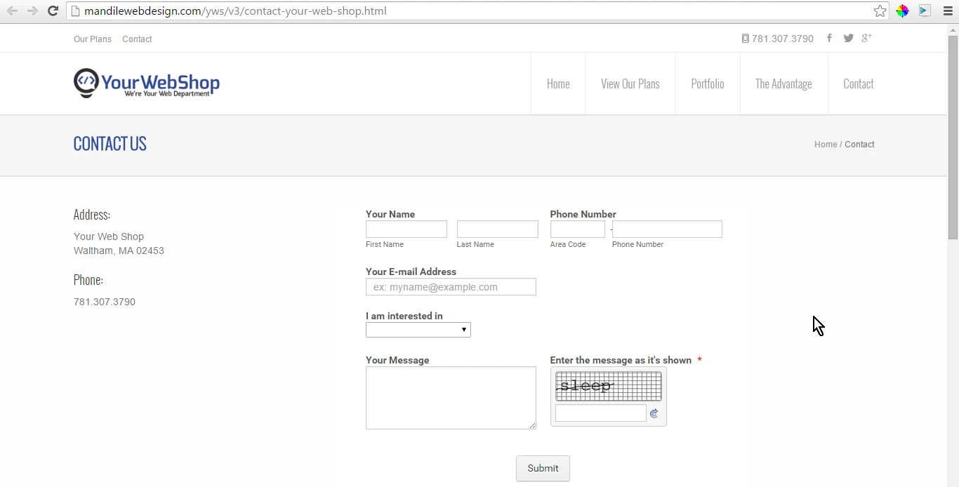
I'm not sure which one worked. But if it is regarding the space in your website, I see a flaw on my suggestion about the width setting to 50%. I presume you would like your website to be mobile responsive.
To resolve the problem, instead of setting the iFrame code's width to 50%, you need to wrap the iFrame embed code on a similar element of your "Address" and "Phone" texts.
Basically this is how it should look liked:
<div class="col-sm-4">
"Address" text
"Phone" text
</div>
<div class="col-sm-6">
<iframe> JotForm iframe code here</iframe>
</div>
We want the iFrame code to be wrapped on the same element that makes your website mobile responsive, not sure how your form works or if you are using a website builder. But based from my understanding, the class col-sm-6 should occupy around 60% of the same row. So you need to wrapped the iframe code using a <div> element with a class col-sm-6.
I'm not sure if that will help.
- Templates
- Integrations
- INTEGRATIONS
- See 100+ integrations
- FEATURED INTEGRATIONS
 PayPal
- Slack
- Google Sheets
- Mailchimp
- Zoom
- Dropbox
- Google Calendar
- Hubspot
- Salesforce
- See more Integrations
- Products
- PRODUCTS
- Form Builder
- Jotform Enterprise
- Jotform Apps
- Store Builder
- Jotform Tables
- Jotform Inbox
- Jotform Mobile App
- Jotform Approvals
- Report Builder
- Smart PDF Forms
- PDF Editor
- Jotform Sign
- Jotform for Salesforce Discover Now
- Support
