


-
givesAsked on February 17, 2016 at 8:52 AM
Hello,
I am currently building a mobile-friendly landing page. However, I ran into a couple snags. How it looks on Jotform, does not look how it is on a mobile screen. I've taken a look at the Designer and HTML codes, but I am not finding my answers. So that is why I am contacting you.
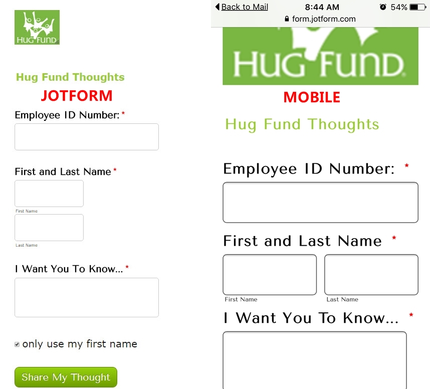
I've attached a screenshot below of both how it appears on a phone and in jotform on a desktop computer.
This is what we need changed:
1) Logo must be smaller how it is in Jotform. The mobile morphs and enlarges it.
2) First and Last Name need to be stacked, not side by side. They also need to be the same width as the other two text boxes.
If someone could help me with these two things, I would greatly appreciate it.
Thank you!
Sincerely,
Vanessa
-
MikeReplied on February 17, 2016 at 11:39 AM
Thank you for contacting us.
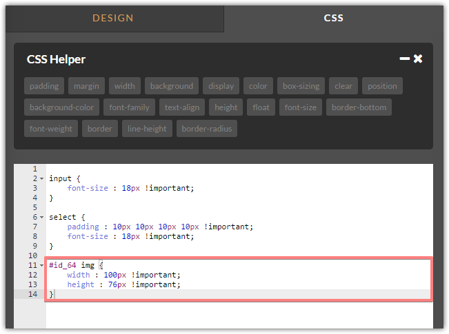
1) Please add the next CSS to have the same image size on different devices.
#id_64 img {
width : 100px !important;
height : 76px !important;
}
2) Seems to be already fixed by you.
If you need any further assistance, please let us know.
- Templates
- Integrations
- INTEGRATIONS
- See 100+ integrations
- FEATURED INTEGRATIONS
 PayPal
- Slack
- Google Sheets
- Mailchimp
- Zoom
- Dropbox
- Google Calendar
- Hubspot
- Salesforce
- See more Integrations
- Products
- PRODUCTS
- Form Builder
- Jotform Enterprise
- Jotform Apps
- Store Builder
- Jotform Tables
- Jotform Inbox
- Jotform Mobile App
- Jotform Approvals
- Report Builder
- Smart PDF Forms
- PDF Editor
- Jotform Sign
- Jotform for Salesforce Discover Now
- Support
