


-
TerraLevelAsked on April 22, 2016 at 3:46 AM
Hello!
Ich have a Problem with the Jotform Formular
On the Mobile Phone it is not total Responsive.
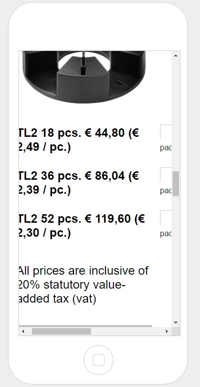
I used the Button responsive und also implemented a form line with a option to order a produkt.
It works on the desktop but not on mobile devises
Thank you for help
 Page URL: http://www.terra-level.at/online-shop
 -
Chriistian Jotform SupportReplied on April 22, 2016 at 4:28 AM
I checked your form on mobile and it appears to be mobile responsive.

However, I did notice that the spinner for the product cannot be seen on mobile.

To resolve the issue, please inject the css below:
@media only screen and (max-width: 480px){
.form-line[data-type="control_spinner"] .form-label.form-label-left {
width: 150px!important;
}
#input_60 {
height: 90px;
}
}
Please follow this guide on how to inject the custom css: How to Inject Custom CSS Codes

You can check out this cloned form where I tested the css: https://form.jotform.com/61122007638952.
To clone it to your account, simply follow this guide: How to Clone an Existing Form from a URL
If you need further assistance, do let us know.
Regards. -
TerraLevelReplied on April 22, 2016 at 4:45 AM
It works, Thank you very much :)
-
Chriistian Jotform SupportReplied on April 22, 2016 at 4:57 AM
You are most welcome. I am glad to know that the issue has been resolved. If you have any other concerns, feel free to contact us again. Cheers. :)
- Templates
- Integrations
- INTEGRATIONS
- See 100+ integrations
- FEATURED INTEGRATIONS
 PayPal
- Slack
- Google Sheets
- Mailchimp
- Zoom
- Dropbox
- Google Calendar
- Hubspot
- Salesforce
- See more Integrations
- Products
- PRODUCTS
- Form Builder
- Jotform Enterprise
- Jotform Apps
- Store Builder
- Jotform Tables
- Jotform Inbox
- Jotform Mobile App
- Jotform Approvals
- Report Builder
- Smart PDF Forms
- PDF Editor
- Jotform Sign
- Jotform for Salesforce Discover Now
- Support


