


-
VanKesterenITAsked on May 25, 2016 at 5:53 AM
Hi,
My form is mobile responsive but my configurable lists are not.
Is there a way to make sure these are also mobile resonsive?
Kind regards,
Mathijs
-
beril JotForm UI DeveloperReplied on May 25, 2016 at 9:09 AM
Can you add the css code below?
@media screen and (max-width: 480px), screen and (max-device-width: 768px) and (orientation: portrait), screen and (max-device-width: 415px) and (orientation: landscape){
td {
display: block !important;
}
}

If this does not resolve the issue, please let us know and we will be glad to take another look.
-
VanKesterenITReplied on May 26, 2016 at 9:30 AM
It helps a little :D
The second and third column are now placed below the first when i hold the phone portrait. When i hold it landscape the second column is half visible and the third is not.
Maybe a better option is to make the first column smaller, is that possible? It has the size of the largest text at this moment but that is no issue, the text to choose opens in a box witch works fine. -
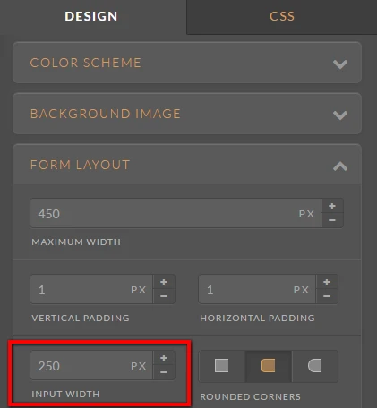
HubersonReplied on May 26, 2016 at 10:50 AM
You can increase the form input max-width to fix it.
.form-input{
max-width: 340px;
}
This can also be done without CSS code from Designer.
- Templates
- Integrations
- INTEGRATIONS
- See 100+ integrations
- FEATURED INTEGRATIONS
 PayPal
- Slack
- Google Sheets
- Mailchimp
- Zoom
- Dropbox
- Google Calendar
- Hubspot
- Salesforce
- See more Integrations
- Products
- PRODUCTS
- Form Builder
- Jotform Enterprise
- Jotform Apps
- Store Builder
- Jotform Tables
- Jotform Inbox
- Jotform Mobile App
- Jotform Approvals
- Report Builder
- Smart PDF Forms
- PDF Editor
- Jotform Sign
- Jotform for Salesforce Discover Now
- Support
