


-
aarboledaAsked on June 5, 2016 at 8:54 AM
Hello
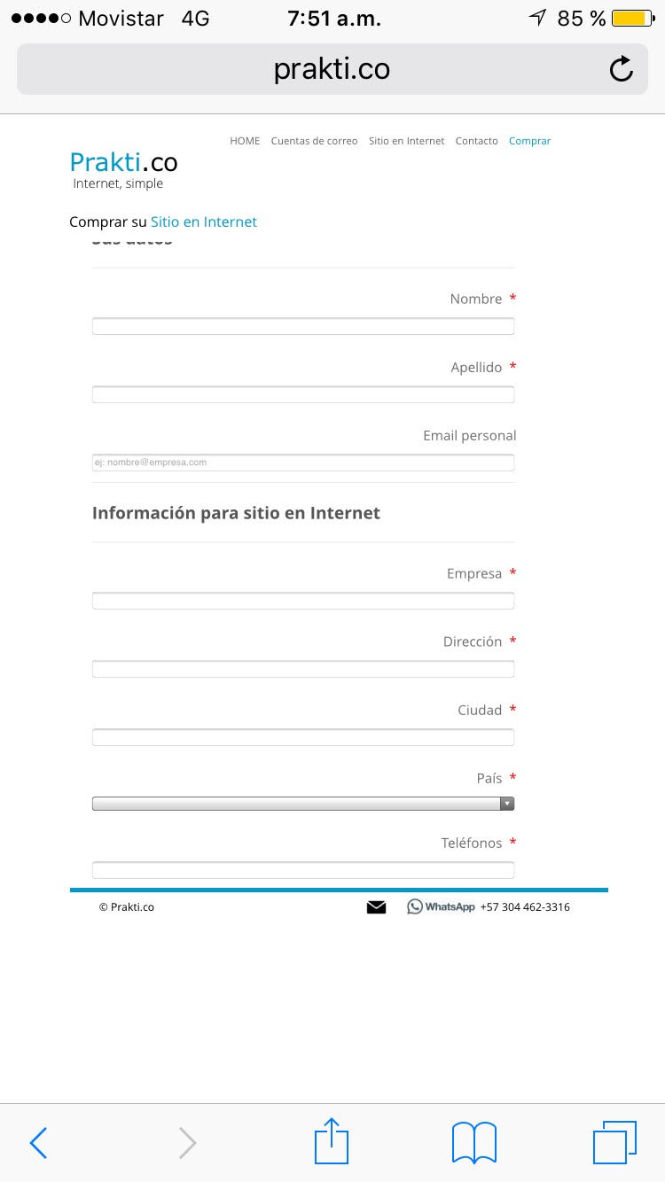
I created this form and it looks and works fine on a PC, but on an Iphone the user won't even be able to use it.
Attached is in Iphone screenshot of this form
How can I fix this ?
 Page URL: http://www.prakti.co/comprar/4592491748
 -
liyamReplied on June 5, 2016 at 10:00 AM
Hello aarboleda,
What I observed with your webpage is that your form is responsive ready, however your web page container handling the form is not. For this reason, upon viewing the form on a mobile device, the text box fields are stretched to 100%.
My recommendation on this is you make a responsive design on your webpage.
Another option: You can remove the media screen CSS codes on your form. (not ideal since it will look not prepared for mobile devices). However, if you wish to pursue with this, you can edit your form on the form builder, but visit the form builder with the &old parameter added.
Example: https://www.jotform.com/?formID=61533781236961&old
Next is Click Preferences > Form Styles > Inject CSS
Remove from the CSS codes all that use the media screen and save your form.
Once done, save your form.
Feel free to let us know if you have further questions or concerns, or if you are in need of assistance.
Thanks.
-
aarboledaReplied on June 5, 2016 at 1:35 PM
I understand, but why don't you look at this other form and try to see why this one looks fine. What is different that makes it look ok on my site ?
http://www.prakti.co/contacto/4592202740
-
David JotForm Support ManagerReplied on June 5, 2016 at 2:00 PM
Please try adding the mobile responsive widget to your form:

This should solve the problem:

Let us know if you need more help, we will be glad to assist you.
- Templates
- Integrations
- INTEGRATIONS
- See 100+ integrations
- FEATURED INTEGRATIONS
 PayPal
- Slack
- Google Sheets
- Mailchimp
- Zoom
- Dropbox
- Google Calendar
- Hubspot
- Salesforce
- See more Integrations
- Products
- PRODUCTS
- Form Builder
- Jotform Enterprise
- Jotform Apps
- Store Builder
- Jotform Tables
- Jotform Inbox
- Jotform Mobile App
- Jotform Approvals
- Report Builder
- Smart PDF Forms
- PDF Editor
- Jotform Sign
- Jotform for Salesforce Discover Now
- Support

