


-
ThePerfectTripAsked on July 18, 2016 at 1:09 PM
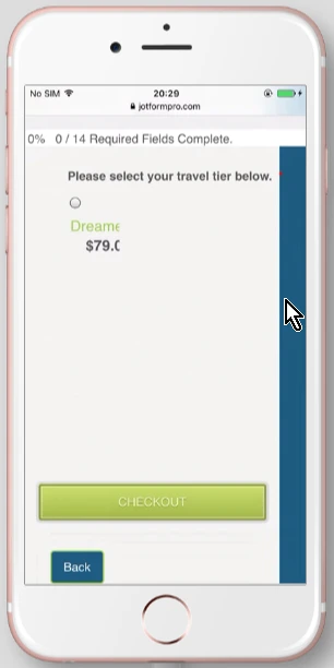
The radio buttons at the end of my form only displays 1/4 buttons (only displays "Dreamer") in the Safari browser. Is there CSS that will adjust that only on the safari browser??
https://www.jotform.com//?formID=60634387256158#
Thank You
-
CharlieReplied on July 18, 2016 at 3:20 PM
If I am not mistaken, the radio buttons you are referring to are under the payment integration's product list. It seems like you have setup a CSS code to make it four columns. Is that correct?
The only case where I see that the radio buttons are disappearing is when I view it on an iPhone iOS device.
In Mac OS X Safari, it is displayed correctly although it shows them on a new line:
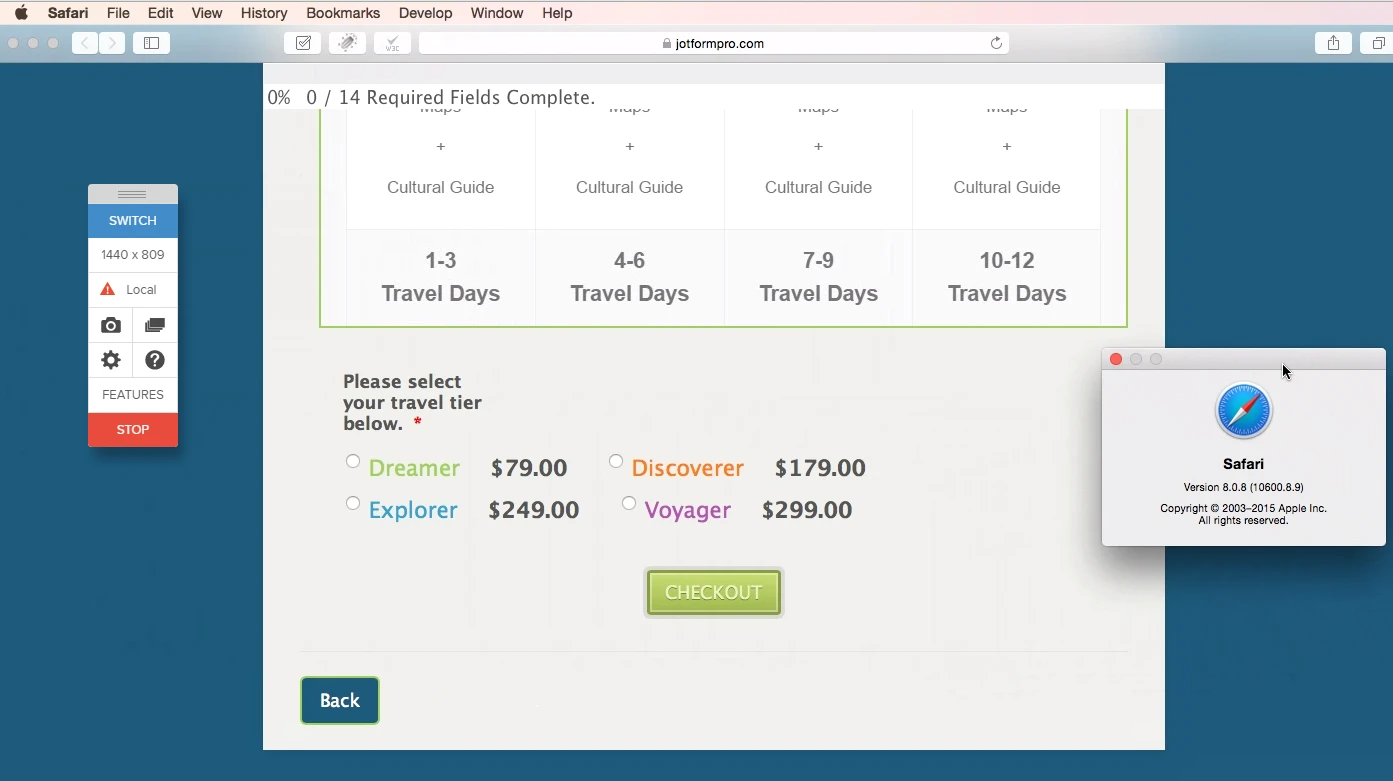
Now this depends on how you would like to format the layout of this element on a mobile device. Would you like to have it the same formatting? Please note that the width is much smaller on a device which might congest your product list.
Here's my proposed solution. Have the product list in 2 columns.
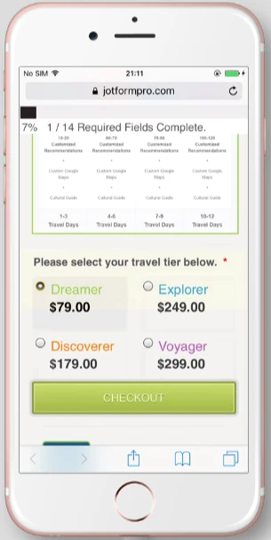
You can clone my form here: https://www.jotformpro.com/form/61995247670972.
Here's what I did:
1. First, make your form mobile responsive: https://www.jotform.com/help/322-How-to-make-mobile-friendly-forms-on-JotForm
2. After that, add this custom CSS code:
@media only screen and (max-width: 500px){
#cid_165 {
column-count: 2 !important;
}
#id_165 {
margin-left : 0 !important;
margin-bottom: 100px !important;
height: 100px !important;
}
#cid_165 > span {
display : inline-block !important;
z-index : 99999999 !important;
height: 80px !important;
}
.form-product-item {
overflow: visible !important;
}
}
Let us know if that will work.
- Templates
- Integrations
- INTEGRATIONS
- See 100+ integrations
- FEATURED INTEGRATIONS
 PayPal
- Slack
- Google Sheets
- Mailchimp
- Zoom
- Dropbox
- Google Calendar
- Hubspot
- Salesforce
- See more Integrations
- Products
- PRODUCTS
- Form Builder
- Jotform Enterprise
- Jotform Apps
- Store Builder
- Jotform Tables
- Jotform Inbox
- Jotform Mobile App
- Jotform Approvals
- Report Builder
- Smart PDF Forms
- PDF Editor
- Jotform Sign
- Jotform for Salesforce Discover Now
- Support
