


-
OptronicsHDAsked on July 21, 2016 at 3:08 PM
I was using regular embed method for my forms but then they weren't showing up on mobile. I was informed by Jotform support to use the iFrame method, which I did, but I can't find a solution to the problem this now presents (there's got to be a better solution than just telling people to use iFrame!). iFrame does make the form show up on mobile, BUT it gets cut off unless you adjust the height. So I set the height of the form to a height that will show the whole form on mobile and not cut it off, and it adds TONS of blank space below my form on desktop. For example I had to set the form to be 1250px height on my contact page so it would all display on mobile but look what it did to the desktop (see screenshot)...
How can I work around this?? Any help is greatly appreciated.
David
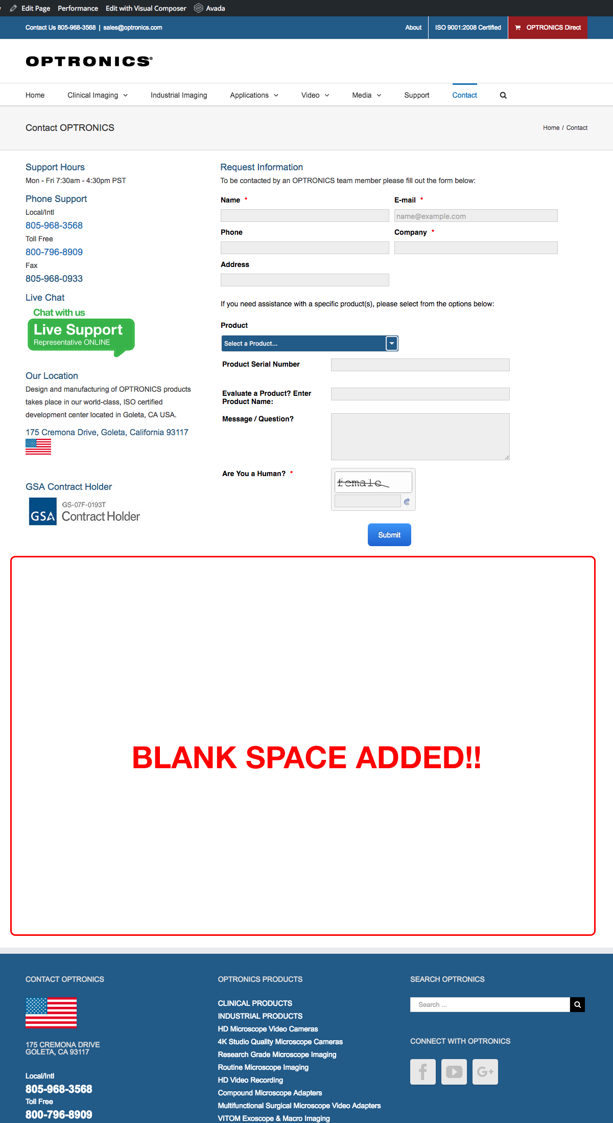 Page URL: http://optronics.com/contact/
 -
KadeJMReplied on July 21, 2016 at 4:06 PM
So basically you are trying to get your embedded form to display properly across desktop and mobile though between our previous advice and after trying to fix it from your end your form has now gained a huge gap when viewed on desktop.
And upon further testing I found I can also see the gap somewhat on my mobile device as well.
Please allow us some time to investigate this problem further to assist in helping you with looking into a better possible solution for this so that your form displays correctly across both.
-
OptronicsHDReplied on July 21, 2016 at 4:41 PM
This is correct, trying to find a solution across desktop and mobile. FYI, I had to add some extra space to account for the *required items that if not filled in push the content down a little to display the error message. A few of those and the submit button could get cut off on mobile.
The URL and screenshot I gave you was just one example of this, we have several other forms on different pages doing the same thing...
I appreciate the reply and look forward to your response.
-
Mike_G JotForm SupportReplied on July 21, 2016 at 7:28 PM
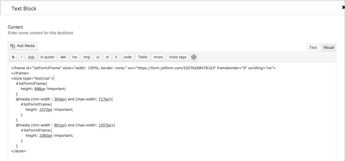
I have created a clone version of your form and made a couple of tests to it.
To fix the issue you're having, here's what you're going to do.
First,

This is to avoid conflicts that may occur between your form scripts and the scripts on your website.
Next, remove the "height" property, "width" property, and "height" attribute of the style property of the iframe.

Then, add the codes below:
<style type="text/css">
#JotFormIFrame{
height: 688px !important;
}
@media (min-width : 304px) and (max-width: 717px){
#JotFormIFrame{
height: 1072px !important;
}
}
@media (min-width : 801px) and (max-width: 1057px){
#JotFormIFrame{
height: 1082px !important;
}
}
</style>

I hope this helps. If in case I misunderstood your concern, please feel free to get back to us with more details so we can further help you.
Thank you.
-
OptronicsHDReplied on July 22, 2016 at 12:02 PM
Hi Mike_G, thanks for the support. Here's what happened when I tried those steps, see below:
Then when I view the form on desktop and mobile, it is still getting cut off.
Desktop
Mobile
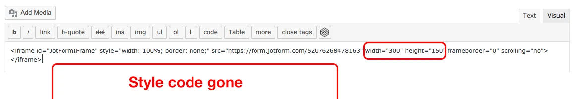
When I go back into the Wordpress text editor it doesn't show me the <style> code for me to edit and it also always adds the "width" "height" back in.
Do I need to add the CSS to my child theme style sheet? If so, is there a way to target the form ID because we have so many different forms (10+) on our site we couldnt apply a one size fits all solution. Does that make sense? Hope this information helps us towards a solution...
Thanks,
David
-
OptronicsHDReplied on July 22, 2016 at 12:29 PM
Also FYI, I re-embedded with the iframe method and set it to a super ridiculous height of 1350px so it would all show. The white space I can deal with while we find a solution, more than a form that doesn't display or get cut off.
I was wondering, how does everyone else using Jotform not have the same issue? How do they deal with it?
-
Kevin Support Team LeadReplied on July 22, 2016 at 1:16 PM
May be that the text editor does not allow to set custom CSS codes, this is why it might be removed.
If you could add the style to your style sheet, it would be good as the style should not be removed, but, please do note that you will need to add it like this:
Please update this parte of code only from "668px" to "700 px".
#JotFormIFrame{
height: 700px !important;
}
@media (min-width : 304px) and (max-width: 717px){
#JotFormIFrame{
height: 1072px !important;
}
}
@media (min-width : 801px) and (max-width: 1057px){
#JotFormIFrame{
height: 1082px !important;
}
}
In order to affect only one iFrame code, you may consider adding a class to identify it, so the code that you will embed should look like this one:
<iframe
id="JotFormIFrame"
class="jotformPage1"
onDISABLEDload="window.parent.scrollTo(0,0)"
allowtransparency="true"
src="https://form.jotform.com/FormID"
frameborder="0"
style="width:100%;
height:2190px;
border:none;"
scrolling="no">
</iframe>
**Do note this is sample iFrame code, do not embed this code.
Then replace the "#JotFormIFrame" with ".jotformPage1" this way you will affect that specific form.
I can see currently the form is cutting off at some screen resolutions, but with the code given by my colleague above this should be resolved.
Please do let us know how it goes.
-
OptronicsHDReplied on July 22, 2016 at 2:55 PM
Ok so to make sure I'm understanding correctly, we'll use the contact page I've been referring to as an example. I take the CSS code you provided (see below)
#JotFormIFrame { height: 700px !important; }
@media (min-width : 304px) and (max-width: 717px)
{ #JotFormIFrame { height: 1072px !important; } }
@media (min-width : 801px) and (max-width: 1057px)
{ #JotFormIFrame { height: 1082px !important; } }
And then I think of a class name for that specific form in this case I'll use .jotformContactUs for the Contact page. I would then replace #JofFormIFrame with .jotformContactUs and I would put the following in my CSS child theme and modify the values each per form?
.jotformContactUs { height: 700px !important; }
@media (min-width : 304px) and (max-width: 717px)
{ .jotformContactUs { height: 1072px !important; } }
@media (min-width : 801px) and (max-width: 1057px)
{ .jotformContactUs { height: 1082px !important; } }
Then copy the iframe code for my form and give it a class of class="jotformContactUs". Is this correct?
OR would I use CSS descendent selectors like the following?
#JotFormIFrame > jotformContactUs { height:700px !important; }
Meaning the #JotFormIFrame is everywhere but when it has a class of "____" whatever I create give it the width height values I set?
David
-
Mike_G JotForm SupportReplied on July 22, 2016 at 5:14 PM
Once you have set a class name (jotformContactUs) for the <iframe> that you embedded in your website, you can already use the following CSS codes
.jotformContactUs { height: 700px !important; }
@media (min-width : 304px) and (max-width: 717px)
{ .jotformContactUs { height: 1072px !important; } }
@media (min-width : 801px) and (max-width: 1057px)
{ .jotformContactUs { height: 1082px !important; } }
to adjust the height of the iframe embdded in your website.
If you have any further question, please feel free to let us know.
-
OptronicsHDReplied on July 25, 2016 at 8:01 PM
OK thanks so much, this method is working in my tests on mobile and desktop. I've created classes for each of the forms. I do have a couple more questions though...
Why doesn't the javascript embed method work on mobile and is JotForm doing anything about it?
I would guess that a large number of people use the javascript embed method and with the number of people using the web on mobile growing every day, it seems like this shouldn't be an issue that Jotform would have more of a solution for. Don't get me wrong, I love Jotform but this is a big issue for me if I'm going to continue to use it in the future.
Thanks,
David
-
Mike_G JotForm SupportReplied on July 25, 2016 at 11:00 PM
If it is possible for you to embed your form using the normal embed script, please do so as, I believe, it will also work on mobile. We suggest the use of iframe codes as an alternative, because, base on experience, it is ideally used to prevent conflicts between scripts that may affect the functionality of some parts of the form. However, if you use the normal embed scripts and everything works fine, feel free to use it on your website.
By the way, I just found out that you can hide the Mobile Responsive widgets and Google Analytics widgets on your form to reduce some space at the bottom of your form.

-
OptronicsHDReplied on August 8, 2016 at 6:15 PM
Hi @Mike_G, thanks for the answer, can you let me know how to hide the Google and Mobile widget to save space?
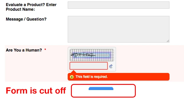
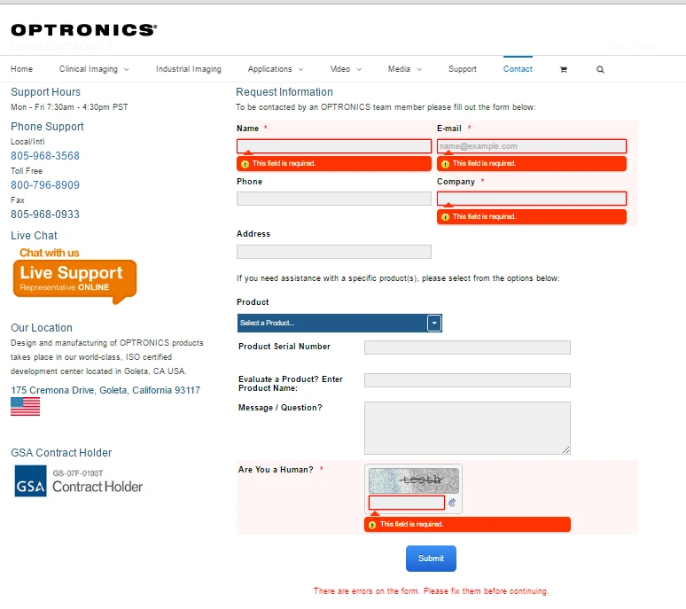
ALSO, I have one more issue in this topic. When using the iframe and someone tries to submit before filling out all the required fields, the error message that appears at the bottom saying "There are errors on the form. Please fix them before continuing" pushes all the content up, cutting off the fields at the top of the form. You cannot scroll to get to these either (see screenshot). I cannot find where this error message is generated to troubleshoot, any ideas?

-
Kevin Support Team LeadReplied on August 8, 2016 at 6:43 PM
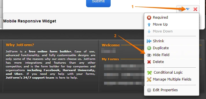
To hide the widgets, you can simply click on it and then click on properties icon, then click on the option "Hide Field" and they will not be shown in the form, so the space they use will be reduced:
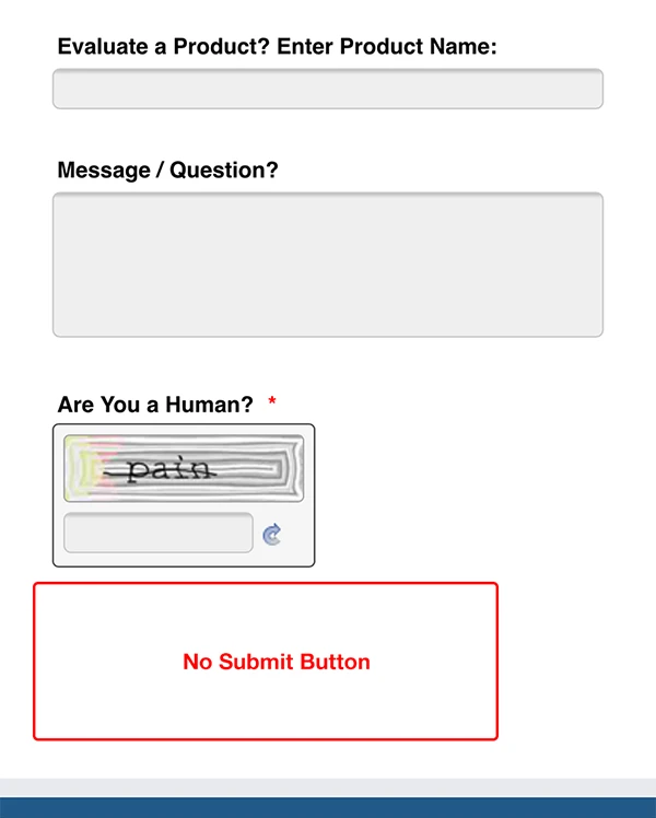
Regarding to the issue about the form cutting off at the top, this is because of the error messages shown, they uses spaces and as the error message shown at the bottom of the form should be displayed it pushes the other fields to the top.
To fix this issue you will need to increase the current height, for example, setting the form height to 830px instead of 700px:
.jotformContactUs { height: 830px !important; }
This should be the result:
- Templates
- Integrations
- INTEGRATIONS
- See 100+ integrations
- FEATURED INTEGRATIONS
 PayPal
- Slack
- Google Sheets
- Mailchimp
- Zoom
- Dropbox
- Google Calendar
- Hubspot
- Salesforce
- See more Integrations
- Products
- PRODUCTS
- Form Builder
- Jotform Enterprise
- Jotform Apps
- Store Builder
- Jotform Tables
- Jotform Inbox
- Jotform Mobile App
- Jotform Approvals
- Report Builder
- Smart PDF Forms
- PDF Editor
- Jotform Sign
- Jotform for Salesforce Discover Now
- Support


