


-
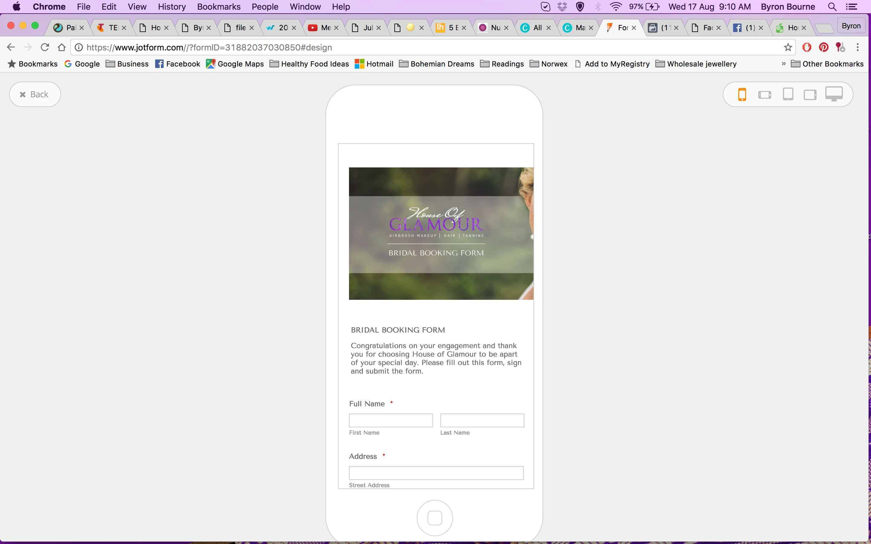
houseofglamourAsked on August 16, 2016 at 3:23 AM
I can't figure out how to make the font smaller as it's much larger then the rest of the form. Also, when you view this form on mobiles - some of the words are cut off and don't fit to screen. It would be good if you had a mobile view option.
Page URL: https://form.jotform.co/31882037030850 -
RoseReplied on August 16, 2016 at 4:35 AM
Regarding your question about making your form mobile responsive, below user guide can assist you about it. If you follow steps at below user guide, your form will be seen properly on any mobile device such as phone or tablet.
https://www.jotform.com/help/311-How-to-make-forms-mobile-responsive
Regarding other question about font size, could you please specify which field's font exactly you want to make smaller? However, if you want to change font size of the whole form; you can arrange it by moving control ball in "Font Options" tool at Designer.
If you need any further assistance from our side, please feel free to contact us. -
houseofglamourReplied on August 16, 2016 at 8:04 AM
Thanks! I managed to change the fonts - but no luck on the mobile side. When I make the changes - it keeps stalling when I save it :(
-
CharlieReplied on August 16, 2016 at 10:12 AM
Apologies for the inconvenience. When you stay "stalling", did you mean that the saving progress is being stuck? There was an issue earlier about this but our developers have already fixed it. Could you please try again?
Now when regards to the mobile responsiveness of the form, I see that the options to make your form mobile responsive is not enabled. Please refer to this link on how to make your form mobile friendly/responsive: https://www.jotform.com/help/322-How-to-make-mobile-friendly-forms-on-JotForm
Let us know if it works now.
-
jonathanReplied on August 16, 2016 at 6:37 PM
Hi,
Is your form https://form.jotform.co/31882037030850 embedded on a website? Please share to us the URL of your website also if it was so that we can also test.
I test the form on mobile browser using its URL, but I could not reproduce the issue of mobile non responsive form.
Here is the video of my test.

It will also help if you can share to us a screenshot image of the issue so that we can have a visual of how the problem looks.
Let us know if issue still persist.
Thanks
-
houseofglamourReplied on August 16, 2016 at 6:45 PM
See how the top paragraph and the last paragraph are butt up right to the left hand side? Also, while posting these images from my phone, I had to turn the phone on the side to even see what I was doing.
-
houseofglamourReplied on August 16, 2016 at 6:56 PM
Sorry, I missed your question. No, form is not on a website. It is in a PDF I send out that has my prices, additional information, more terms and conditions and then after they have read all that, they book through this form.
-
houseofglamourReplied on August 16, 2016 at 7:13 PM
Even when I look at the preview mobile view on my laptop, I have the same issue....
-
Chriistian Jotform SupportReplied on August 16, 2016 at 10:53 PM
I checked the form on an iPhone 6 emulator and the text on the paragraph seem to display fine.


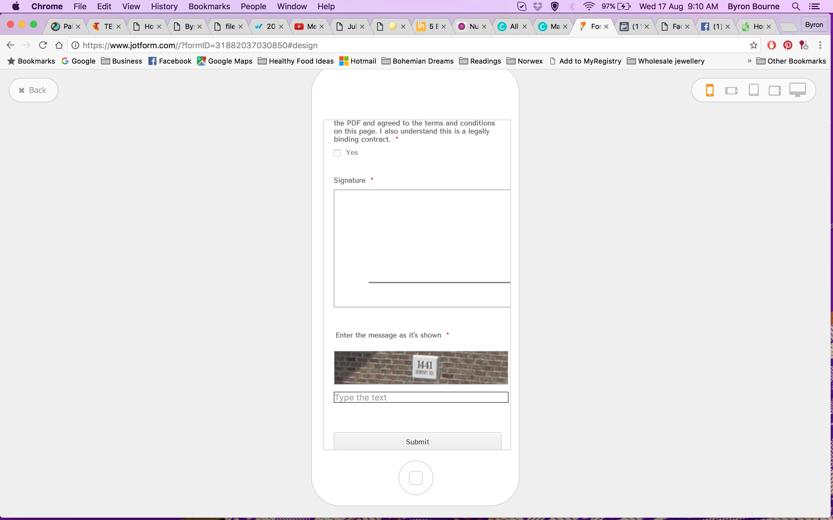
The only issue I noticed is that the image and the signature fields were cut-off on the right. To resolve this, simply add the Mobile Responsive Widget to your form.

If you need further assistance, please let us know.
Regards. -
houseofglamourReplied on August 17, 2016 at 12:34 AM
Great, that worked. Thanks! The only thing is the signature box still doesn't fit on the screen?
-
Chriistian Jotform SupportReplied on August 17, 2016 at 3:49 AM
Please inject the custom CSS code below into your form to fit the signature box on the screen.
@media only screen and (max-device-width: 667px) {
li#id_18 {
width: 95%;
}
canvas.jSignature {
width: 300px!important;
}
}

If you need further assistance, please let us know.
Regards.
- Templates
- Integrations
- INTEGRATIONS
- See 100+ integrations
- FEATURED INTEGRATIONS
 PayPal
- Slack
- Google Sheets
- Mailchimp
- Zoom
- Dropbox
- Google Calendar
- Hubspot
- Salesforce
- See more Integrations
- Products
- PRODUCTS
- Form Builder
- Jotform Enterprise
- Jotform Apps
- Store Builder
- Jotform Tables
- Jotform Inbox
- Jotform Mobile App
- Jotform Approvals
- Report Builder
- Smart PDF Forms
- PDF Editor
- Jotform Sign
- Jotform for Salesforce Discover Now
- Support


