


-
biancamartignone1Asked on November 8, 2016 at 12:39 AM
Hi There
My first problem is that when a user views the form on a mobile device, there are scrolling glitches. Sometimes it scrolls sometimes it doesn't. Is there any way to turn off scrolling and always make the entire form show rather than within a "box"?
My second problem (screenshot attached) is that the 2 products which I have 2 options for (colour and quantity) are being cut off? It seems like the elements have a height of 17px causing them to be cut off but I cannot seem to fix them?Any help will be greatly appreciated!
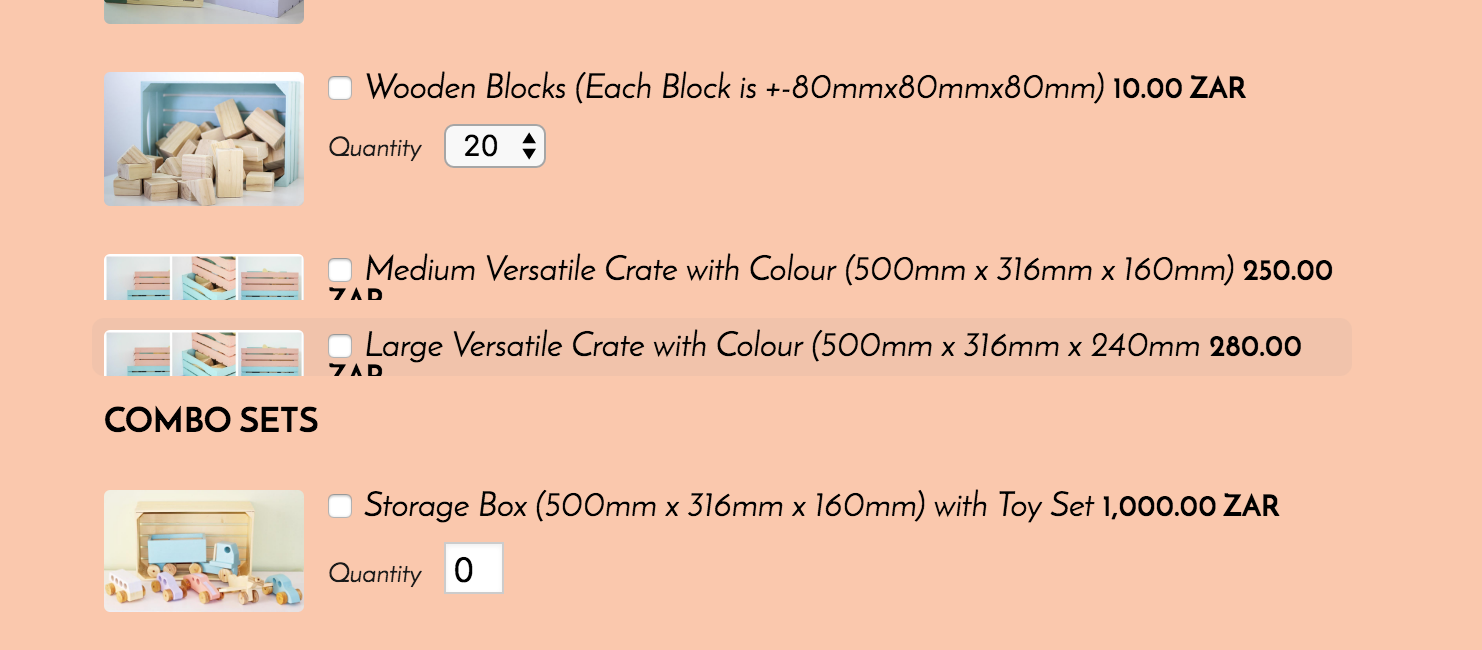 Page URL: http://www.thewoodstory.co.za/new-page
 -
candyReplied on November 8, 2016 at 6:18 AM
Hello,
For your first question, I have checked your form on my Android mobile phone also on an Apple tablet.
I was able to scroll down until the end of the web page on the Android mobile phone and Apple tablet. I have submitted the form. However, It worked after waiting and trying couple times. Please see the screenshots below:


I have seen that you received my submissions.
Yes, there is a way to disable scrolling as you can see the following CSS codes of your form:
.gr__thewoodstory_co_za{
overflow:hidden
}
However, if you add this code to your page, it is not possible to Submit your form. I have tried your form disabling scrolling and it did not work on the PC. I did not understand that if you disable scrolling how your form will work? For my personal opinion; It will be too small to see on the mobile devices. Could you please explain your idea more?
For your second question, I have split the thread in order to assist better by our support team. We will answer it at the following link: https://www.jotform.com/answers/984761
Thanks in advance.
- Templates
- Integrations
- INTEGRATIONS
- See 100+ integrations
- FEATURED INTEGRATIONS
 PayPal
- Slack
- Google Sheets
- Mailchimp
- Zoom
- Dropbox
- Google Calendar
- Hubspot
- Salesforce
- See more Integrations
- Products
- PRODUCTS
- Form Builder
- Jotform Enterprise
- Jotform Apps
- Store Builder
- Jotform Tables
- Jotform Inbox
- Jotform Mobile App
- Jotform Approvals
- Report Builder
- Smart PDF Forms
- PDF Editor
- Jotform Sign
- Jotform for Salesforce Discover Now
- Support
