
In his famous 1908 essay, ‘Ornament and Crime,’ modern architect Adolf Loos wrote: “The evolution of culture marches with the elimination of ornament from useful objects.” This pronouncement banished many of the frilly, decorative fonts of centuries past from the realm of High Design. Fast forward to the present day: Web 3.0 is awash in enough sleek sans serif and classic roman typefaces to make designers long for the typographic indulgences of yesteryear.
Harness the power of the antique and make your graphics pop with one of these vintage-inspired fonts, which have returned to the spotlight both in print and online. From the Wild West and Victoriana to the Avant Garde and Calligraphy, there are plenty of styles to choose from. Fonts have been grouped informally, with contemporary interpretations alongside (almost) original prototypes. All are available free for personal use, but please make sure to read the license agreements carefully.
Pro Tip
Sign up for a free Jotform account to create powerful online forms in minutes — with no coding required.
Wood Type and Display Fonts
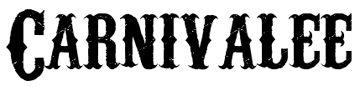
Carnivalee Freakshow
This distressed, wood-type-inspired font has the shabby charm of an old sideshow banner. Equal parts macabre and cheeky, it is appropriate for graphics ranging from the irreverent to the horrific.
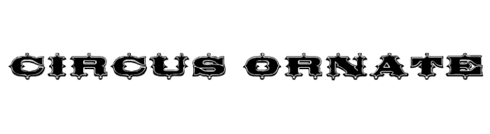
Circus Ornate
Dieter Steffmann’s Circus Ornate captures the spirit of classic circus graphics, but still stands on its own as an ornamental, boisterous display font.
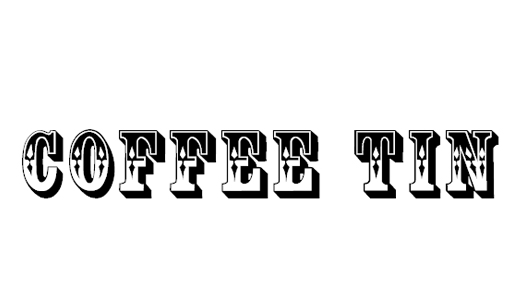
Coffee Tin (similar to the Rosewood font)
Inspired by fonts like Rosewood and Ponderosa, which are modeled after the display fonts of the late 18th century, Coffee Tin reinterprets old-fashioned advertising graphics with contemporary clarity.
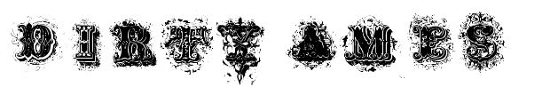
Dirty Ames
This is another beautiful distressed font that draws inspiration from 19th century display types. The Typeology foundry based this font and its name on an 1884 typeface by D.T. Ames.
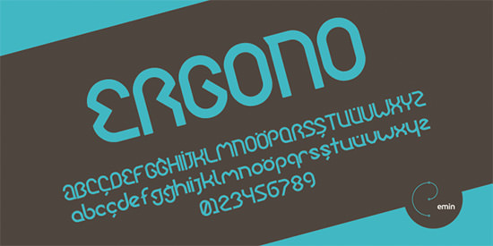
Ergono
License: Free for private and commercial use
Additional characters: Yes
JF Ringmaster
A vintage beauty by Jester Font Studio.

Showboat
Shareware designer, David Rakowski, designed this font in 1991. 17 years later, its balance of monumentality and delicacy makes it a blast from the past that looks memorable in the present.

Tuscan
Rick Mueller’s Tuscan is one of his many vintage-inspired fonts, though its combination of sinuous contours and ample weight makes it memorable. This font has the flair of an antique display face without the fuss.

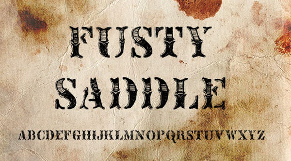
Fusty Saddle
Inspired by Sideshow, from Harold’s Fonts, Fusty Saddle is a hand-drawn, Wild West-inspired font made digital. Bittbox not only provides you with a font but a definition: “fusty,” according to their site, means “old-fashioned in attitude and style.”
Nashville
This digital adaptation of wood-type, with a Wild West twang, was designed by Matthew Austin Petty of Disturbed Type. Like a cowboy’s stubble, rough edges and scruffy surfaces make this font a more masculine antique.

Space and Astronomy font
From the independent digital type foundry, Fountain, Second and Astronomy font combines traces of the past with dreams from the future. Underneath this font’s embellishments are mechanical footprints, adding a hint of steampunk.

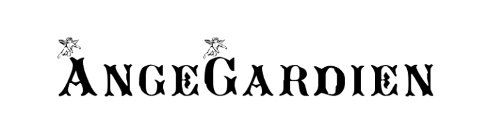
AngeGardien
The name of this font is derived from the French for “guardian angel,” and its capital letters are indeed guarded by winged figures. AngeGardien’s combination of daintiness and strength, shared with other great vintage typefaces, might be what makes it worthy of protection.
Antique and Renaissance Fonts
Caslon Antique
Caslon Antique is what an original, 18th century Caslon type might look like now: a little worn around the edges, but no less steadfast. This interpretation of the classic Caslon serif adds age and wisdom to a text without sacrificing legibility.

Dominican
Another decayed antique face with loads of personality, Dominican is inspired by the time-battered beauty of antiquarian books.

Old Dog New Tricks
An unusual all-caps font, Old Dog New Tricks dips below the baseline to add interest to an otherwise classic serif. Its combination of Deco and antiquarian influence may make its pedigree murky, but remix culture dictates that the offspring of unexpected unions can create truly singular forms.

Lost in Future font
The “Lost in Future” font is a futuristic display font with a sharp and angular design. Each character appears to be constructed from geometric shapes, with bold lines and sharp angles giving the font a futuristic and tech-inspired appearance.

Blackletter and Calligraphic Fonts
Faith Collapsing
The shaky baseline and faded letters might make it seem disorderly, but this font is strong enough to support any layout that is incorrigible enough to merit it.

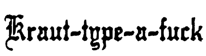
Kraut Type-A-F**k
Based on the title typeface for P.T. Anderson’s 2007 film, this font demonstrates the effect that the Wild West can have on a traditional blackletter.
Olde English
The Olde English typeface is an interesting example of how a typeface, despite its associations in one time and place, can easily become affiliated with another. Though its forms are inspired by medieval German blackletter types, Olde English is actually named for the Old English language—which was printed in Insular script.

Alte Schwabacher
The Schwabacher typeface got its name from the German village of Schwabach, and its appearance from manuscript calligraphy. Though it was used only occasionally in Germany after the 16th century, its legacy is central to the history of the printed book.

Fette Fraktur
Fraktur was used extensively in German printing up through the 20th century, and comes in many variations. Fette Fraktur is a heavy, relaxed version that manages to be legible to the Antiqua-trained eye without losing its distinctive appearance.

FLW Script
This font was designed to induce nostalgia for the early years of baseball, when stadiums were still named after neighborhoods and people. In the spirit of vintage baseball jerseys, this script is as jaunty as it is rugged.

Wrexham Script
Wrexham Script is a more condensed and angular sports-inspired font with a vintage flair.

ALS Script
With the abundance of handwriting fonts available on the web, it can be easy to forget that the simple script typeface has its precedents in centuries of practiced and often professional penmanship. ALS Script, with its balance and elegance, is a font worthy of this heritage: its forms recall the official handwriting of the 18th and 19th centuries.

Adine Kirnberg
Despite Loos’ warnings against ornament, the decorative curlicues of Adine Kirnberg do not disrupt its readability or its effectiveness. This well-designed cursive, with its delicate hint of the antique, is not mere wedding-invitation fare.

Aunchanted Xspace font
The “Aunchanted Xspace” font is a unique and futuristic display font with a space-themed design.

Olho de Boi
According to designer Billy Argel, Olho de Boi is a font inspired by the first Brazilian postage stamp released on August 1, 1843. The idiosyncratic scratches and loops make this script seem to come straight out of old letters.

Treasure Map Deadhand
There may only be one International Talk Like A Pirate Day, but why not write like a pirate every other day? This font is aptly named: the pirate-inspired scrawl resembles the waterlogged italics of a lost treasure map.

Nouveau and Deco Fonts
Fletcher Gothic
From Casady & Greene, Fletcher Gothic is an Art Nouveau font with clean lines and striking details: use it to bring turn-of the-century style to this century’s graphics.

Hadley
The curvilinear forms of this font recall the plant-like contours of Art Nouveau. Hadley brings an organic quality to text that allows it to refer to the past without losing its contemporary relevance.

Secesja
If Alphonse Mucha had designed a font, Secesja might be it. Sinuous serifs and spiraling ornaments make the letterforms burst with life.

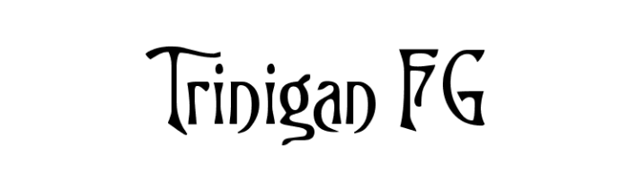
Trinigan
In the early 1900s, Charles Dana Gibson’s pen and ink drawings of corseted women with bouffant hairstyles came to be known as “Gibson Girls.” Trinigan, with its undulating arms and hourglass stems, revives this classic figure in typographic form.
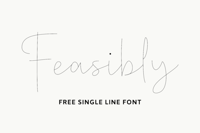
Feasibly Single Line Font
The “Feasibly Single Line” font is a unique display font that appears to be created with a single, continuous line. This makes it an excellent choice for designs that require a simple, yet eye-catching typography.
Michelle FLF
The geometric winding of this all-caps font almost resembles musical notation. Still, Michelle’s typographic potential is clearly not limited to ragtime and jazz.

Bodoni Ultra
Though there are many modern revivals of Bodoni’s original typeface that align it more readily with Times New Roman than times past, Bodoni Ultra is a striking exception. The dramatic alternation between thick and thin strokes echoes Chauncey H. Griffith’s 1929 Bodoni Poster typeface, used widely in popular print media.

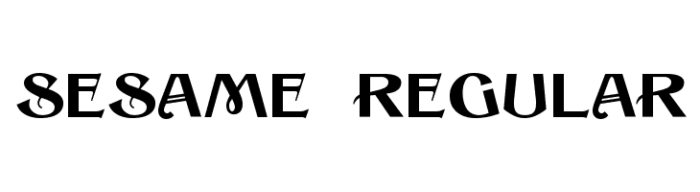
Sesame
Jugend magazine, the publication that helped launch the German Art Nouveau movement (“Jugendstil”), was a trendsetter when it came to the graphic and decorative arts of the late 19th century. Sesame is a font in the spirit of a Jugend cover: lavish, distinctive, and eccentric.
Conga Line
Betty Boop meets Broadway in a Conga Line: the 1930s charm of this font comes from its blend of cartoonish bounce and cinematic monumentality.

Tall Deco
Another architectural font, Tall Deco suggests the glass and ironwork of modern skyscrapers.

Modern and Avant Garde Fonts
Enigmatic
Enigmatic and Waukegan echo the softened rectangular shapes of Bell Gothic, a typeface commissioned by AT&T in the 1930s for use in telephone directories. Bell Gothic was and is a highly recognizable typeface that has been used for avant garde as well as popular graphics.

Waukegan

akaChen (in the spirit of Clarendon)
This font bears a marked resemblance to the Clarendon typeface, which was first designed in the mid-19th century and has been used frequently in display work.

After
The “Feasibly Single Line” font is a unique display font that appears to be created with a single, continuous line. This makes it an excellent choice for designs that require a simple, yet eye-catching typography.

Agit Prop
A font in the spirit of Soviet Constructivism, Agit Prop is intended to convey the graphic essence of Bolshevist agitation and propaganda. Whether or not you agree with the politics behind the design, it’s difficult to deny this font’s stark and monumental beauty.

Further Resources
- 20+ High-Quality Free Fonts for Retro and Vintage Design
- Retro / Vintage fonts on Dafont: Over 300 various free retro fonts, with a preview option and various filter views.
- Vintage Type Showcase A Flickr Pool with classic vintage typography.
- Letterheadfonts: A famous type foundry with impressive vintage and retro fonts.
- Houseind: Probably one of the largest type foundries specializing in vintage typography.
- Fontdiner: Another vintage type design foundry.
Photo by Mr Cup / Fabien Barral on Unsplash


Send Comment:
46 Comments:
June 19, 2019
Great collection!
September 14, 2012
I use some of these for my shirts.
January 19, 2012
Thank you for this great selection of display fonts. I'm a fan of the vintage seed packages and want carry on/ revive that look with a contemporary flare.
Thanks!
December 11, 2011
AWESOME FONTS :) B)
July 13, 2011
Love this collection. Nice to see an accessable 'rosewood' copy.
May 27, 2011
Hey The font Kraut Type-A-Fuck is not based on PT Andersons movie. I made the font, he found it, he bought it (for a underprice because his assistant lured me into believing it was for a independent film.. Goddammit, I sometimes hate hollywood) and used it for his movie. End of story.
May 11, 2011
how do you open these in microsoft word 2007?
May 7, 2011
Beautiful example of vintage typography used in a contemporary context
April 10, 2011
These are too beautiful. Thanks for sharing with us! I'm really taken with the font called "nasty". Grunge is always good in my book .
February 21, 2011
Thanks man! I'm looking for some old fashioned fonts that would look kinda like the old west so these will help immensely. Thank you!
February 12, 2011
Love the fonts! Thank you so much!
January 7, 2011
Thank you for the great links. Very cool of you to post. :)
Ciao,
DT
January 6, 2011
Fabulous! I can't wait to make use of some of these.
August 30, 2010
Awesome vintage fonts, specially thanks for wood fonts
July 7, 2010
Thx your Very much. ^^
Nice front.
January 8, 2010
Good fonts are so hard to find. I am sure glad to find some.
November 27, 2009
Awesome list of resources! Thank you for sharing.
I would just like to add one more set of typography resources and that is the forum of
It is a private typography forum with an unbelievable amount of free fonts, premium fonts and exclusive typefaces. I think it was voted the best typography forum of 2009. If you are a font lover/addict, check it out. Like I said though, it is either private or invite only. I have never seen a typography site like it with all it has to offer. Anyhow, check it out, pilo.me
Anyhow, great article, I definitely will be referring to these time to time.
November 17, 2009
These are nice
November 9, 2009
hi dear aim 26 years old Abigale male i am Nepali aim looking for forever friend pals if u can invaded me to u friend pals...............aim so happy if u are my friend.
October 26, 2009
Love this hand picked selection because these fonts aren't over used. Nice and tasteful. Thank you!
October 23, 2009
oh great some stupid fonts that are barely legible.
October 19, 2009
Thanks for these vintage fonts.
October 17, 2009
these are great!
October 16, 2009
Very nice font collection thanks
October 14, 2009
Alte Schwabacher, not Ulte