
We’re designers, so it makes sense that a lot of us are visual learners and do better looking at charts and graphs than reading an article or listening to a podcast. Typography and color are two great topics that are perfectly suited for infographics, charts, and other graphical learning tools.
Below we’ve collected a good number of great infographics that will teach you how to use typefaces and colors effectively. There are guides for choosing a typeface, for combining typefaces, for figuring out what different colors mean in different cultures, and a lot more.
Typography
Dig into the history of typography and catch up on the typographic origins. Whether you need help choosing the right font or want to know how to effectively combine fonts, the graphics below can help, for both print and online design.
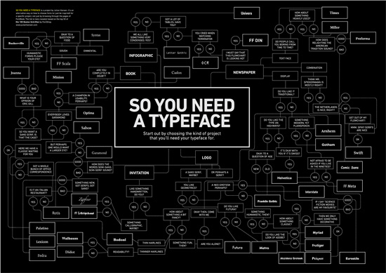
So You Need a Typeface
While at first this infographic appears to be a bit tongue-in-cheek, it’s actually quite useful. Start by choosing what type of project you’re working on, and then just answer a series of yes or no and good or bad questions to find a suitable typeface.
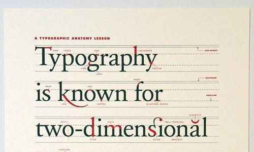
The Anatomy of Typography
Understanding all the elements that make up a typeface is an important step in learning to expertly combine typefaces. This infographic breaks down the anatomy of individual characters within a typeface, covering everything from aperture to strokes to the different types of terminals.
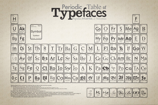
Periodic Table of Typefaces
The most popular fonts are graphically represented in the style of the periodic table of elements in this poster. It gives some brief history of each typeface (including the date it was first designed and who designed it), as well as the classificiation of each font. There are a number of different versions of the poster available for purchase, or you can print it yourself.
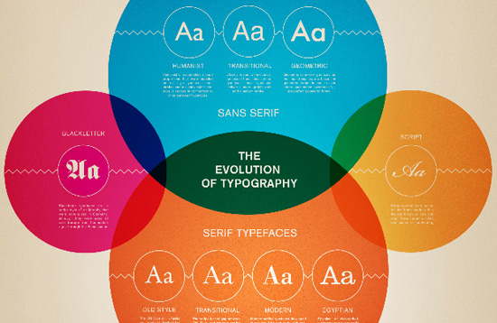
The Evolution of Typography
This infographic showcases the changes in typographic design throughout history. It covers the evolution of serif typefaces and sans-serif typefaces, as well as a brief description of the history of script and blackletter typefaces.
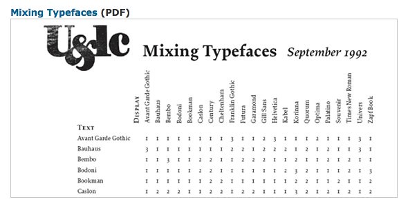
Mixing Typefaces
This simple chart serves as a guide for combining twenty-two different common typefaces. It offers three separate classifications for determining whether two typefaces are compatible: “Combine at will”, “Not a conservative choice”, and “Think again.”
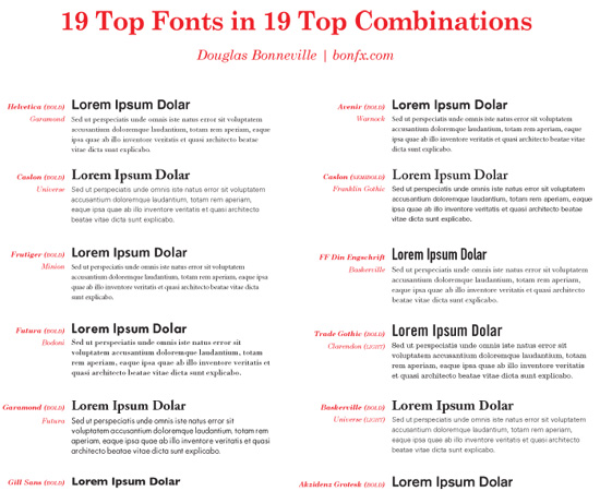
19 Top Fonts in 19 Top Combinations
This great chart provides an instant visual reference to good combinations of popular fonts, including Helvetica, Garamond, Gill Sans, Minion, and more.
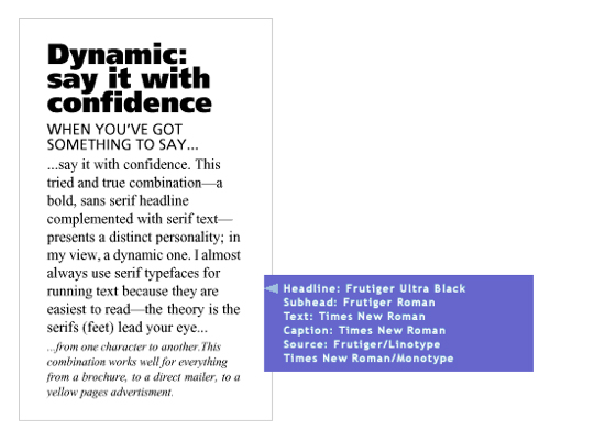
Type Palettes
Graphical representations of typography combos are a great way to see how different fonts work together. This Type Palettes article shows a number of complex typography combinations, using different typefaces for headlines, subheadings, text and captions.
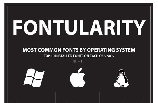
Most Popular Fonts by Operating System
Not everyone is using @font-face for their website designs yet. And even those who are need a backup for older browsers (or in case their font service is down or unavailable). This chart shows all the most popular typefaces by operating system, and even includes the most commonly used fonts from Google Font Directory and FontSpring.
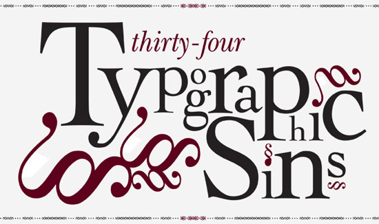
34 Typographic Sins
There are dozens of mistakes commonly made in typographic layouts. This poster details thirty-four of them, as well as what the correct usage is.
Color
Color science and theory is a remarkably complex field. The graphics included below, though, can offer valuable insight into the world of color, including how to effectively create color palettes and what colors mean.
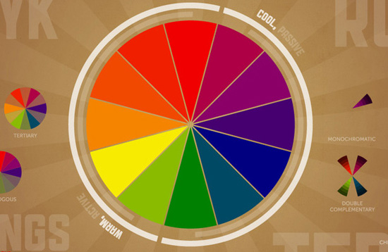
Basic Color Relationships
This infographic gives all the basic information you need to know about color theory. It includes terms, the way RGB and CMYK work, and meanings of different colors, as well as a color wheel the illustrates warm and cool colors.
What Colors Mean to Different Cultures
When designing for an international audience, it’s important to note the effect your color scheme will convey to your audience. This handy chart shows exactly what different colors mean in different countries, helping to prevent any cultural faux pas.
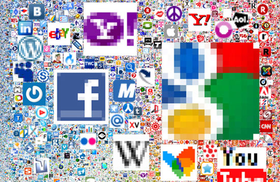
Colors of the Most Powerful Brands in the World
Certain colors have become associated with certain brands, both in the “real world” and online. This series of graphics explores the colors used in the various design schemes and logos of the biggest brands in the world. Each of these graphics explores a different aspect of the use of color in branding.
Colors of Twitter Profiles
This infographic compares the use of colors by geography, keyword, and demographic of Twitter users who have used the Colourlovers Themeleon Twitter profile designer. It also showcases the most colorful Twitter personalities, and the colors they use.

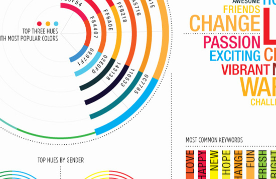
Top Voted Colors of 2010
Staying current on trends in color is important for designing a site that looks current (or stays timeless). This infographics shows the results of a survey of over 1000 people chose the most popular colors of 2010 and the words that the colors represent.
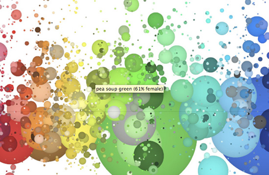
His and Hers Color Names
A useful, interactive infographic that displays the results of XKCD’s color survey, which used five million plus samples to judge what men and women consider accurate names for all the colors of the spectrum. Some are downright hilarious, while others are incredibly creative. In either case, it gives a good indication of how the sexes feel about different colors across the spectrum.
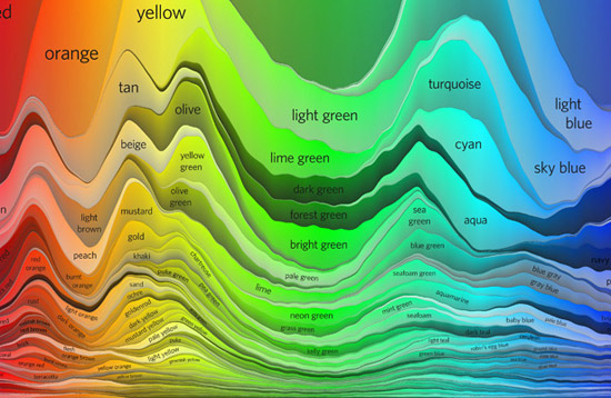
The Color Strata
Here’s another visualization of the XKCD Color Survey dataset, broken down into the 200 most common color names. The format used here is really interesting, and not something commonly seen.
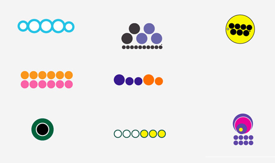
Recognizing Brands by Color Scheme
An interesting study that seeks to simplify brand logos by breaking it down into it’s basic color and circles to represent text and lines. A useful way to see where the color scheme of a logo works it’s magic, which can help you design color schemes with more impact.
Useful Infographics
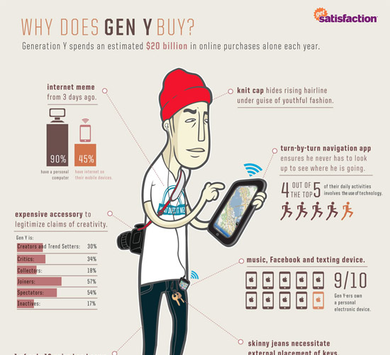
Why Does Gen Y Buy
This infographic is useful to anyone creating an ecommerce site that’s aimed at Generation Y, who spend about $20 billion online each year.
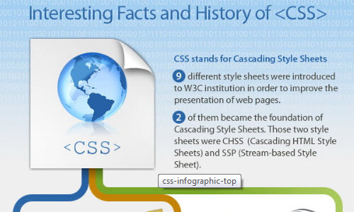
Interesting Facts and History of CSS
This infographic combines the history of CSS with a number of interesting facts about it. It includes the different versions of CSS, as well as support by different browsers.
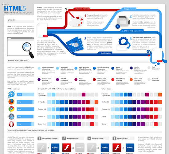
WTF is HTML5 and Why We Should All Care
This is a brilliant infographic that shows what new features HTML5 has added, and what those features mean for the future of the internet.
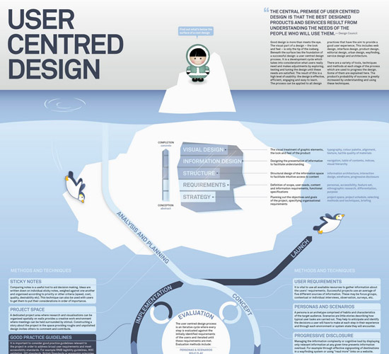
User Centered Design
This infographic breaks down the elements of user-centered design, as well as the process of creating such designs.
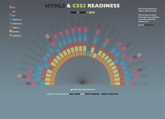
HTML5 & CSS3 Readiness
This interactive infographic breaks down exactly which browsers support which new features of HTML5 and CSS3.
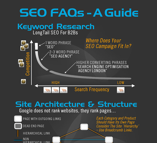
The Visual FAQ of SEO
This infographic gives a great breakdown of what you need to know about search engine optimization. It covers things like site architecture and structure, link building, and SEO tactics.
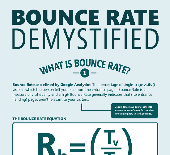
Bounce Rate Demystified
This infographic from KISSmetrics showcases how bounce rate statistics work, and how they’re calculated.
The Anatomy of a WordPress Theme
This is an incredibly useful infographic that breaks down the parts of a WordPress theme in great detail. If you’re a theme developer (or want to be), it can also serve as an excellent quick-reference guide.

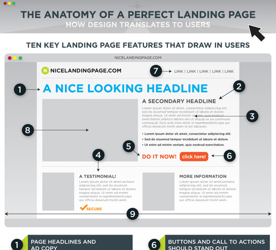
The Anatomy of a Perfect Landing Page
The creation of a great landing page is equal parts art and science. This infographic breaks down exactly what goes into a great landing page.
Interesting Infographics
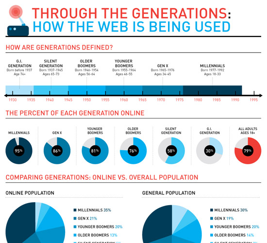
Through the Generations: How the Web is Being Used
This infographic breaks down common internet usage patterns among different generations, including Millenials, Gen X, GI Generation, Silent Generation, and the Boomers.
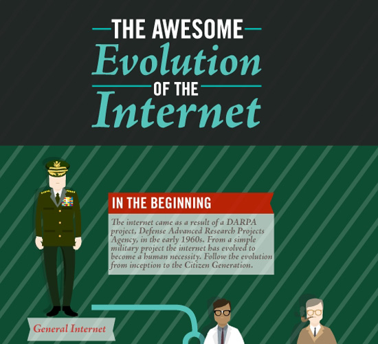
The Awesome Evolution of the Internet
This is a fun infographic that breaks down the evolution of internet users from the beginning of the web.
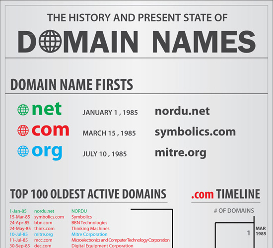
The History and Present State of Domain Names
Ever wondered what the evolution of domain names looks like? This infographic breaks it down from the first .net domain name in 1985 through now.
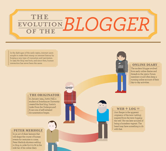
The Evolution of the Blogger
An interesting infographic that shows the evolution of bloggers from those keeping online diaries to company bloggers, vloggers, and others.
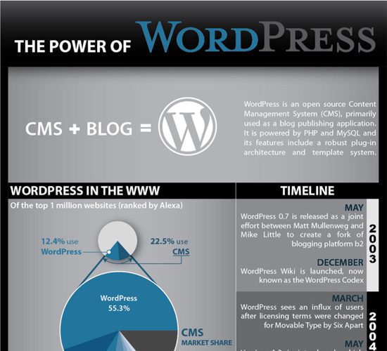
The Power of WordPress
This infographic showcases the power of WordPress as both a CMS and a blogging platform. It includes a timeline of WordPress from May 2003 through September 2010, as well as details on the types of sites using WP and daily user activity.
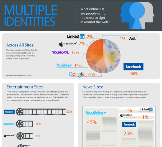
Multiple Identities
This infographic discusses what profiles users utilize to sign up for and use different services across the internet, including Google, Facebook and Twitter.
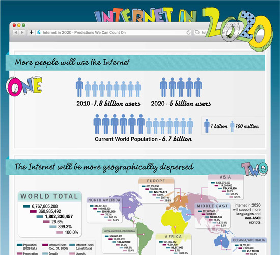
The Internet in 2020
Here’s a great graphical representation of what the internet is predicted to look like in 2020, based on current data. It covers how many people will likely be online, who those people will be, and more.
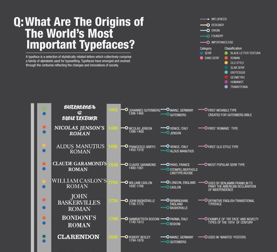
Origin of Important Typefaces
This infographic shows a timeline of when important typefaces were developed and by whom.
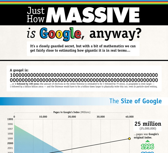
Just How Massive is Google, Anyway?
Figuring out just how big Google is can be tricky. This infographic sheds some light on the subject.
The History of Programming Languages
This infographic from O’Reilly shows the history of various programming languages, from 1954 until 2004.

Dribble: What Is It Used For?
An interactive HTML5 infographic that offers details about Dribble usage and users.

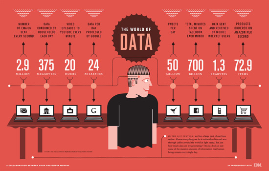
The World of Data We’re Creating on the Internet
This infographic from Good Magazine shows how we use the internet and the data people create on a daily basis, including email, video, and other content.
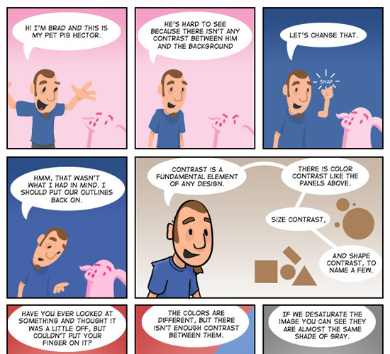
The Brads – Learning About Contrast in Design
Contrast is a very important concept designers need to grasp if they want to be successful. This infographic/comic strip from Vectortuts+ explains contrast in an easy-to-understand way.
Other Resources:
Saul Bass: The Evolution of an Artist
Photo by Natalia Y. on Unsplash


Send Comment:
32 Comments:
March 1, 2025
This post offers excellent tips on designing charts with better typography and color. The advice is super useful, especially for Project Report Writing, where clear and appealing visuals are key to making your report stand out. A must-read!
December 7, 2023
Incredible compilation for someone who's passionate about programming assignments
February 22, 2021
Thanks for the article. Hmm there could be something in interviewing people with large social followings and writing articles about them
Aral Digital Marking
January 1, 2020
Your blog is superior to anything standard a commitment of gratefulness is all together for sharing Then justVery dazing, a dedication of thankfulness is with the objective for sharing to us Enjoyed the aggregate of your blog.Really imagining read more.dissertation helps
October 18, 2019
surprising post I should thank you for the undertakings you have made recorded as a printed copy this intersting and oversaw article.assignment helps
November 1, 2012
This is the best article from the entire Internet! Thanks a lot!!!!!
April 2, 2012
Some great articles here. I like the one with the significance of colour when recognising brands! :)
March 27, 2012
Loved the periodic table, very helpful. Thanks!
January 24, 2012
Awesome useful! Thank you very much!
May 18, 2011
These are really helpful charts! Thanks for sharing.
April 1, 2011
Huh .. amazing .. I very thank you this essential collection of informations :)
March 29, 2011
Great set of resources. Thanks!
March 28, 2011
BRILLIANT! Thanks
March 28, 2011
Great! Thanks a lot 4 sharing your knowledge.
March 27, 2011
So informative article, Thanks!!
March 26, 2011
Excellent, no words for this collection... Thanks!!
March 25, 2011
In "Through the Generations: How the Web is Being Used", I think the order of the pie charts on the percent of each generation on line would make more sense if it was the same as the timeline above.
March 24, 2011
This is the best resource I've found in a while. Thanks!
March 24, 2011
This was extremely interesting! Thanks for putting it together. I am a graphic designer and found lots of valuable information.
March 23, 2011
That was a great article. I am a fashion designer and graphic student and the article is quite useful.It is a perfect collection and nicely summerized the key elements of typography and Colour theory in fine and visual art.
Thanks
March 23, 2011
Thanks for sharing wonderful and useful ideas.
Regards
Paul
March 23, 2011
Great post to fall back on for inspiration!
March 22, 2011
Very useful and interesting, I want more articles ! :-)
March 22, 2011
Cool collection. Thanks a lot!
March 22, 2011
Great article, great inspiration, thanks a lot!