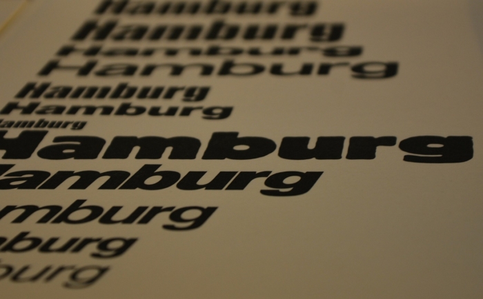
Typography obviously belongs to the cohort of the fine arts, where even the smallest details and elements are meaningful and can influence the overall perception of the final creation, whether it is a picture or a text, printed with a particular typeface. In terms of fonts design, serifs are those tiny elements, which add a particular character to a typeface, contributing to the unique feel and look every font is characterized with.
By definition, serifs are the small lines or strokes at the ends of the main strokes of the letters in a particular font. Sometimes, serifs are also descriptively explained as “hooks” or “little feet” at the ends of the vertical and horizontal strokes of a letter. Consequently, fonts with serifs are usually mentioned as Serif fonts, for example, Times Roman, Garamond, Souvenir, etc. On the other hand, fonts, where letters are not supplied with such embellishing elements, are called Sans Serif fonts (“sans” means “without” in French).
It is interesting to note that along with purely decorative function serifs are believed to play a role in the text perception mechanism by the human eyes, making the printed text easier to read. This is why Serif fonts have always been among the primary choices for printing books, newspapers, and magazines. However, in electronic media, due to the specificity of perceiving a text on the computer screen, it is preferred to use Sans Serif rather than Serif fonts, because reading letters without serifs is considered to be easier on the screen.
Stemming out of the ancient Roman alphabet with the letters carved into stone, Serif fonts have passed a long way of development and evolution. As the result, now we have several types of Serif fonts, each with its own peculiarities and specific features.
Old Style Serif Fonts
Dating back to the middle of the 15th century, old style serif fonts are considered to be based on the humanist calligraphy. The key features of the old style serif fonts are low line contrast (when there is only a slight difference between thick and thin lines forming a letter) and diagonal stress (the thinnest parts of the letters are those at the angles). It is believed that the combination of diagonal stress and bracketed serifs in old style serif fonts creates a special positive word picture, which is especially favorable for the ease of reading and perception.
Free old style serif fonts


Commercial old style serif fonts


Transitional Serif Fonts
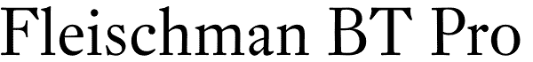
Everyone knows Times New Roman font, which is commonly used as the default font in computer text editors. This font, created in 1932, is the most vivid representative of the transitional serif fonts, which first appeared in the middle of the 18th century and now stands between old style and modern serifs in the typical font classification. Unlike old style serifs, transitional serif fonts feature higher line contrast with more distinctive difference between thick and thin lines. Transitional serif fonts are sometimes called “baroque fonts”.
Free transitional serif fonts


Commercial transitional serif fonts


Modern Serif Fonts
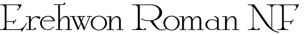
Modern serif fonts first appeared at the end of the 18th century. Also known as Didone serif typefaces, the family of modern serifs fonts has vivid differences from the old style serif fonts. These are the extreme high line contrast, vertical stress instead of diagonal, and long and fine serifs. Vertical lines of the modern serif fonts are usually very heavy, which, in combination with thin and light serifs, makes a text, printed in modern serif font, less readable.
Free modern serif fonts


Commercial modern serif fonts


Slab Serif Fonts
The first slab serif font was presented in the early 19th century by Vincent Figgins under the name Antique. However, in view of public craze in Europe for everything Egyptian at those times, the slab serif fonts were commonly called Egyptian. Virtually no difference between thick and thin lines of the letters is the key feature of slab serifs. With the bold and rectangular shapes, slab serif fonts often have fixed width, which means that every letter occupies the same horizontal space.
Free slab serif fonts


Commercial slab serif fonts


Clarendon Serif Fonts
Clarendon serif font is sometimes classified as the subtype of slab serif fonts. However, unlike traditional slab serifs, Clarendon font has some brackets at the junction of a stem and serifs. Also, Clarendon fonts usually feature heavy and square-cut serifs. This font group was widely used in the Old West in “wanted” posters and later on traffic signs in the USA. Now Clarendon font can be found on the logotypes of many companies with Sony among them.
Free Clarendon serif fonts


Commercial Clarendon serif fonts


Freeform Serif Fonts
Along with the serif fonts, designed in accordance with particular typography rules or tradition, such as old style serif fonts or modern serifs, there are also many freeform serif fonts, developed these days. Designers, inspired by a rich legacy of serif fonts and modern trends in typography, use all their imagination to present serif fonts in a fresh and sometimes completely unexpected way.
Free freeform serif fonts


Commercial freeform serif fonts


Banner Image by Franz P. Sauerteig from Pixabay


Send Comment:
48 Comments:
October 31, 2012
Bodoni Antiqua?
October 31, 2012
I've been a typographer for many years now and right now i'm having trouble remembering if there is a different category for Wedge Serifs of if they're just considered Serifs.
November 18, 2011
I'm looking for a Bodoni style font, but not the slab version... anyone know where I can find this? It's killing me....
February 2, 2011
In addition, three of those free Moderns are not at all Moderns. One is Old Style, and two are Transitional. There are lots of errors in this article.
December 20, 2010
This is really great! Thanks for sharing.
November 5, 2010
Excellent posting, well crafted I have to admit.
June 26, 2010
great post. I've gotta do something bout my legs...
June 9, 2010
Nice post thanks guys for sharing it.
May 7, 2010
i feel so geek when i get excited just from reading the title xD
April 18, 2010
i too agree for Jennifer
April 14, 2010
This article is going to help a lot with my clients. Most of them have no idea about any of the basics of design. Letting them see this ad will make explanation much easier.
April 14, 2010
I agree with the Type Professor above, in that it’s great you are exposing readers to type classification. S/he is also correct in pointing out that Baskerville is most certainly Transitional; in fact, Baskerville is the archetypal Transitional typeface. There are quite a few others that are wrongly classified, but ... I’ll keep my mouth shut, and just congratulate you for spreading the word.
See also this article for an explanation of the Transitional classification:
April 14, 2010
Thanks for the well written and very useful article.
April 14, 2010
Thank you! It was driving me nuts that Baskerville was listed as a Modern typeface. That type classification page you linked to is much clearer than a lot of the examples here.
April 13, 2010
You are so fake.. Like all the other comments on this site are just adds.
April 12, 2010
I don't know if there's so many type of serif fonts out there. All I thought was that Times New Roman, Garamond, Goudy, etc are serifs, without any further classification. Thanks Noupe
April 12, 2010
Museo is indeed perfect!
go serif!
April 12, 2010
Great article with some beautiful examples of serif typography. We use Sentinel for our corporate font by which is a great option for our corporate/relaxed vibe.
April 12, 2010
Sorry, but Kevin is correct.
April 12, 2010
Baskerville is the model for transitional classification. Kevin is correct.
April 12, 2010
Great collection! I'm a serif girl, and I really love Museo. It's just perfect.
April 12, 2010
Kevin,
You're wrong. Baskerville is Modern serif. Gotta check all characters. If you check M or N, you'll see yourself.
April 11, 2010
thanks for putting this together. good read.
April 11, 2010
Thanks for the well written and very useful article.
April 11, 2010
spam