Widgets in your form come with a set of configurable properties that allow you to control their appearance, behavior, and data handling. You can modify visual elements such as alignment, label positioning, width, and height, as well as set requirements like making a field mandatory. Additional layout controls—such as shrinking a field, moving it to a new line, or hiding it—offer further flexibility in organizing your form.
Accessing the Question Properties
Whether you’re adding a new widget or updating an existing one, accessing the Question Properties only takes a second—here’s what to do:
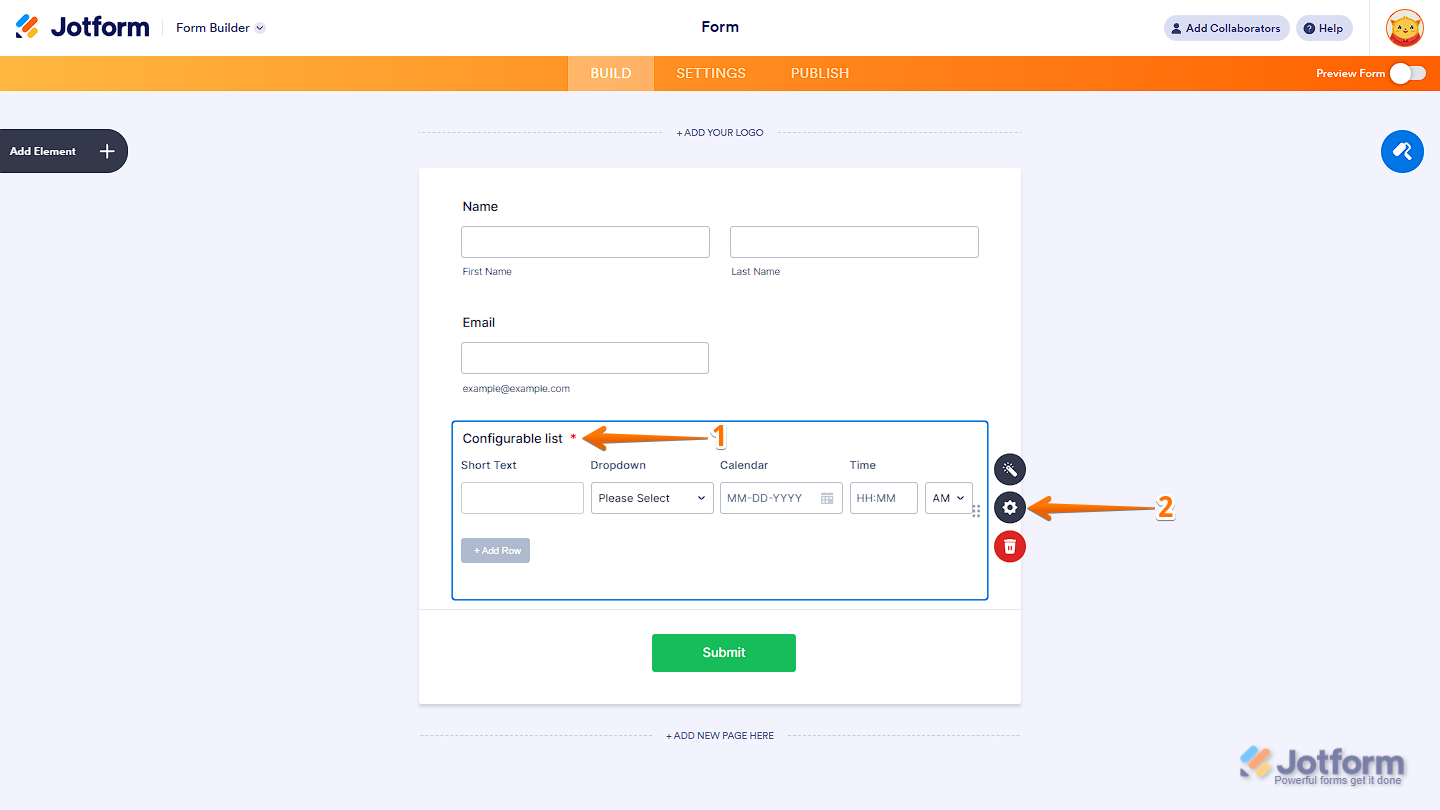
- In Form Builder, click on the widget that you’ve added to the form.
- Now, click on the Gear icon on the right side of the widget to open the Question Properties.
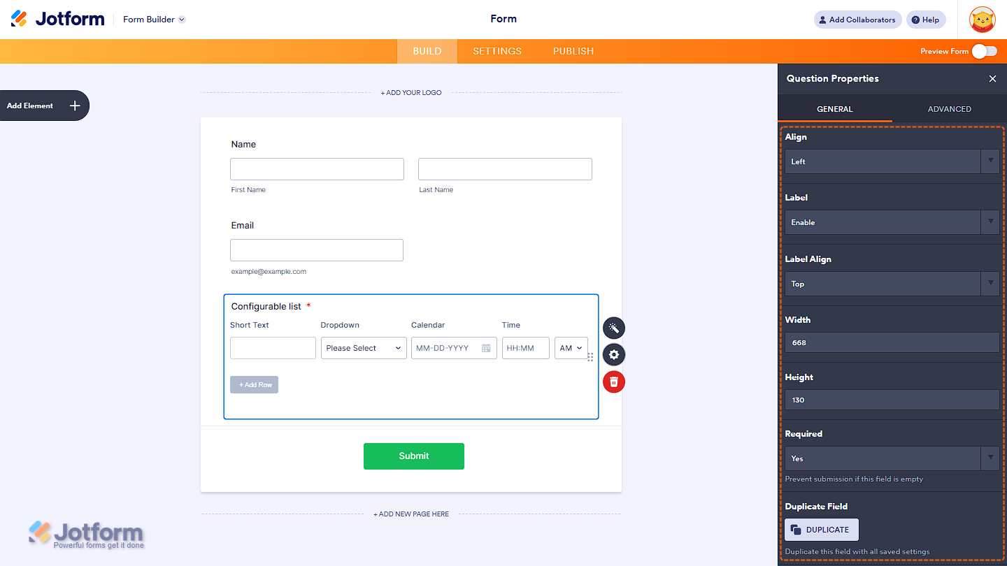
Configuring the General Tab of a Widget
The General tab contains key options for customizing how the label and widget appear and behave within your form. It has the following options:
- Align — Adjust the position of the fields inside the widget.
- Label — Show or hide the widget’s label.
- Label Align — If the label is displayed, you can place it on top, to the right, or to the left of the widget.
- Width — Define the overall width. Especially useful for input-type widgets.
- Height — Specify the height. Handy for widgets like maps (e.g., Geolocation widget).
- Required — Make the field optional or required for submission.
- Duplicate Field — Create a copy of the widget, including all current settings.
Note
Not all widgets support the options listed above. Some widgets may have limited settings based on their purpose or functionality. Additionally, certain fields may be marked as required by default. Always check the individual widget’s properties panel to see which options are available.
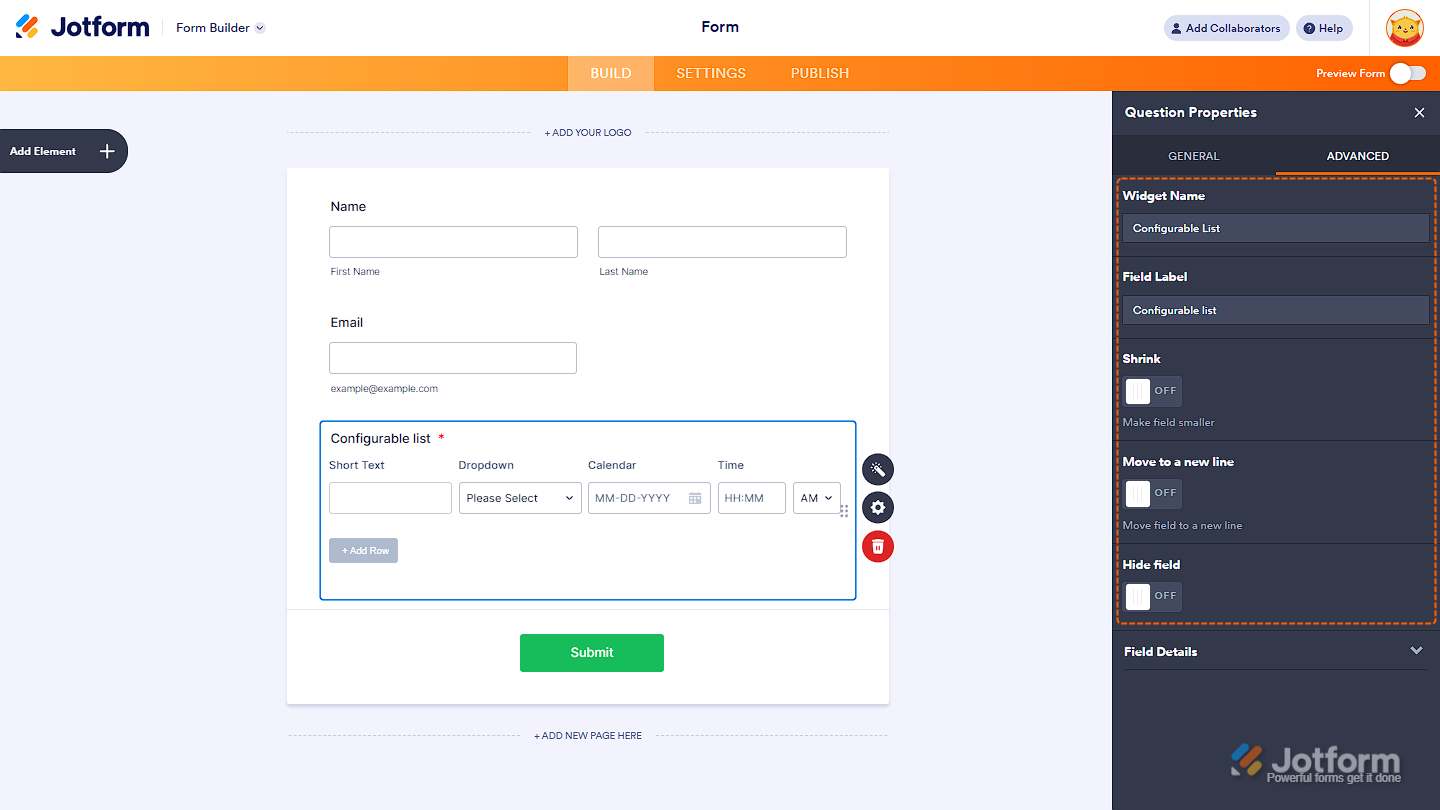
Configuring the Advanced Tab of a Widget
The Advanced tab is where you’ll find the options for positioning the whole widget in the form. Here, you’ll find the following options:
- Widget Name — You can rename the widget, but it’s generally best to keep the default name for consistency and easier identification.
- Field Label — Update the label text shown on the form.
- Shrink — Reduce the widget’s size to allow side-by-side placement with other fields.
- Move to a New Line — Force the widget to start on a new line. Useful when using the Shrink option to control layout.
- Hide Field — Hide the widget from users. Avoid hiding required widgets, as this may prevent form submission.
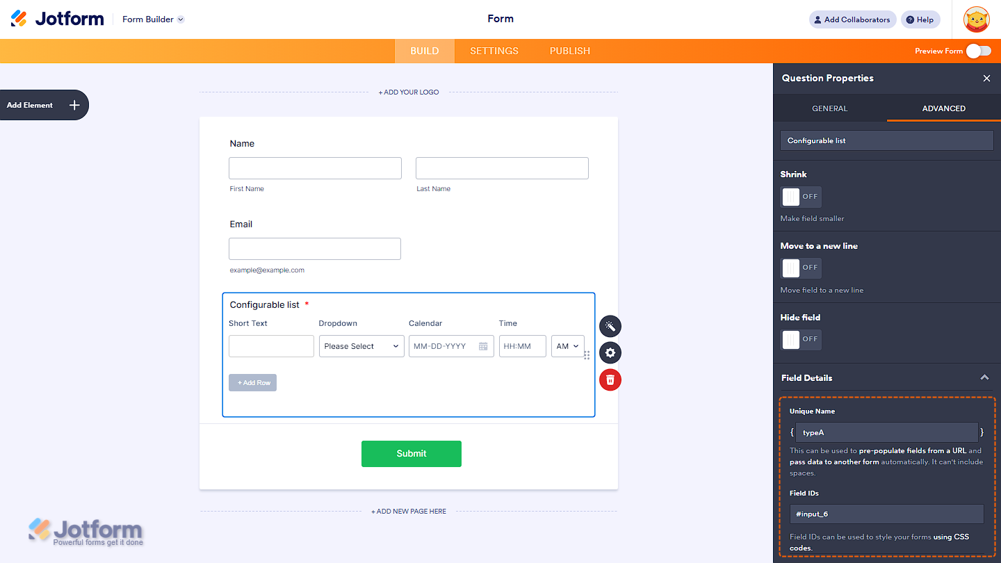
The Field Details section includes the widget’s Unique Name and Field ID—useful for passing data to another form or using it for 3rd-party integrations through Webhook and styling the widget using Custom CSS codes.
Curious about how the field positioning works? You can check out our guide on How to Position Form Elements in Jotform to learn more.

Send Comment: