Jotform’s asmSelect widget helps you make a smoother way for users to pick multiple options without overwhelming your form. This handy tool lets people select from a list of choices in a clean, dropdown-style menu—keeping your form neat while still allowing plenty of flexibility. It’s perfect for longer option lists, saves space, and gives your form a polished, user-friendly feel.
Here are a few ways to use it:
- Allow Users to Select Multiple Options Easily — You can use the asmSelect widget to let users pick multiple items from a long list without scrolling through checkboxes. It transforms a standard multiple-selection dropdown into a more interactive interface.
- Organize Long Lists with Searchable Options — The widget is ideal for forms with long option lists, such as countries, skills, or products. Users can search and select items quickly, improving usability and reducing errors.
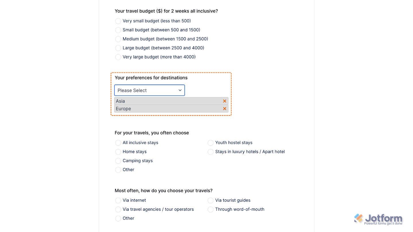
- Display Selected Items Clearly — When users select multiple options, the asmSelect widget shows them as separate tags. This makes it easy to review choices before submitting the form.
- Manage Categories or Interests Efficiently — You can use the widget to let users select multiple categories, preferences, or interests in surveys, registration forms, or preference settings.
Note
Selected items appear in a neat preview list, making it easy for users to review and remove options.
Adding and Setting Up the asmSelect Widget
Adding the asmSelect widget to your form is a quick and easy way to save space while keeping things neat, organized, and user-friendly. To get going, here’s what you’ll do:
- In Form Builder, click on Add Element on the left side of the page.
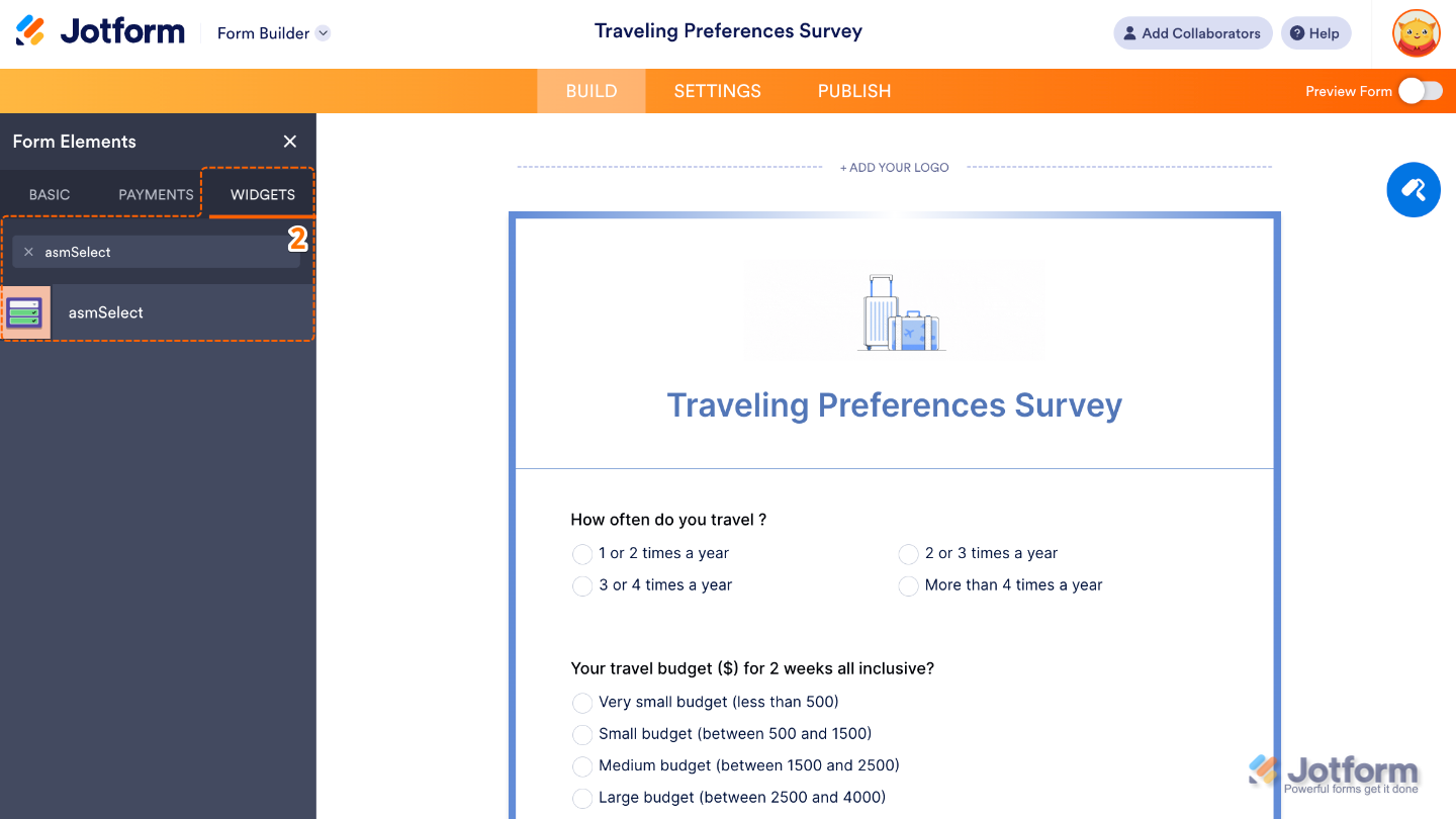
- Now, in the Form Elements menu, under the Widgets tab, search for asmSelect and then click on it. Or, just drag and drop it to where you want it to be on your form.
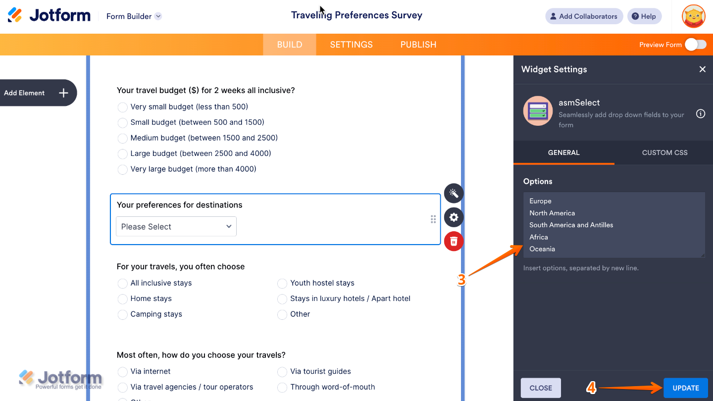
- Next, in the Widget Settings window that opens on the right side of the page, set up the Option to add the choices you’d like to show to the user, with one option per line, so each appears separately.
- Once you’re done, click on Update.
That’s it. You’ve successfully added and set up the asmSelect widget to your form. Now, you have a field in your form that makes it easy for users to choose multiple options from a neat dropdown list, and even remove them if they change their minds. Curious how it works on a live form? Check out this Demo Form.
If you’d like to tweak how your Adobe Sign field looks, simply click the gear icon to open its properties and adjust the settings to match your needs.
Note
For advanced styling, you can add your own custom CSS under the Custom CSS tab in the widget settings and style the asmSelect field. Our guide on How to Inject CSS Codes to Widgets walks you through everything.
Pro Tips
- Use asmSelect for fields where users may change their minds—the built-in remove option makes it quick and stress-free.
- Test your form on mobile to make sure the dropdown and preview list are comfortable to tap and scroll through.

Send Comment: