The Divider element is a simple yet effective way to organize your form and improve its overall readability. It helps break up sections, group related fields, and guide users as they move through each part of the form. By adding clear visual separation, you can make your form feel less cluttered and easier to follow, creating a smoother and more user-friendly experience.
Here are a few ways to use it:
- Use it to separate different sections, like personal details, contact information, and preferences.
- Add it between groups of related fields to make your form easier to scan and understand.
- Use it to create a clear break before important sections or instructions.
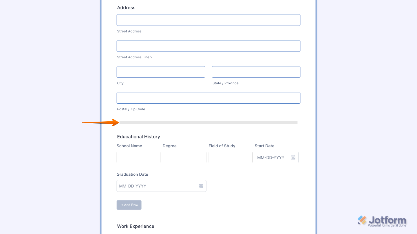
- Place it between long parts of a form to reduce visual clutter and improve readability.
Adding and Setting Up the Divider Element
Whether you’re building a new form or editing an existing one, you can add and configure the Divider element in just a few steps. This is how it’s done:
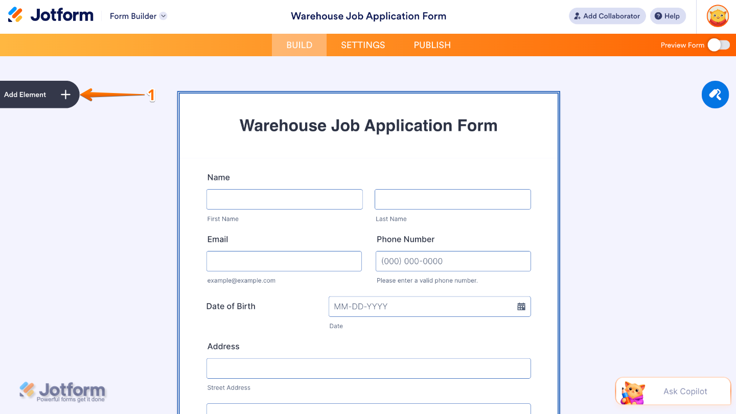
- In Form Builder, click on Add Element on the left side of the page.
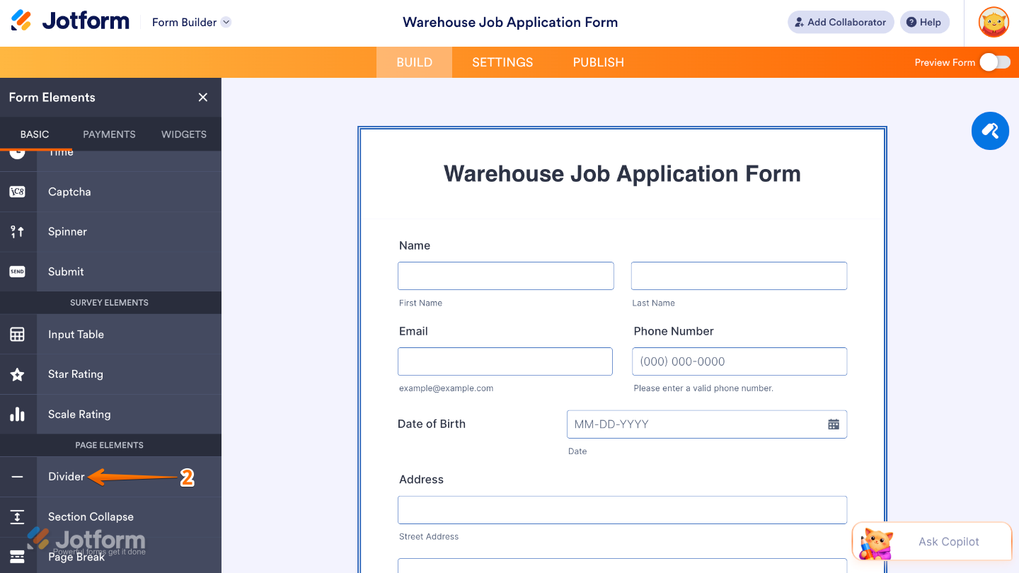
- Then, in the Form Elements menu, under the Basic tab, scroll down and then click on Divider. Or, just drag and then drop it to where you want it to be on your form.
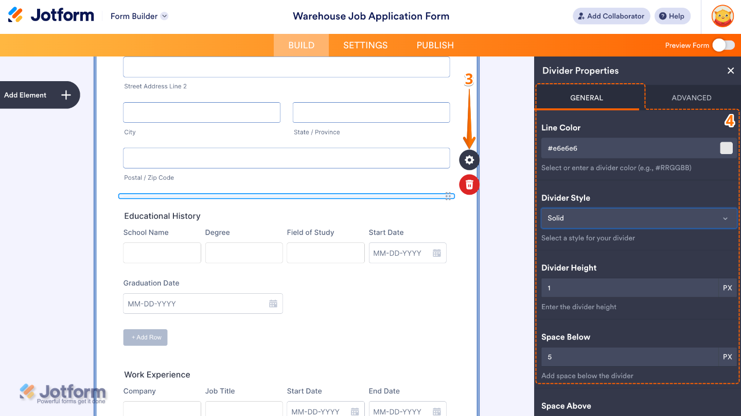
- Next, click on the Gear icon to open the Divider Properties menu on the right side of the page.
- Then, under the General tab, set up these things:
- Line Color — Changes the color of the divider line, allowing you to match it with your form’s theme or branding.
- Divider Style — Lets you choose how the divider looks, such as solid, dashed, or dotted lines to create different visual effects.
- Divider Height — Adjusts the thickness of the divider line, making it thinner for subtle separation or thicker for stronger section breaks.
- Space Below — Controls the amount of space added under the divider, helping you manage spacing between form sections.
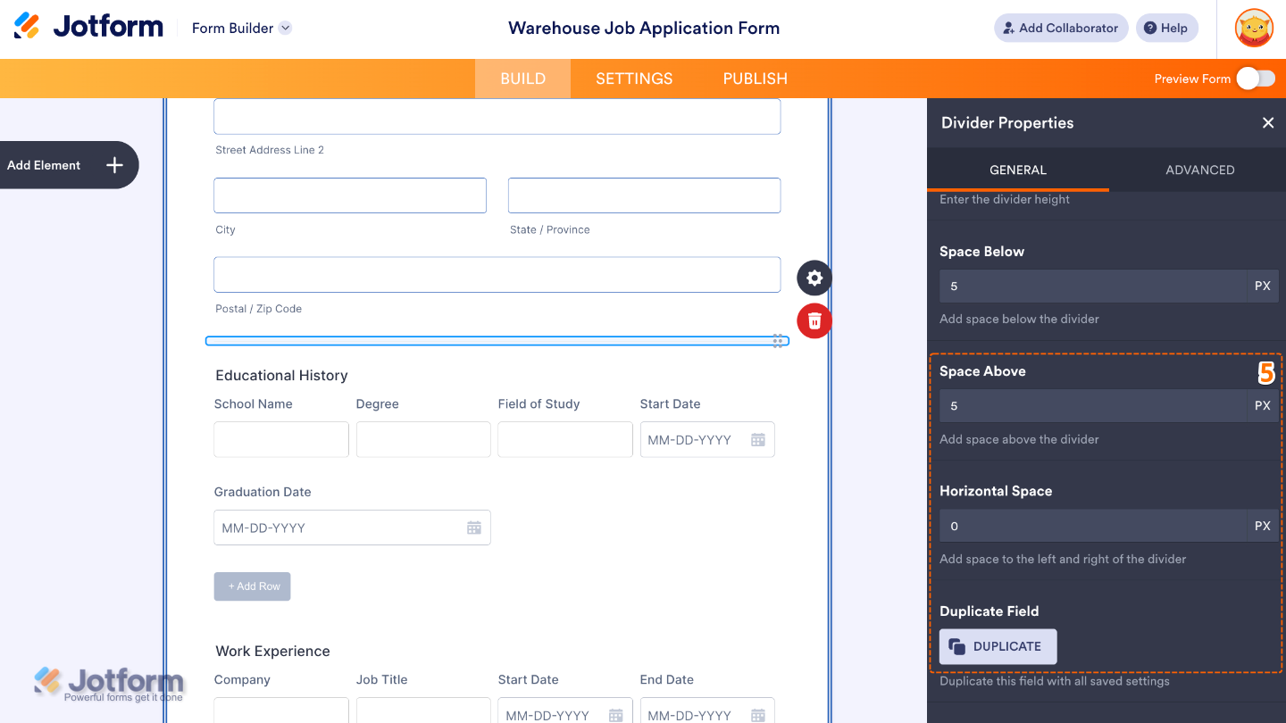
- After that, scroll down and continue setting up these option:
- Space Above — Controls the amount of space added above the divider to improve layout balance and readability.
- Horizontal Space — Adjusts the left and right spacing around the divider, useful for aligning it with form content or keeping it centered.
- Duplicate Field — Click on Duplicate to create a copy of this field with all its saved settings.
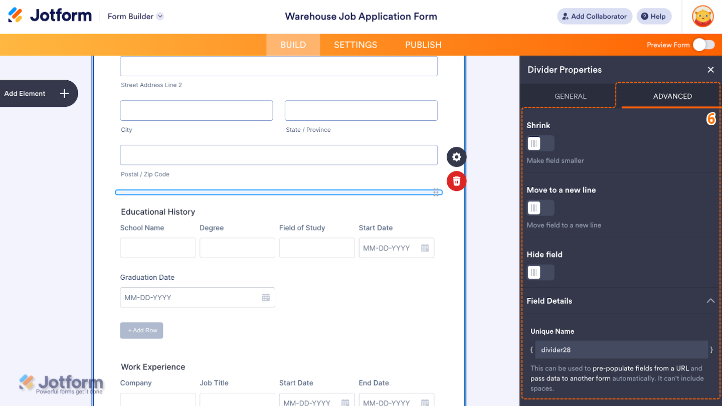
- Finally, click on the Advanced tab and continue to manage these details:
- Shrink — When enabled, it reduces the visual size of the field.
- Move to a New Line — Forces the divider to appear on its own line, ensuring it doesn’t sit beside other form elements in multi-column layouts.
- Hide Field — Turn this on to completely hide the field from users.
- Field Details —This will show you additional technical information about the field:
- Unique Name — The unique identifier for the field, which can be used to pre-populate it from a URL or pass data to another form automatically.
That’s it. You now have a fully set-up Divider element that helps organize your form into clear sections, making it easier for users to read, follow, and complete your form. Want a quick preview? This demo form shows how it looks in action.
Note
The Divider element is currently not available in the Card form layout and can only be used in the Classic form layout. Need help changing the layout? See our guide on How to Change Your Form Layout.
Pro Tips
- Use the Divider element to break your form into clear, easy-to-follow sections so users don’t feel overwhelmed.
- Place dividers between related groups of fields to improve structure and readability.
- Keep spacing consistent so your form looks clean and well-organized from top to bottom.
- Combine dividers with headings or short descriptions to guide users through each section more smoothly.

Send Comment: