Jotform’s Line Checkbox widget lets you display your checkboxes in a neat, single-line layout—perfect for short lists or when you want to save space. It gives your form a clean, modern look and even allows users to choose from color options that match your branding. Best of all, it’s super easy to set up—just add your checkbox options, and you’re good to go. No coding required.
Here are a few ways to use it:
- Create a Clean, Horizontal Option List — You can use the Line Checkbox widget to display answer choices in a single horizontal line instead of a vertical list.
- Design Simple Rating Scales — The widget is ideal for creating rating questions such as satisfaction levels or agreement scales. Placing the options in one line makes the scale easier to read and quicker to answer.
- Build Quick Preference Selectors — You can use them to let users quickly select preferences, such as size, color, or subscription type. The horizontal format keeps the form visually clean and organized.
- Create Inline Survey Questions — For surveys with several short questions, the widget helps keep each question compact and visually consistent. This improves readability and enhances the user experience.
Adding and Setting Up the Line Checkbox Widget
Adding a cleaner, more compact way for users to make multiple selections on your form is easy with the Line Checkbox widget. It only takes a minute to set up—here’s how:
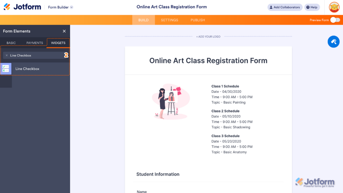
- In Form Builder, click on Add Element on the left side of the page.
- Now, in the Form Elements menu, under the Widgets tab, search for Line Checkbox and then click on it. Or, just drag and drop it to where you want it to be on your form.
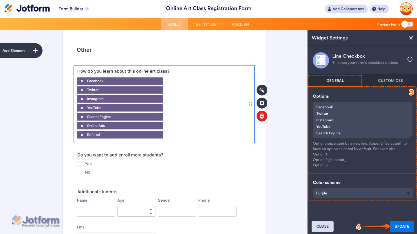
- Next, in the Widget Settings window that opens on the right side of the page, set up the following options:
- Options — Add here the choices you want users to select from—just add one per line, and each will show up as its own checkbox.
- Color Scheme — Pick a color theme that fits your form’s style or brand. You can choose from fun preset options like red, green, blue, gray, orange, yellow, pink, or purple.
- Once you’re done, click on Update.
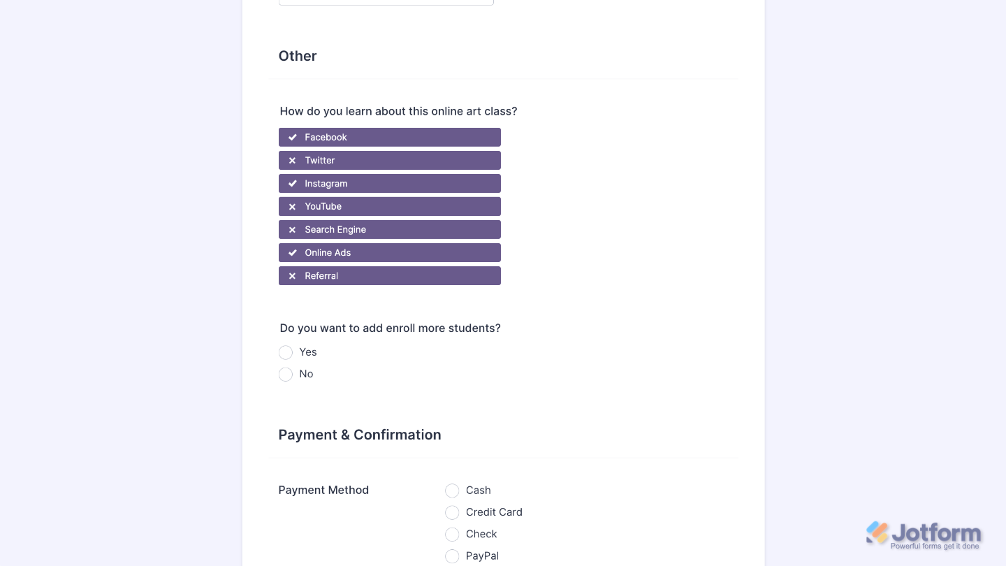
That’s it. You’ve successfully added and set up the Line Checkbox widget to your form. You now have a field in your form that shows all the options in a single row—perfect for keeping things clean, organized, and space-saving. Wondering how it looks in action? Check out this Demo Form.
If you’d like to adjust how your Line Checkbox field looks, simply click the gear icon to open its properties and customize the settings to match your preferences.
Note
For advanced styling, you can add your own custom CSS under the Custom CSS tab in the widget settings and style the Line Checkbox field. Our guide on How to Inject CSS Codes to Widgets walks you through everything.
Pro Tips
- If your option labels are a bit long, they might wrap to the next line depending on the device screen size—so keeping them short helps everything look clean.
- For a smoother user experience, preview your form on both desktop and mobile to see how the line checkboxes display.

Send Comment: