Jotform’s Minimal Checkbox widget makes it easy to add a clean, modern checkbox field to your form without clutter. It’s perfect when you want users to select one or multiple options while keeping your form sleek and simple. Whether you’re creating a survey, signup form, or questionnaire, this widget helps you gather choices in a neat, user-friendly way.
Here are a few ways to use it:
- Collect Multiple Selections Cleanly — You can use the Minimal Checkbox widget to let users select multiple options while keeping the form design clean and simple. The minimal style reduces visual clutter.
- Highlight Optional Choices — The widget is ideal for optional selections, such as add-ons, preferences, or features. Its understated design keeps the focus on the choices themselves.
- Build Mobile-Friendly Forms — The minimal layout works well on mobile devices, allowing users to easily tap their selections without the interface feeling crowded.
- Create Modern, Streamlined Surveys — You can use the widget in surveys to maintain a sleek and professional look, especially when presenting multiple-choice questions.
Adding and Setting Up the Minimal Checkbox Widget
Adding the Minimal Checkbox widget to your form gives you a clean, stylish way to let users select options. Setting it up takes no time at all—here’s how:
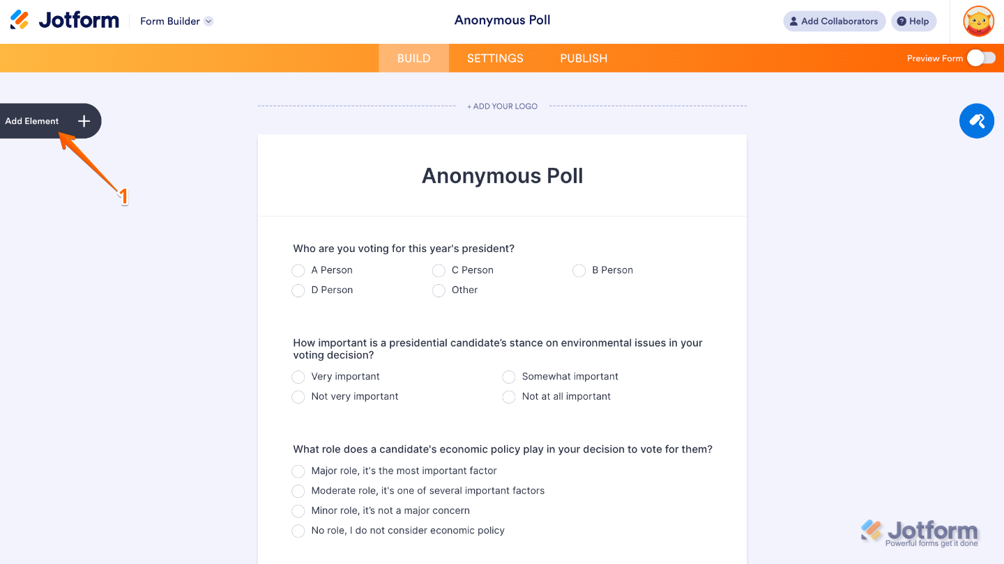
- In Form Builder, click on Add Element on the left side of the page.
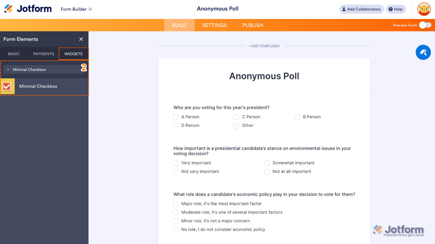
- Now, in the Form Elements menu, under the Widgets tab, search for Minimal Checkbox and then click on it. Or, just drag and drop it to where you want it to be on your form.
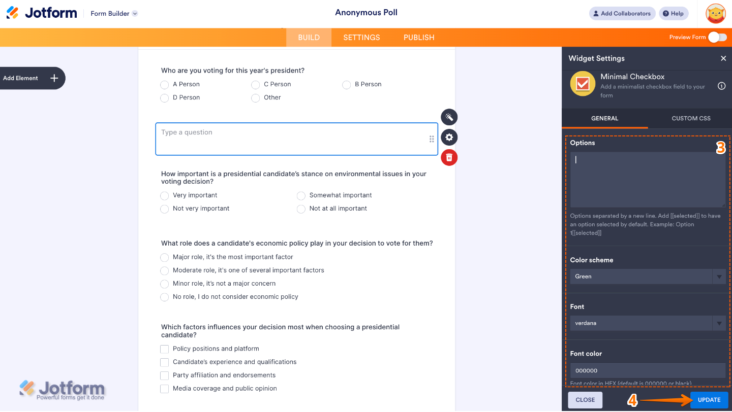
- Next, in the Widget Settings window that opens on the right side of the page, set up the following options:
- Options — Add the list of choices for your users to select from. Just type in each option on its own line, and feel free to add as many as you like.
- Color Scheme — Customize the overall look of your checkboxes by choosing a color style that matches your form’s design.
- Font — Pick the font style you’d like for the text next to your checkboxes to keep everything consistent with your form’s branding.
- Font Color — Choose the color of your option labels so they stand out clearly and match the feel of your form.
- Once you’re done, click on Update.
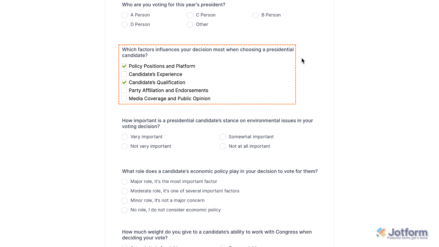
That’s it. You’ve successfully added and set up the Minimal Checkbox widget to your form. Now, you have a field in your form that lets users easily make their selections while keeping the design neat and minimal. Curious how it works on a live form? Check out this Demo Form.
To tweak how your Minimal Checkbox field looks, just click the gear icon to open its settings and adjust it to your liking.
Note
For advanced styling, you can add your own custom CSS under the Custom CSS tab in the widget settings and style the Minimal Checkbox field. Our guide on How to Inject CSS Codes to Widgets walks you through everything.
Pro Tip
Since this widget is all about a clean, minimal style, try not to overload it with too many options—this keeps your form easy to read.

Send Comment: