Jotform’s Multiple Selection widget is a great way to let users choose more than one option from the list, perfect for when more than one answer applies. Whether you’re collecting preferences, listing skills, or offering a set of choices where more than one can apply, this widget keeps your form flexible and user-friendly.
Here are a few ways to use it:
- Event RSVPs — Make it easy for your guests to pick the activities, workshops, or sessions they want to join—no back-and-forth emails needed.
- Order forms — Give your customers the freedom to choose multiple add-ons, toppings, or extras so they can customize their order exactly how they like it.
- Surveys & feedback — Sometimes one answer just isn’t enough—let people select everything that applies so you get richer, more useful insights.
- Team or group preferences — Quickly gather everyone’s availability, interests, or favorite choices in one go to make planning and decision-making a breeze.
Note
The widget settings don’t include an option to limit how many items users can select.
Adding and Setting Up the Multiple Selection Widget
Adding a Multiple Selection field to your form is a simple way to let people pick more than one option from a list, great for gathering feedback, booking services, and so much more. To get going, here’s what you’ll do:
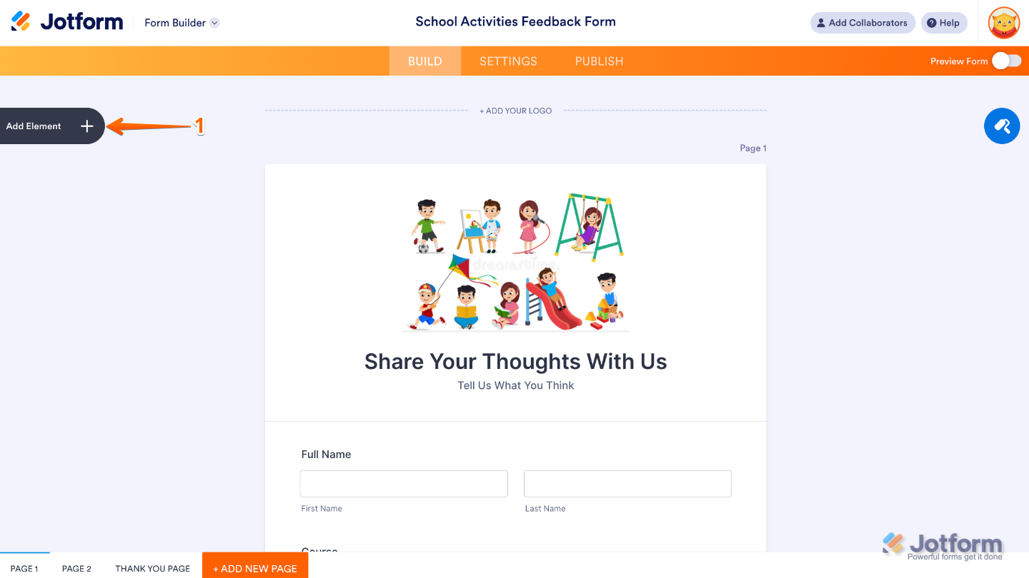
- In Form Builder, click on Add Element on the left side of the page.
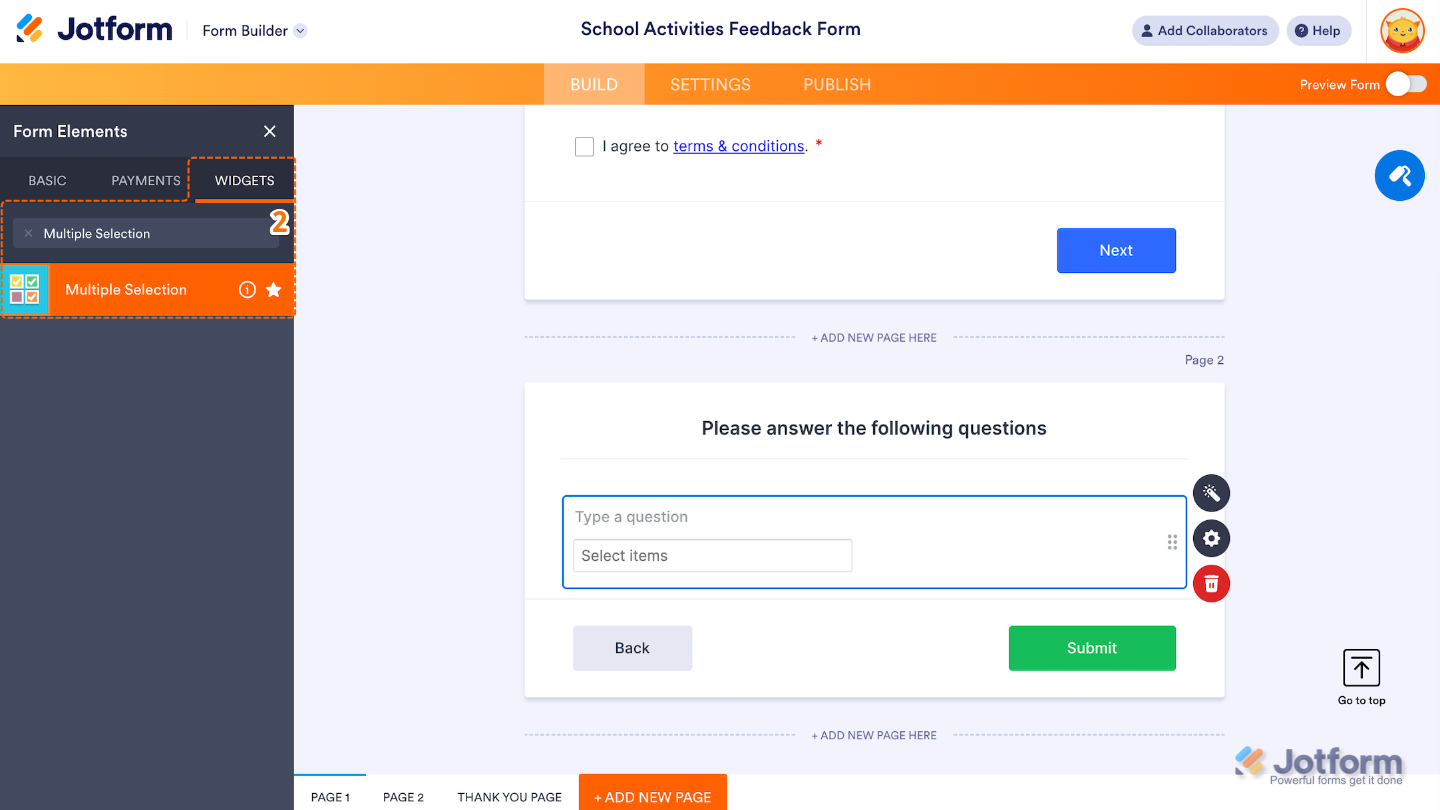
- Now, in the Form Elements menu, under the Widgets tab, search for Multiple Selection and then click on it. Or, just drag and drop it to where you want it to be on your form.
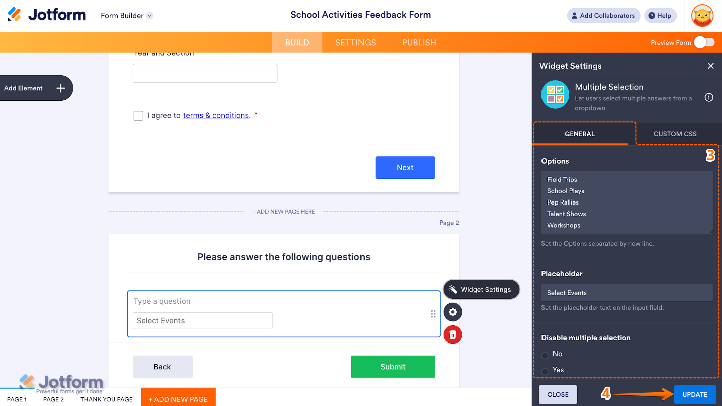
- Next, in the Widget Settings window that opens on the right side of the page, under the General tab, set up the following options:
- Options — This is where you list the choices that users can select from. Each option should go on a new line.
- Placeholder — Set up to customize the text that shows up in the field before anyone makes a selection. By default, it says Select Items.
- Disable Multiple Selection — If you choose Yes, users will only be able to pick one option instead of selecting multiple.
- Once you’re done, click on Update.
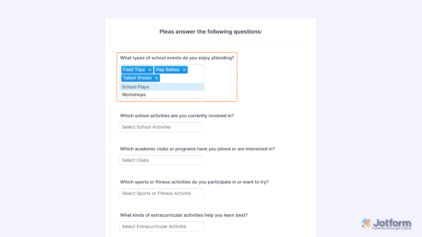
That’s it. You’ve successfully added and set up the Multiple Selection widget to your form. Now, your users can select multiple options from a dropdown menu. Take a peek at this Demo Form to see it in action.
To personalize how your Multiple Selection field looks, simply click the Gear icon to open its settings.
Note
For advanced styling, you can add your own custom CSS under the Custom CSS tab in the widget settings and style the Multiple Selection field. Our guide on How to Inject CSS Codes to Widgets walks you through everything.
Pro Tips
- Use clear, straightforward labels for each option so users know exactly what they’re picking. It’s super helpful when you’re collecting specific input.
- Turn on the Required setting if you want to make sure users choose at least one option before hitting submit.
- For longer lists, group similar options or add spaces to make things easier to read at a glance.
- Give your form a quick preview on both desktop and mobile to make sure everything looks tidy and works smoothly for everyone.

Send Comment:
1 Comment:
January 30, 2026
The multiple choice widget didn't work even though I followed all the steps, checked and checked again