The Short Text element is a simple but powerful way to collect brief responses from your users, like names, short answers, or quick details. It helps keep your forms clean, easy to fill out, and well-organized.
Here are a few ways to use it:
- Collect basic details like first names, last names, or usernames.
- Ask quick questions that only need short answers, such as City or Job Title.
- Use it for contact information like email prefixes or reference codes.
- Gather short feedback or comments from users.
Adding and Setting Up the Short Text Element
Whether you’re building a new form or editing an existing one, you can add and configure the Short Text element in just a few steps. This is how it’s done:
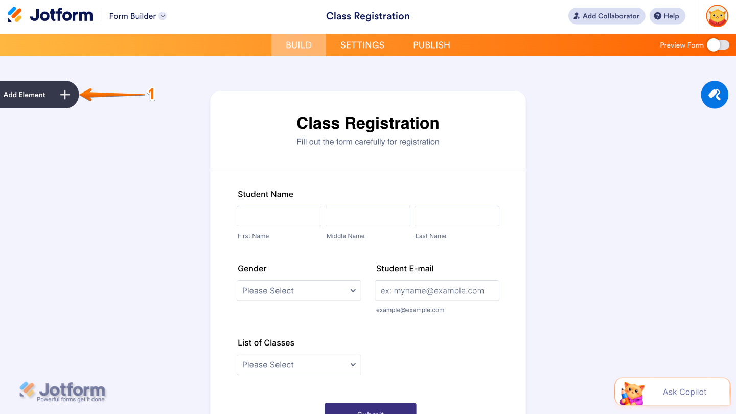
- In Form Builder, click on Add Element on the left side of the page.
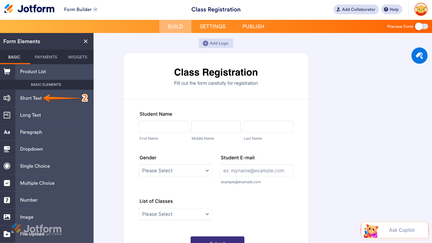
- Then, in the Form Elements menu, under the Basic tab, scroll down and then click on Short Text. Or, just drag and then drop it to where you want it to be on your form.
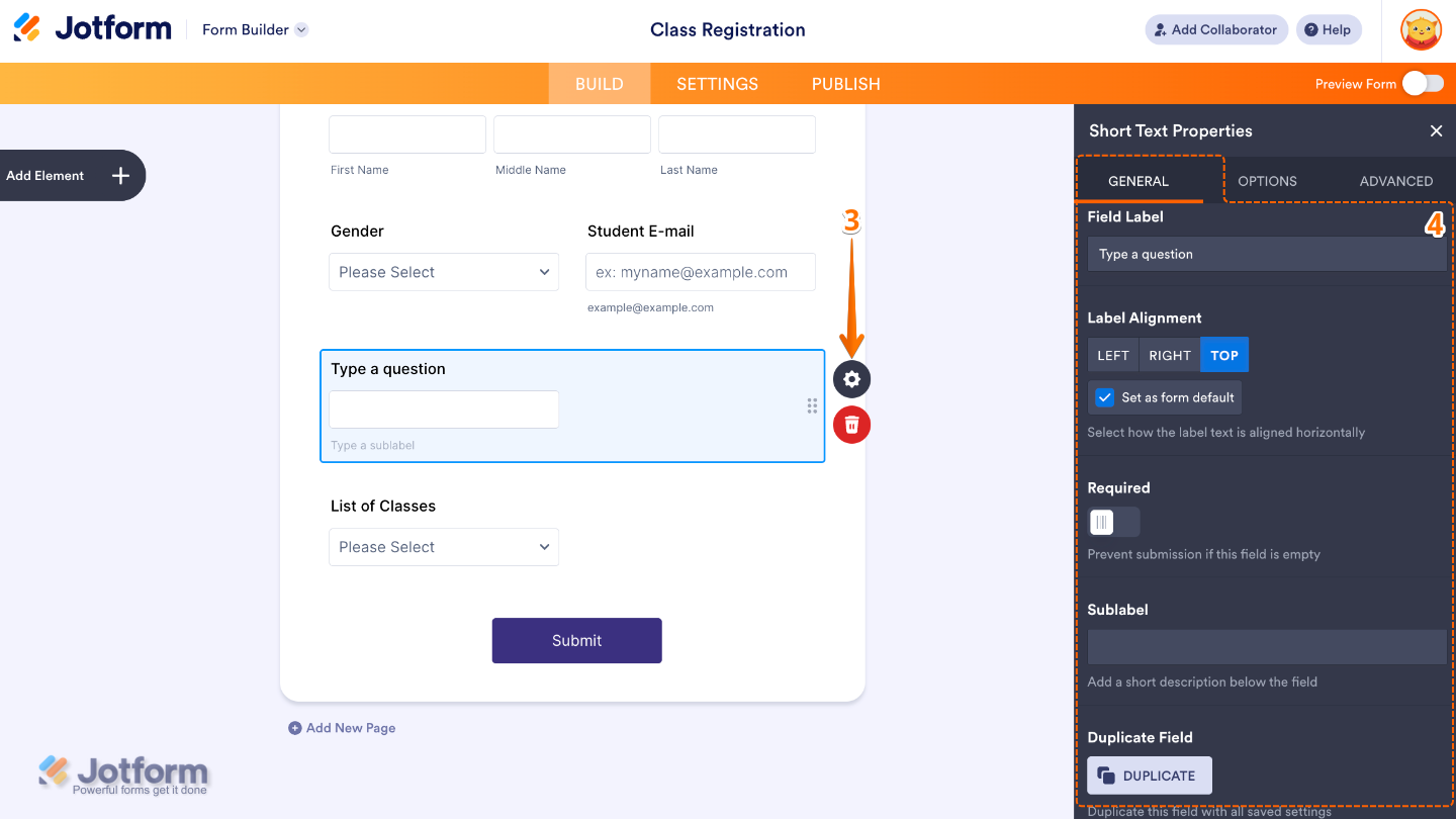
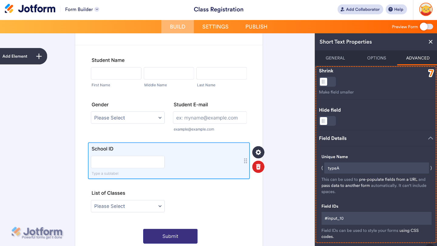
- Next, click on the Gear icon to open the Short Text Properties menu on the right side of the page.
- Then, under the General tab, set up these things:
- Field Label — Enter the main label shown above the Full Name field.
- Label Alignment — Use this to control where the label appears in relation to the field.
- Required — Toggle this on if you want to make the Full Name field mandatory to complete.
- Sublabels — Set this up to customize labels for each part of the name field.
- Duplicate Field — Click on Duplicate to create a copy of this field with all its saved settings.
- Now, click on the Options tab and toggle on the options that you want to use:
- Width — If enabled, you have the control on how wide the input field appears on the form.
- Validation — Select an option to define rules for what type of input is allowed.
- Character Limit — Toggle on to set the minimum and maximum number of characters users can type.
- Input Mask — Set this up to apply a fixed format that users must follow while typing.

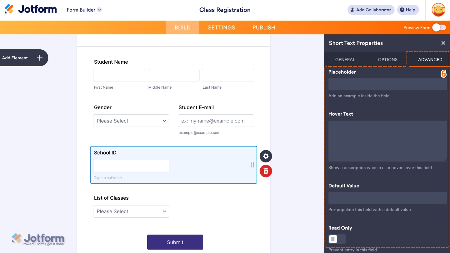
- After that, click on the Advanced tab and continue to manage these details:
- Placeholder — Use this to display sample text inside the input field.
- Hover Text — Set this up to show help text when users hover over the field.
- Default Value — let’s you pre-fill the field with a preset value when the form loads.
- Read Only — Toggle this on to make the field non-editable.
- Then, scroll down to set up these last three options:
- Shrink — When enabled, it reduces the visual size of the field.
- Hide Field — Turn this on to completely hide the field from users.
- Field Details — View additional technical information about the field:
- Unique Name — The unique identifier for the field, which can be used to pre-populate it from a URL or pass data to another form automatically.
- Field IDs — The CSS selector for the field, which can be used to style it with custom CSS.
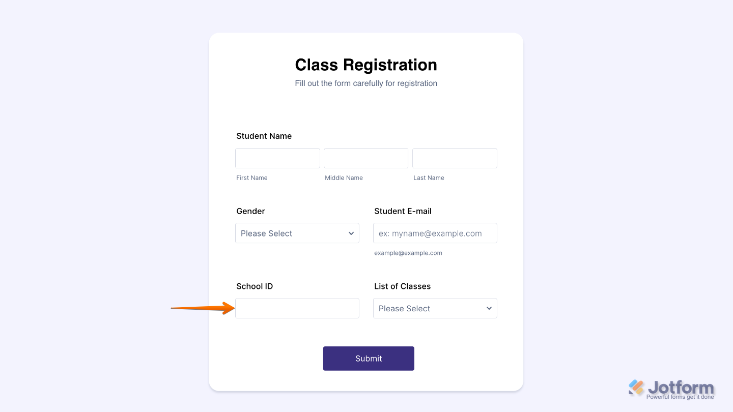
That’s it. You now have a fully set-up Short Text element that makes it easy to collect quick, simple responses while keeping your form clean, clear, and user-friendly. Here’s a demo form so you can see it in use.
Note
The Short Text element is available in both Classic and Card form layouts. However, some options like Width, Shrink, and Hover Text are not available in the Card layout, while it includes a Description option in the General tab instead.
Pro Tips
- Keep the Field Label clear and specific so users instantly understand what information is being requested.
- Use Validation rules whenever possible to ensure users enter data in the correct format and reduce errors in submissions.
- Apply Character Limits to control response length, especially for fields like usernames, IDs, or short codes.
- Use Input Mask to guide users when entering structured data like phone numbers, dates, or reference codes.

Send Comment: