Jotform’s Square Checkbox widget gives your form a fresh, modern twist on standard multiple-choice options. Instead of the usual round checkboxes, you get clean, stylish square boxes that blend nicely with your form’s design. Whether you’re gathering preferences, creating a checklist, or letting users select more than one option, it’s an easy upgrade that looks great and works smoothly.
Here are a few ways to use it:
- Create Visually Distinct Multiple-Choice Questions — You can use the Square Checkbox widget to present answer options in a bold, button-style layout instead of traditional checkboxes. This makes your form look more modern and interactive.
- Highlight Product or Service Options — The widget works well for showcasing products, plans, or service packages. Its square design helps each option stand out, making it easier for users to compare and select.
- Build Image-Based Selections — You can customize the widget to include icons or images inside each square option. This is ideal for selecting colors, styles, categories, or visual preferences.
- Improve Mobile-Friendly Selections — The larger square layout makes it easier for users to tap options on mobile devices. This enhances usability and reduces selection errors.
Note
The Square Checkbox widget is perfect when you want users to select more than one option. If you only need them to choose a single answer, though, a single-choice field would be a better fit.
Adding and Setting Up the Square Checkbox Widget
Adding the Square Checkbox widget is quick and easy—no coding required. Just drag it into your form, and you’re all set. To get going, here’s what you’ll do:
- In Form Builder, click on Add Element on the left side of the page.
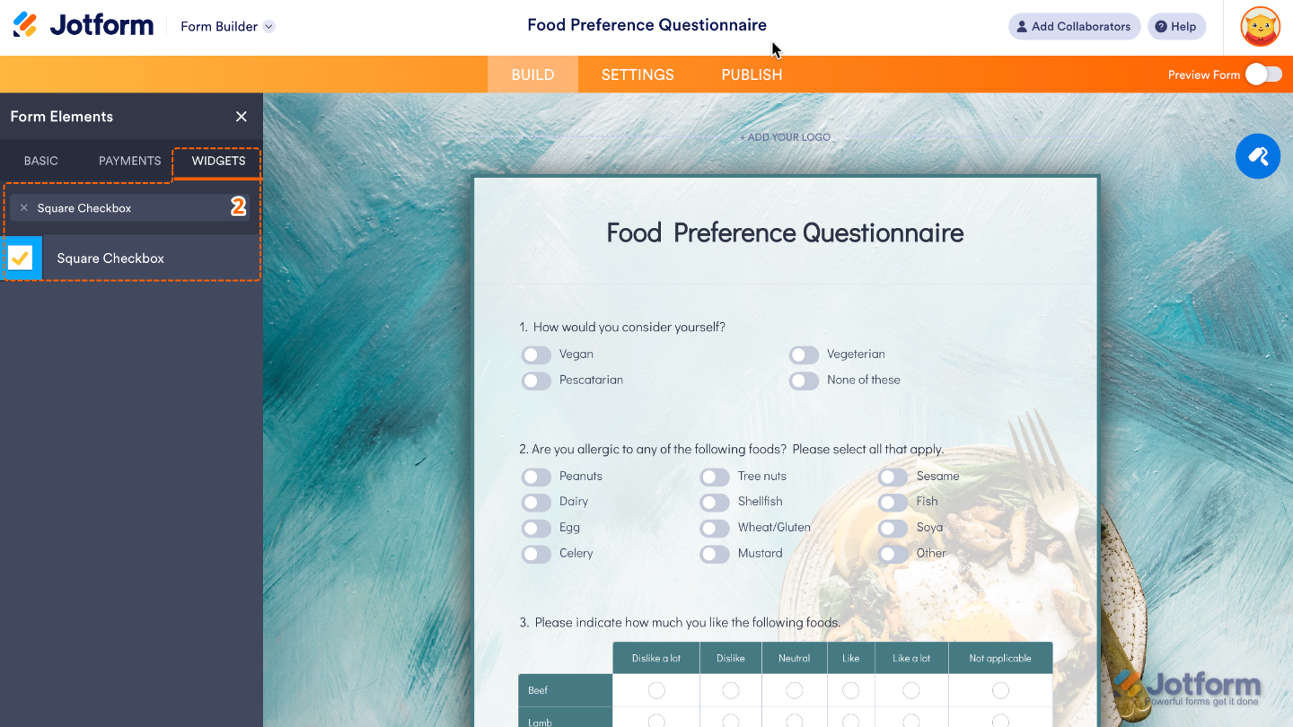
- Now, in the Form Elements menu, under the Widgets tab, search for Square Checkbox and then click on it. Or, just drag and drop it to where you want it to be on your form.
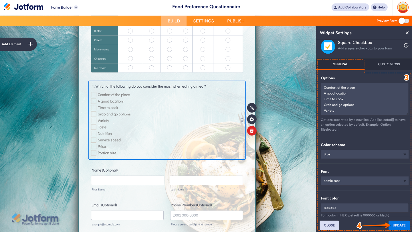
- Next, in the Widget Settings window that opens on the right side of the page, set up the following options:
- Options — Add the choices you’d like to show as square checkboxes, with one option per line so each appears separately.
- Color Scheme — Pick a color that will set the look of your checkboxes, including the checkmark color when they’re selected.
- Font — Choose a font to set the style of the text for your option labels, so they match the look and feel of your form.
- Font Color — Adjust this to choose the color of the text that appears next to your checkboxes.
- Once you’re done, click on Update.
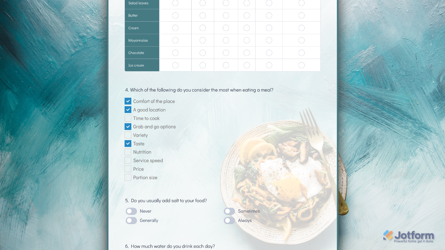
That’s it. You’ve successfully added and set up the Square Checkbox widget to your form. Now, you have a field in your form that makes it easy for users to pick multiple options, great for collecting preferences, feedback, or checklist items while keeping things looking clean and modern. You can check out our guide on Demo Form to learn more.
To further customize your Square Checkbox field appearance, just click on the Gear icon to open its properties.
Note
For advanced styling, you can add your own custom CSS under the Custom CSS tab in the widget settings and style the Square Checkbox field. Our guide on How to Inject CSS Codes to Widgets walks you through everything.
Pro Tips
- Try matching the checkbox colors to your brand palette to give your form a more polished, cohesive look.
- If you have a long list of options, organize them into clear categories so users can quickly find what they’re looking for.
- Don’t forget to test your form on mobile to make sure the checkboxes are large enough to tap comfortably.

Send Comment: