Jotform’s Square Radio Buttons widget gives your forms a modern twist by replacing the usual round radio buttons with sleek square ones. It’s a simple way to freshen up your form’s design while still letting users choose just one option from a list. Perfect for surveys, polls, quizzes, or any form where you want clean, stylish single-choice fields.
Here are a few ways to use it:
- Present Single-Choice Options in a Bold Layout — You can use the Square Radio widget to display options as square buttons instead of traditional radio buttons. This makes selections more noticeable and visually engaging.
- Highlight Product or Plan Selections — The widget works well for showcasing products, pricing tiers, or subscription plans. Each option stands out clearly, helping users compare and choose one easily.
- Create Image-Based Selection Choices — You can customize the square options with images or icons, making it ideal for selecting styles, designs, or categories in a more visual way.
- Improve Mobile Selection Experience — The larger square buttons make it easier for users to tap and select an option on mobile devices, reducing input errors.
Note
The Square Radio Buttons widget is designed for single selections—perfect when you only want users to pick one option from the list.
Adding and Setting Up the Add to Square Radio Buttons Widget
Adding the Square Radio Buttons widget to your form gives your fields a fresh, modern look by swapping out the usual round buttons for stylish square ones. You can do it in a few simple steps:
- In Form Builder, click on Add Element on the left side of the page.
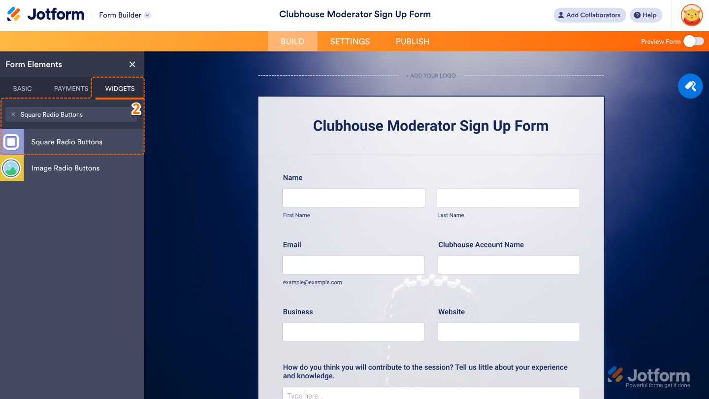
- Now, in the Form Elements menu, under the Widgets tab, search for Square Radio Buttons and then click on it. Or, just drag and drop it to where you want it to be on your form.
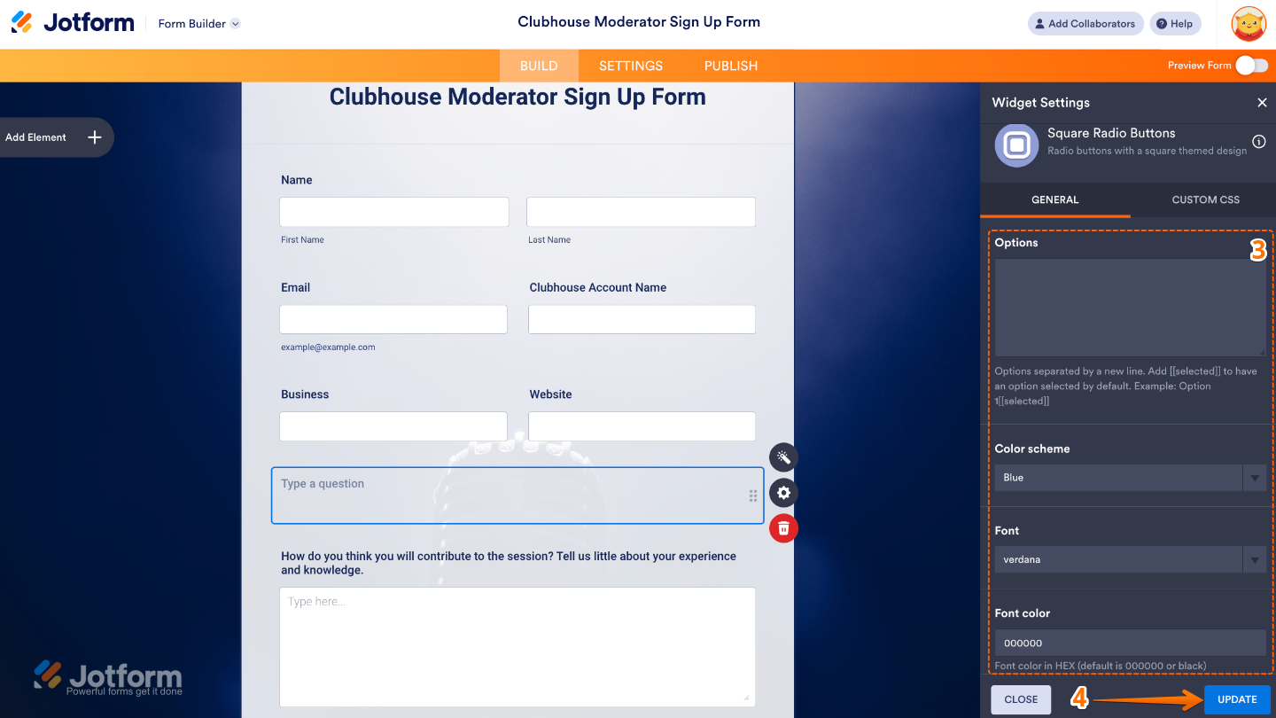
- Next, in the Widget Settings menu that opens on the right side of the page, set up these options:
- Options — Add the list of choices you want people to pick from. Each one you enter will appear as a square radio button on your form.
- Color Scheme — Choose the overall color style for your radio buttons so they blend nicely with your form’s design or match your brand colors.
- Font — Select the font style that best fits the look and feel of your form, keeping it consistent with the rest of your fields.
- Font Color — Pick a text color for your options to make them stand out or keep things subtle, depending on your form’s vibe.
- Once you’re done, click on Update.
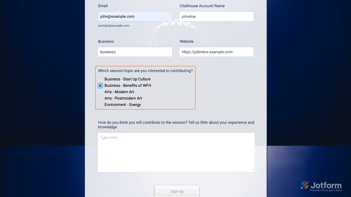
That’s it. You’ve successfully added and set up the Square Radio Buttons widget to your form. Now, you have a field in your form that swaps the usual round buttons for clean, modern square ones—giving your form a fresh look while still keeping it simple and easy for people to make their choice. Curious how it works on a live form? Check out this Demo Form.
To further customize your Square Radio Buttons field’s appearance, just click on the Gear icon to open its properties.
Note
For advanced styling, you can add your own custom CSS under the Custom CSS tab in the widget settings and style the Square Radio Buttons field. Our guide on How to Inject CSS Codes to Widgets walks you through everything.

Send Comment: