Jotform’s Toggled Content widget is a great way to keep things clean and organized while still giving your users all the details they need. Instead of overwhelming people with too much text up front, this widget lets you hide extra information behind a simple toggle button. With just one click, users can expand the content they’re interested in—whether it’s instructions, terms, or helpful tips—and collapse it again when they’re done. It’s an easy, user-friendly way to make your forms look neat while still being super informative.
Here are a few ways to use it:
- Hide Optional Instructions or Guidelines — You can use the Toggled Content widget to display additional instructions only when users choose to view them. This keeps your form clean while still providing helpful information when needed.
- Organize FAQs Within a Form — The widget works well for adding expandable FAQ sections directly inside your form. Users can click to reveal answers without leaving the page.
- Show Terms and Conditions on Demand — Instead of displaying long blocks of text, you can place terms, policies, or agreements inside a toggle section. This prevents the form from looking cluttered.
- Display Conditional Explanations — You can include detailed explanations, examples, or definitions that users can expand if they need clarification. This is helpful for complex questions or technical forms.
Note
The Toggled Content widget is designed for non-editable content, so users can read but won’t be able to change what’s written.
Adding and Setting Up the Toggled Content Widget
Adding the Toggled Content widget to your form is a quick way to share important information with your users without letting them edit it. Here’s how to set it up:
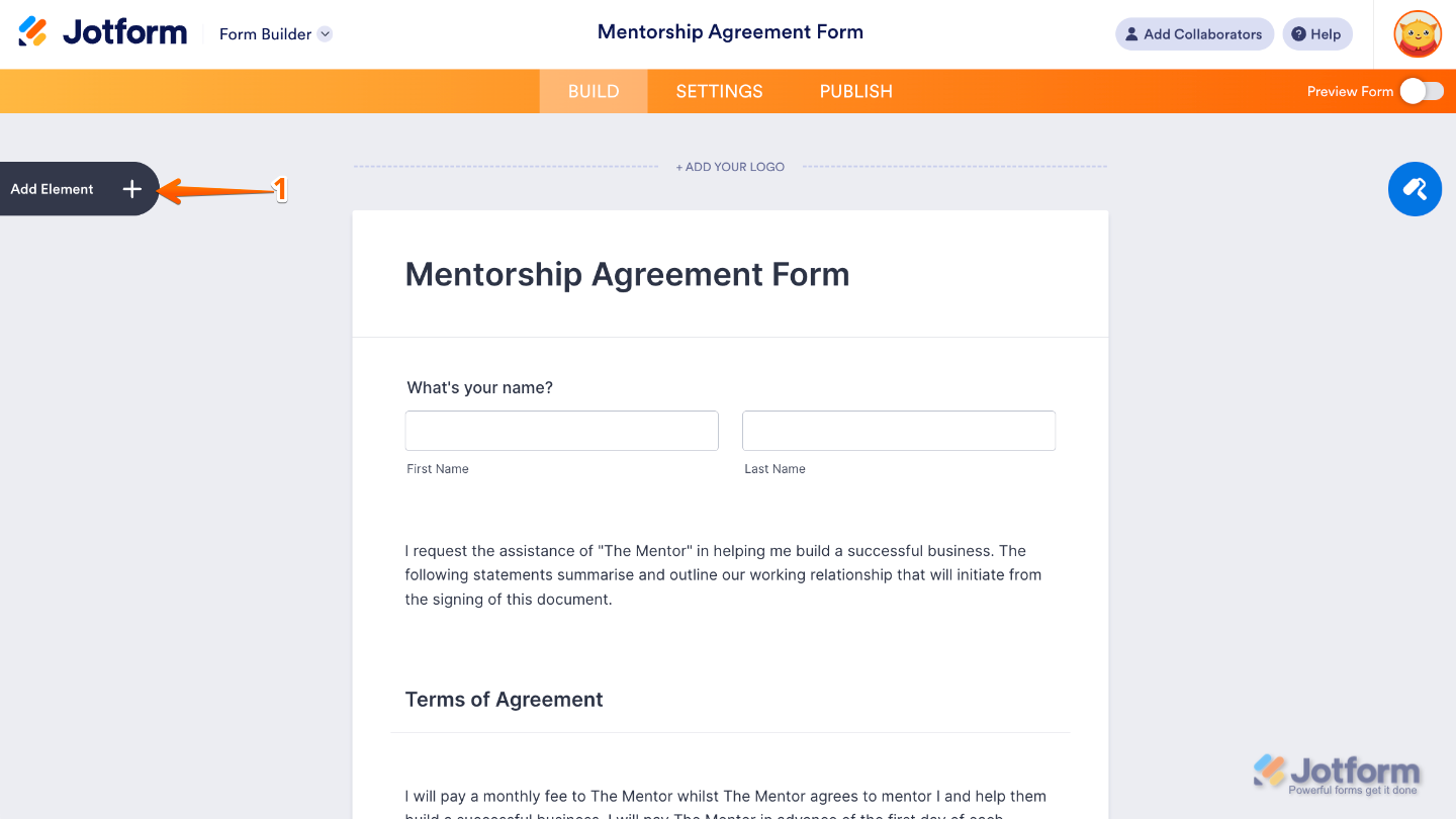
- In Form Builder, click on Add Element on the left side of the page.
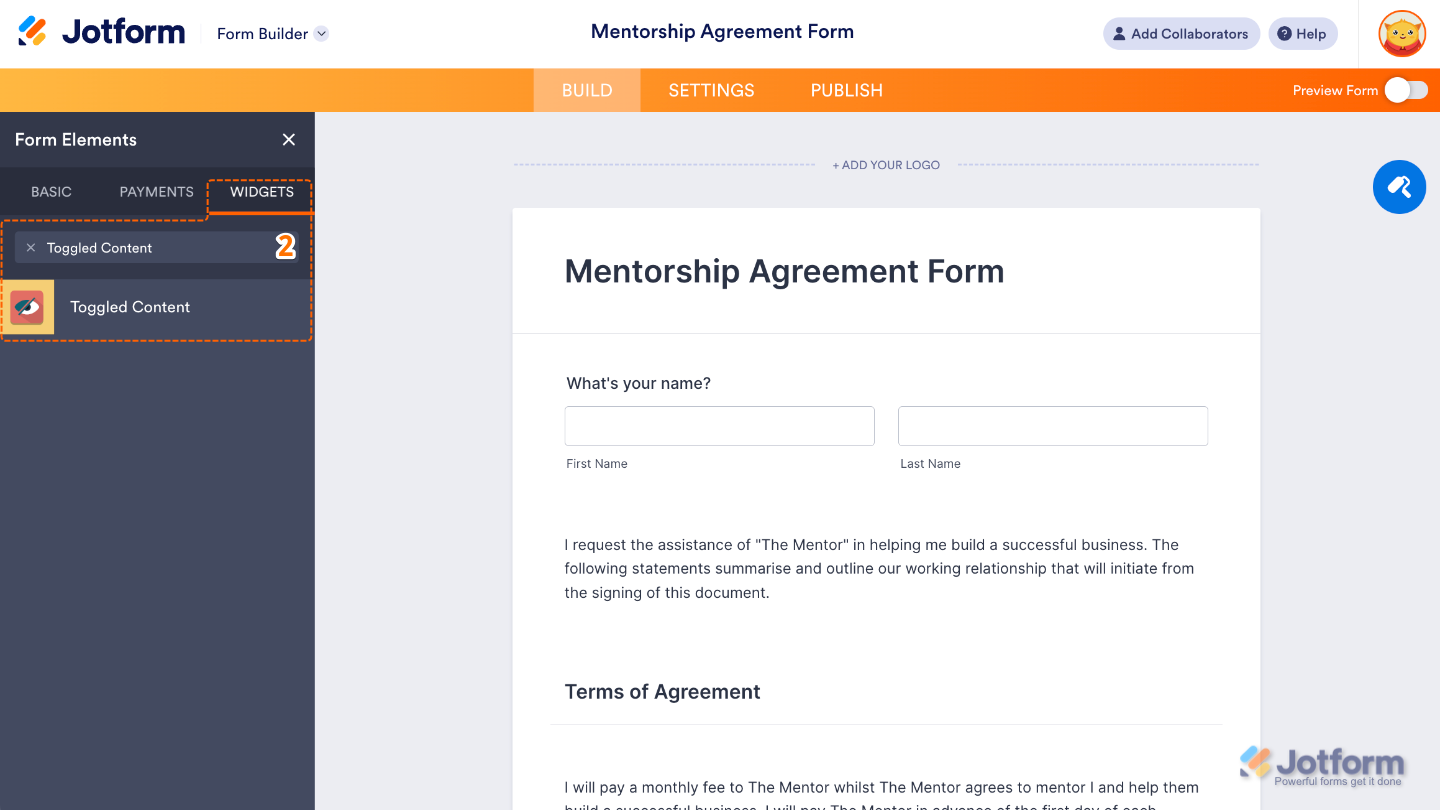
- Now, in the Form Elements menu, under the Widgets tab, search for Toggled Content and then click on it. Or, just drag and drop it to where you want it to be on your form.
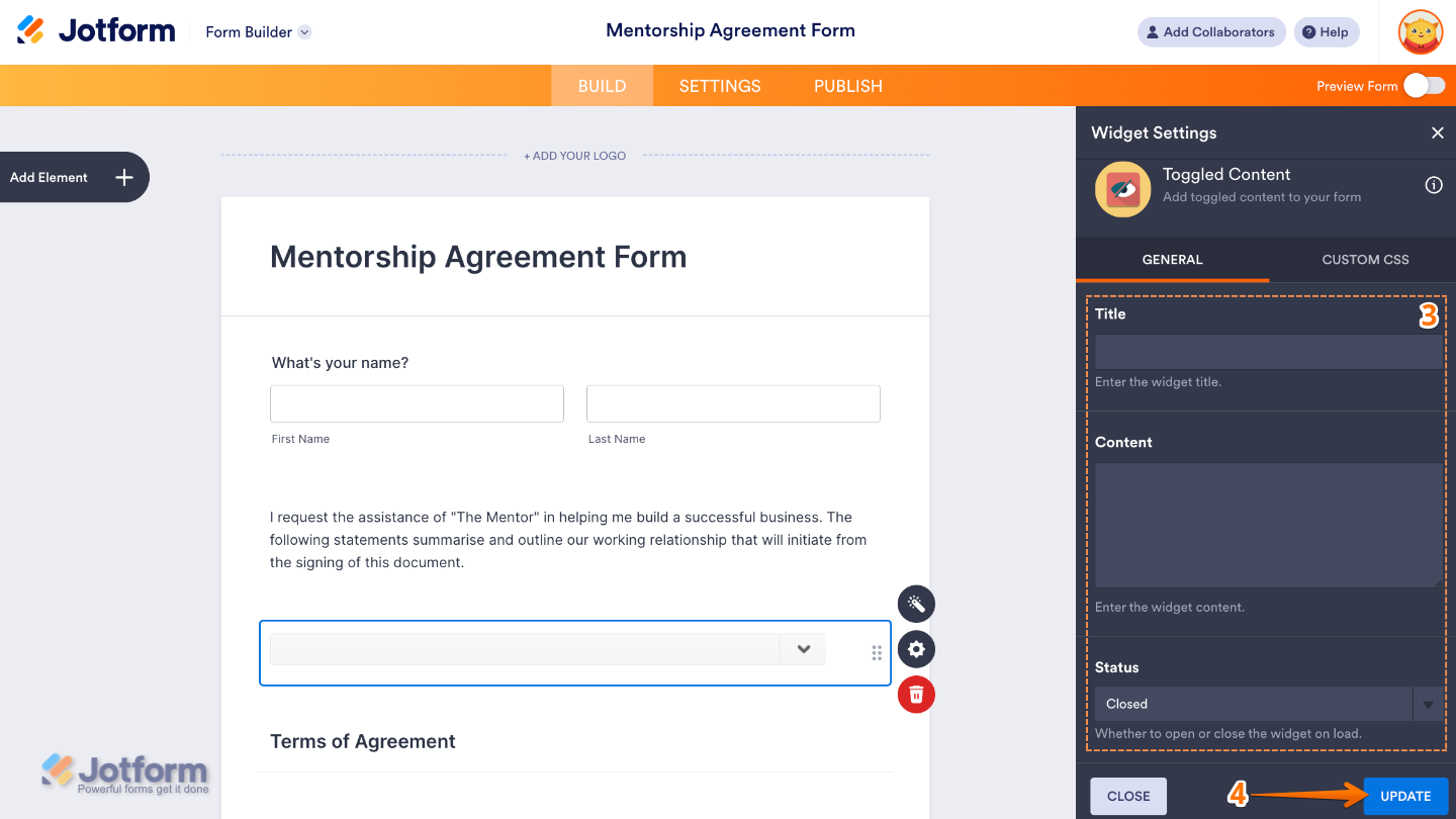
- Next, in the Widget Settings window that opens on the right side of the page, set up the following options:
- Title — Create a clickable heading that your users can see — kind of like a label that gives them a quick hint about the information waiting inside the toggle.
- Content — Add the actual information you’d like to show or hide. It could be helpful instructions, guidelines, terms, or any text you want people to read—but not change.
- Status — Choose how the content appears at first. You can keep it Open so everything is visible right away, or set it to Closed so users click the title to reveal the details.
- Once you’re done, click on Update.
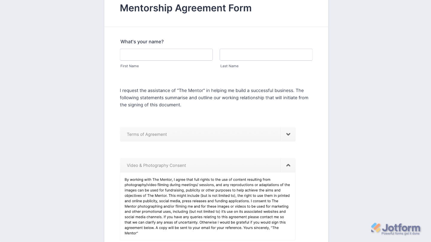
That’s it. You’ve successfully added and set up the Toggled Content widget to your form. Now, you have a field in your form that allows you to show or hide content like instructions, terms and conditions, or helpful notes — all without needing any coding. Want a quick preview? This Demo Form shows how it works.
To tweak how your Toggled Content field looks, just click the gear icon to open its settings and adjust it to your liking.
Note
For advanced styling, you can add your own custom CSS under the Custom CSS tab in the widget settings and style the Toggled Content field. Our guide on How to Inject CSS Codes to Widgets walks you through everything.
Pro Tips
- Keep titles short and clear. A simple heading like “Instructions” or “Terms & Conditions” helps users know what to expect when they click.
- Use toggles to avoid clutter. If your form has a lot of details, hiding them under toggles makes your layout cleaner and easier to follow.
- Test before publishing. Open your form as a user would and check if the toggle works the way you intended (open or closed by default).

Send Comment: