
Automated data analysis tools keep teams efficient. AI keeps tabs on the mundane, such as cleaning data, summarizing patterns, generating charts, creating reports, answering questions in natural language, and automating recurring analysis workflows. Humans are able to focus on more complex work.
As a marketing consultant, I rely on automated data analysis. It means I can spend more time taking action to improve things for my client.
The challenge is finding the automated data analysis tool that fits your workflow and needs. This article rounds up eight options, comparing pricing, standout features, and ideal use cases, so you can make your choice with confidence.
| Tool | Best for | Standout feature | Free packages available? | Pricing |
|---|---|---|---|---|
 Jotform AI Data Assistant |
Teams collecting data through Jotform forms or teams that can benefit from Jotform’s range of business tools |
Builds tables, charts, and summaries from a plain-language prompt |
Yes |
From $34/month |
 Julius AI |
Nontechnical business users who want answers from data without writing code |
Connects directly to live databases such as Snowflake, BigQuery, and Postgres |
Yes |
From $20/month |
 ChatGPT Data Analysis |
People already working in ChatGPT who want ad hoc analysis |
Writes and runs real Python code against uploaded files |
Yes |
From $20/month |
 Microsoft Power BI Copilot |
Organizations already invested in Microsoft’s ecosystem |
Generates DAX measures and report summaries from natural-language prompts |
Yes |
From $14/month |
 Tableau Pulse |
Executives who want to monitor KPIs without opening a dashboard |
Proactively pushes personalized insights to Slack, email, and mobile |
No |
From $15/month |
 ThoughtSpot |
Large enterprises with a large volume of data and a dedicated data team |
Builds dashboards and explains root causes automatically |
No |
From $25/month |
 Zoho Analytics |
Small and mid-market teams, especially those already using Zoho One |
Ask Zia turns natural-language questions into instant charts at no extra cost |
Yes |
From $24/month |
 Polymer |
Small businesses and marketing teams wanting quick dashboards |
Auto-labels data and builds dashboards from spreadsheets with zero setup |
Yes |
From $25/month |
1. Jotform AI Data Assistant
Why it made the list: Jotform AI Data Assistant is one of the most accessible AI data analysis tools on the market. From a text prompt, Jotform’s AI Data Assistant turns form and table or sheet data into organized insights without any code. And it builds the table, chart, or summary for you.

Key strengths
- Builds and organizes tables from a plain-language prompt, with no manual data entry
- Summarizes patterns, flags outliers, and highlights records that need attention
- Supports voice input, making data analysis efficient
Key drawback: It works only with data already in your Jotform account and doesn’t connect to outside databases or spreadsheets.
The Jotform AI Data Assistant is best suited for teams already collecting data through Jotform forms and wanting to turn submissions into decisions without hiring a dedicated analyst.
It works with the data in your forms and tables and covers what’s laid out on the Jotform AI Data Assistant features page: creating tables from prompts, summarizing themes and outliers, generating charts, and automating bulk actions across records.
Where it shines is turning Jotform Tables into something closer to conversational analytics: Instead of writing filters or formulas, you describe what you want to find in the data, such as over-budget expenses or major cost drivers, and the assistant returns the summary. Paired with Jotform Report Builder, it also generates bar graphs, pie charts, and submission grids automatically. If your focus is form performance rather than content, Jotform Form Analytics covers that, tracking response rates, traffic sources, and conversion rates.
Jotform AI Data Assistant is part of the wider Jotform system, sitting alongside form building, Jotform Tables for data storage, Jotform Workflows for automation, Jotform Report Builder for visualizing results, and more. You can start for free, and paid packages start paying for themselves quickly in the return on investment in Jotform and everything it has to offer.
Pricing
Free Starter plan available; paid plans are Bronze ($34 per month), Silver ($39 per month), Gold ($99 per month),and Enterprise (custom pricing).
2. Julius AI
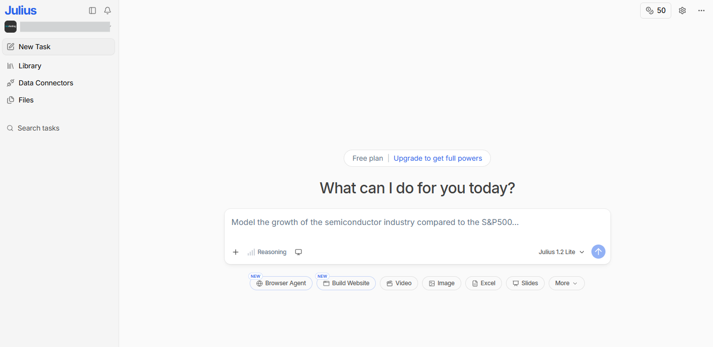
Why it made the list: Julius AI is a conversational, browser-based data analyst. Users can upload a spreadsheet or connect a database, then ask a question in plain English, and it returns a chart, statistical test, or summary within seconds.
Key strengths
- Handles CSV, Excel, PDF, and Google Sheets files up to several gigabytes with no data cleanup required, so you can go from a messy export straight to analysis
- Autogenerates charts, runs statistical tests, and explains the results in plain language
- Connects directly to live databases such as Snowflake, BigQuery, and Postgres on paid tiers
Key drawback: It’s entirely browser-based, with no offline mode, and you have to upgrade for advanced reasoning features. More advanced modeling, such as regression, forecasting, or machine learning, still needs a specialist tool or a data scientist’s input.
Julius AI is best suited for nontechnical business users and analysts who want answers from their data without writing code or formulas. You upload a file or connect a source, and Julius scans it, previews the structure, and lets you start asking questions immediately.
It’s built for people who’d otherwise be stuck manually building pivot tables or waiting on a data team. As one of the more efficient self-service analytics tools for business users, it also supports saved workflows for common tasks such as data cleaning and column transformations.
Pricing
Free plan available; paid plans are Plus ($20 per month), Pro ($45 per month), Max ($200 per month), and Business ($450 per month).
3. ChatGPT Data Analysis
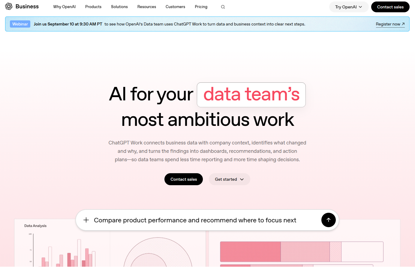
Why it made the list: ChatGPT can inspect uploaded data, create tables and charts, and review code-backed analysis. It can also write and run Python code to analyze uploaded files.
Key strengths
- Writes and executes Python code against uploaded CSV, Excel, or PDF files
- Generates a wide range of charts, from interactive bar, line, and scatter plots to heat maps and waterfall charts
- Shows and lets you copy the underlying code behind every analysis
Key drawback: It’s a general-purpose assistant with data analysis layered on top, not a dedicated tool, so it lacks live database connections, persistent dashboards, and collaboration features.
ChatGPT Data Analysis is best suited for people already working in ChatGPT who want quick, ad hoc analysis without switching context. It handles the routine work well: exploratory analysis, data cleaning, standard chart generation, and basic statistical calculations, explained in plain language alongside the code that produced them.
Pricing
Free plan with limited access available; full access with paid plans: Standard ($20 per month) or a higher-usage Premium plan ($100 per month).
4. Microsoft Power BI Copilot
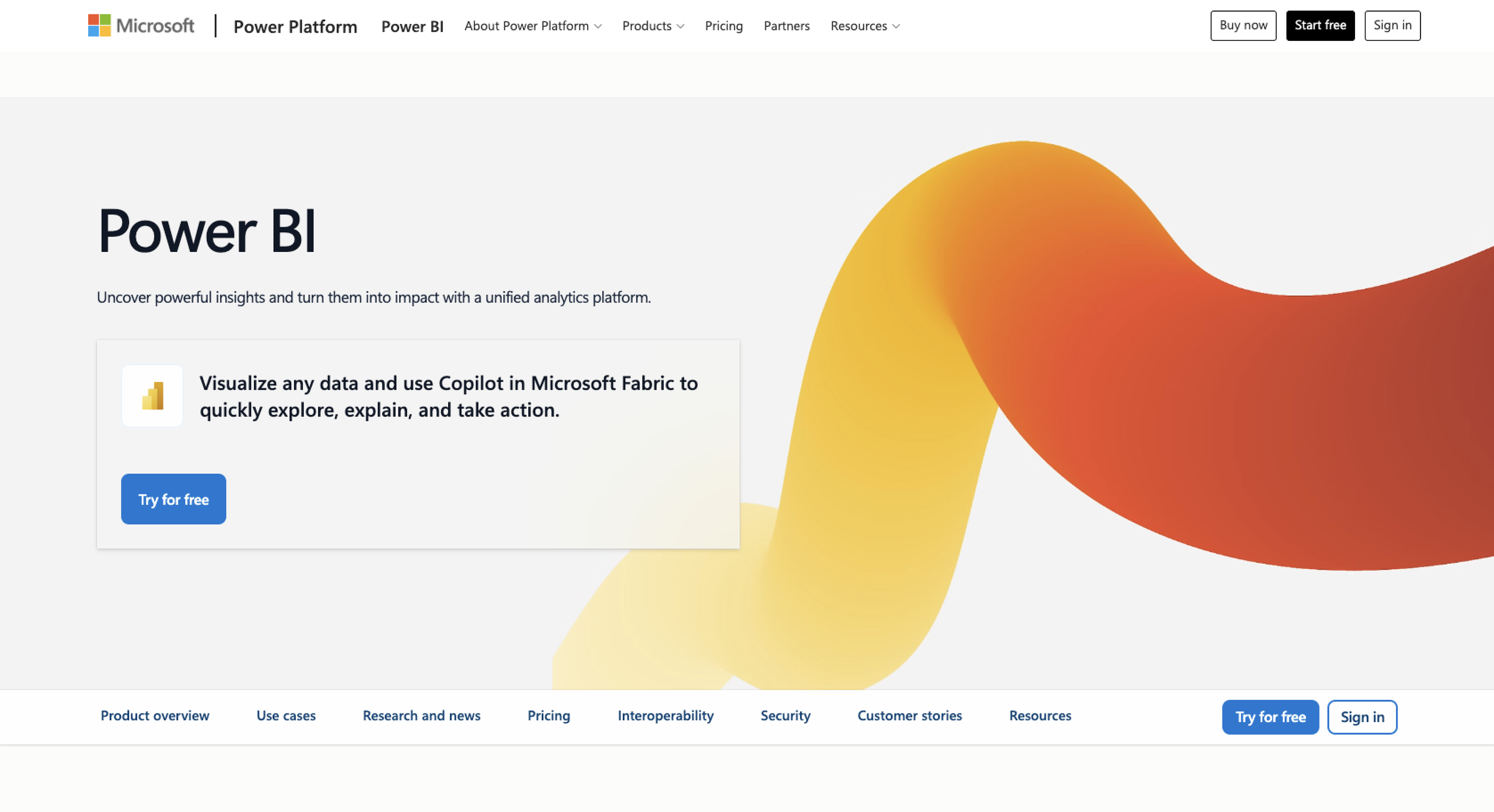
Why it made the list: Power BI Copilot is ideal for Microsoft users, since it sits within Microsoft’s established BI platform.
Key strengths
- Generates report-wide and visual-level summaries in plain language, surfacing trend shifts and key drivers automatically
- Writes DAX measures and applies schema changes, such as renaming tables or building relationships, from natural-language prompts
- Turns plain-language questions into finished visuals within an existing report
Key drawback: Copilot doesn’t run on a standard Power BI license. It requires a separate Fabric capacity (F2 or higher), which adds cost.
Power BI Copilot is best suited for organizations already invested in Microsoft’s ecosystem, connecting to structured data across Excel, SharePoint, Azure, and other Microsoft 365 tools. As one of the more established tools on the enterprise market, it handles trend summaries, narrative explanations, and model-building well. Teams already running Power BI reports get AI-generated insights layered directly on top, without switching platforms.
The main limitations are cost and complexity. Copilot’s capacity requirement is a significant budgeting decision, and building genuinely custom analysis still benefits from DAX knowledge. It’s also built for structured, connected data rather than open-ended feedback analysis.
Pricing
Free interactive reports; paid plans include Power BI Pro ($14 per month), Power BI Premium Per User ($24 per month), and Power BI in Microsoft Fabric (custom pricing).
5. Tableau Pulse
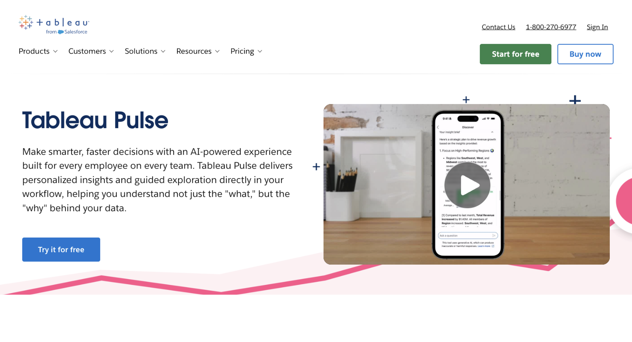
Why it made the list: Tableau Pulse proactively pushes personalized, natural-language updates on the metrics you follow straight to Slack, email, or your phone.
Key strengths
- Proactively pushes personalized insights for followed metrics to Slack, email, and mobile, bringing action into existing workflows, and provides immediate notifications so team members can react fast to issues
- Automatically identifies the top contributors and outliers behind a metric’s movement
- Lets users ask natural-language follow-up questions about any metric and get a plain-language answer with a supporting visual
Key drawback: Pulse is attuned to straightforward, single-number metrics such as revenue or conversion rate; composite or multistep metrics, such as cohort retention curves, work poorly. It’s also exclusive to Tableau Cloud and isn’t available on Tableau Server.
Tableau Pulse is best suited for executives and business leaders who want to stay on top of KPIs without regularly logging into a dashboard. It works from Tableau’s governed metrics layer, so the insights and root-cause explanations it surfaces are consistent with the wider Tableau environment. Its scheduled digests and Slack pushes are effective for driving analytics adoption among people who’d otherwise never open Tableau.
Pulse handles metric monitoring and anomaly detection well, but it isn’t built for open-ended, qualitative feedback analysis, and its more advanced conversational features sit behind the premium Tableau+ tier.
Pricing:
Bundled into Tableau Cloud (from $15 per month).
6. ThoughtSpot
Why it made the list: ThoughtSpot lets any employee ask questions about enterprise data in plain language and get a governed, trustworthy answer, without writing SQL or waiting on a data team to build a dashboard.
Key strengths
- Lets any user search enterprise data in plain language and get an answer grounded in a governed semantic layer
- Builds dashboards (“Liveboards”) automatically and explains what changed and why
- Proactively flags unexpected KPI shifts, such as a sudden margin drop
Key drawback: Cost scales quickly with usage, data volume, and query count, and setup depends on properly curating the underlying semantic model first.
ThoughtSpot is best suited for large enterprises with substantial data volumes and a dedicated data team to maintain the underlying models. It connects live to cloud data warehouses such as Snowflake and Databricks, working directly with structured, governed enterprise data rather than open-ended feedback or unstructured text.
It’s adept at turning natural-language questions into trustworthy answers at enterprise scale, positioning it as one of the more capable automated analytics tools for organizations already investing heavily in data infrastructure. Its proactive monitoring and automated Liveboard generation also make it a strong fit for teams looking for data automation tools that reduce manual dashboard-building work. The trade-off is price and complexity: This isn’t built for smaller teams on tighter budgets, and answer quality depends heavily on how well the underlying data has been modeled.
Pricing
Paid plans are Essentials ($25 per month), Pro ($50 per month), and Enterprise (custom pricing).
7. Zoho Analytics
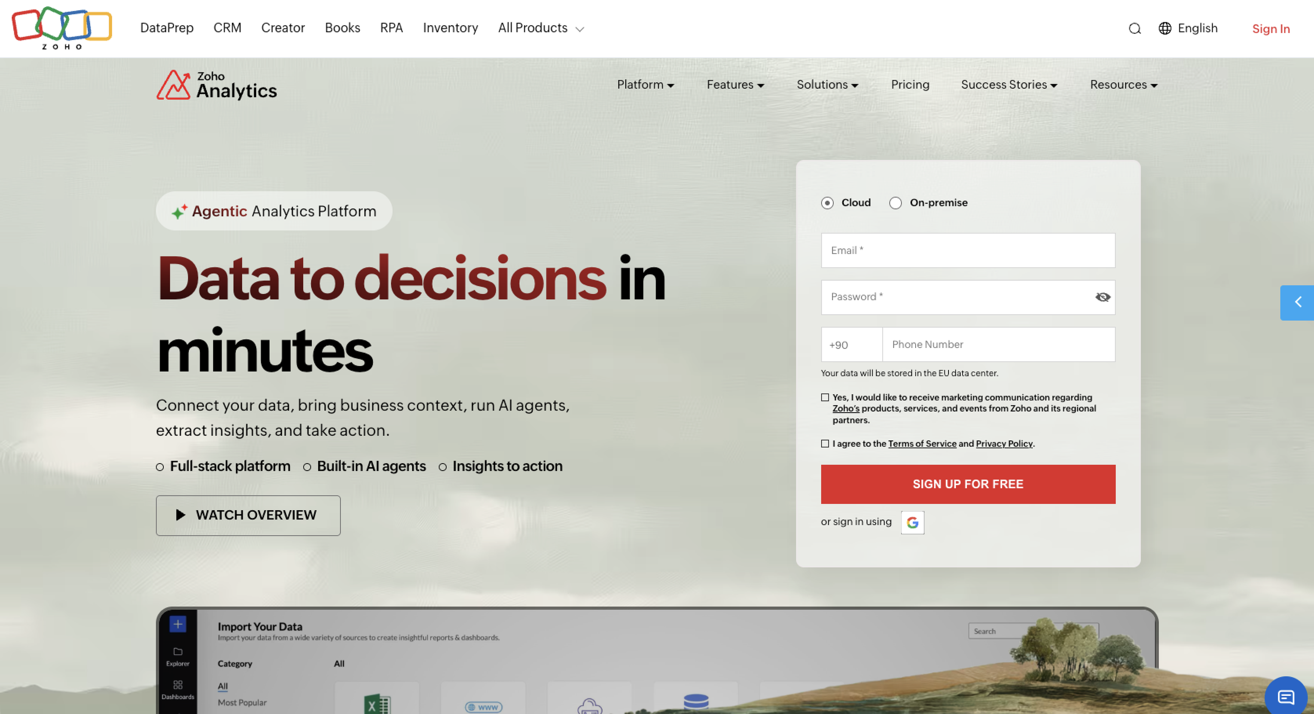
Why it made the list: Zoho Analytics pairs an affordable, self-service BI platform with Zia, Zoho’s built-in AI, letting users ask questions in plain language and get charts, narratives, and anomaly alerts without a separate AI add-on or extra cost.
Key strengths
- Lets you type a question in plain language and get an instant chart or dashboard, no SQL required
- Automatically generates narrative explanations and flags outliers and unusual patterns in the data
- Includes deep native integration with the rest of Zoho One, including CRM, Books, Desk, and People, and comes with prebuilt dashboards
Key drawback: Row limits are tight at the lower tiers (Basic caps out at 500,000 rows, Standard at 1 million), so growing data volumes can force a tier jump sooner than expected.
Zoho Analytics is best suited for small and mid-market teams, particularly those already using Zoho One apps, who want affordable, AI-assisted BI without paying extra for the AI layer. It connects to over 500 sources, including cloud databases, SaaS apps, files, and custom REST APIs, and it comes with prebuilt dashboards for Zoho CRM, Books, Desk, and Projects data.
Zia’s natural-language querying and automated insights are bundled in from the Standard plan upward. The main limitations are the row and user caps at lower tiers and that predictive analytics and forecasting are gated behind the pricier Premium plan. Connecting to enterprise data sources outside the Zoho system is also less smooth than working with native Zoho data.
Pricing
Limited free plan available; paid plans are Basic ($24 per month), Standard ($48 per month), Premium ($115 per month), and Enterprise ($455 per month).
8. Polymer
Why it made the list: Polymer turns spreadsheets and connected data sources including Shopify and Google Analytics into interactive dashboards, with no setup, coding, or SQL required.
Key strengths
- Automatically suggests and builds dashboards from raw spreadsheet data, with no coding or manual setup
- Auto-labels columns and identifies data types and relationships as soon as you import, saving you manual prep work
- Generates a plain-language description of any chart in one click through Insight Explanations
Key drawback: Its natural-language search is more basic than those in dedicated query engines such as ThoughtSpot or Tableau, and it’s built for straightforward marketing and e-commerce metrics rather than deep statistical analysis.
Polymer is best suited for small businesses, marketing teams, and solo operators who want quick, presentable dashboards from their data but don’t have a background in BI. It connects to sources including Shopify, Google Analytics, Google Ads, Facebook Ads, and Google Sheets, and it comes with more than 20 dashboard templates for common use cases, such as Shopify sales reports and social ad performance.
The AI auto-categorizes columns, recommends data visualizations, and generates plain-language explanations for every chart. You can also embed dashboards into other apps for client or team reporting. The main limitation is depth: It’s not designed for advanced statistical modeling or the kind of enterprise-scale natural-language querying that ThoughtSpot and other dedicated platforms offer.
Pricing
Free plan available; paid plans are Starter ($25 per month), Pro ($50 per month), and Teams ($125 per month).
How to choose the right automated data analysis tool
The right tool depends on your business’s needs. Start comparing some of the following criteria, and they should lead you to the best solution.
- Data source: Check where your data lives. Some tools work only with data already inside their own platform (Jotform, Zoho), others connect to live databases and warehouses (Julius AI, ThoughtSpot, Power BI Copilot), and some are built around spreadsheets and ad platforms (Polymer).
- Data volume: Free and entry-level plans cap out fast, often at a few hundred thousand rows. If you’re working with millions of rows or enterprise-scale datasets, budget for a higher tier or a platform built for scale, such as ThoughtSpot or Power BI.
- Analysis complexity: Most of these tools handle exploratory analysis, summaries, and standard charts well. Only a handful, such as Julius AI on its paid tiers, can handle advanced statistical modeling, forecasting, or machine learning; the rest are better suited to everyday reporting.
- Automation needs: Decide whether you want a tool that answers questions when asked (ChatGPT Data Analysis, Julius AI) or one that monitors metrics and pushes alerts on its own (Tableau Pulse, ThoughtSpot).
- Reporting needs: If you need polished, recurring reports and dashboards, look at tools built around report generation, such as Jotform Report Builder, Power BI, or Zoho Analytics, rather than a general-purpose chat assistant.
- Team skill level: No-code, conversational tools (Jotform AI Data Assistant, Julius AI, Polymer) suit teams without a data background. Tools such as Power BI Copilot and ThoughtSpot reward some technical knowledge, particularly for setup and modeling.
- Budget: Prices vary widely, from free plans to enterprise pricing that can cost hundreds of dollars per user, per month. Match the tool to your team size and data volume, as well as its feature list, since the priciest options often add enterprise controls you may not need. Also consider the future and how your needs might change.
Still need help making the right decision?
- Choose Jotform AI Data Assistant, Julius AI, or ChatGPT Data Analysis if you need fast, conversational answers from data you already have, without hiring a dedicated analyst.
- Choose Microsoft Power BI Copilot, Tableau Pulse, or ThoughtSpot if you need enterprise-grade dashboards and governed reporting across a large organization.
- Choose Zoho Analytics or Polymer if you need an affordable, no-code BI tool built for a small business or marketing team.
FAQ about automated data analysis tools
There’s no single best option; it depends on your data source, team size, and budget. Small teams often do well with no-code tools such as Jotform AI Data Assistant or Polymer, while larger organizations with complex, governed reporting needs tend to reach for platforms like Power BI Copilot or ThoughtSpot instead.
Yes. AI can clean and organize data, summarize trends, flag outliers, generate charts and reports, and answer natural-language questions about your data. It handles the routine, repetitive work well, freeing up time for the parts that need human judgment, such as deciding what action to take based on the findings.
Look for natural-language querying, automated chart and report generation, outlier and anomaly detection, and connections to the data sources you actually use. Depending on your needs, proactive alerts, collaboration tools, and live database connections may be helpful too. Prioritize the features that match your workflow.
Generally, yes, for standard analysis such as summaries, trends, and chart generation. Accuracy depends on data quality and how well the tool understands your specific context. Tools with a governed semantic layer, such as ThoughtSpot or Tableau Pulse, tend to be more reliable, because answers are grounded in defined metrics.
Yes. Jotform AI Data Assistant can analyze data collected through Jotform forms and tables. You can build tables, summarize patterns, generate charts, and automate bulk actions using plain-language prompts. Paired with Jotform Report Builder and Jotform Form Analytics, it covers both the content of your data and the performance of the forms collecting it.
This article is for SMB teams, operations managers, marketers, researchers, HR teams, customer support teams, and business users who want to reduce manual spreadsheet work, analyze incoming data faster, and turn raw responses or records into summaries, charts, reports, and follow-up actions without relying heavily on analysts or developers.




































Send Comment: