


-
EMCA11939Asked on December 8, 2016 at 7:58 PM
My header looks OK on a web page (though too much space at the top) but on a mobile phone the text is cut off. The site supplied needs to be seen on a mobile screen. Any suggestions?
Many thanks, Barb
Page URL: http://emca.us/events/benefit-2017/ -
John_BensonReplied on December 9, 2016 at 12:37 AM
Hello Barb,
Please try adding this custom CSS code to your form:
@media only screen and (max-width: 480px) {
#cid_32 {
margin-top : 50px !important;
}
}
Here's a guide on: How-to-Inject-Custom-CSS-Codes
Hope that helps. Let us know how it goes. Thank you.
-
EMCA11939Replied on December 9, 2016 at 9:44 AMThe title now works fine when a mobile is held vertically (any size), but:
- When a mobile phone is held vertically it cuts off the right side of all fields
- When a mobile phone is held horizontally the title is cut in half horizontally but the fields show fine
- on a tablet the title is cut in half horizontally whether it is held horizontally or vertically, but the fields are fine.
I’m using your mobile responsive widget.
This is the only form I’ve had this problem with. Any thoughts?
Many thanks for any light you can shed.
Thanks, Barb
... -
BorisReplied on December 9, 2016 at 11:30 AM
Your form is not displaying in a mobile friendly manner due to the custom CSS that you have previously applied to your form:
.form-all {
width : 400px!important;
}This code is hard-coding your form to have a width of 400 pixels. As such, your form will always look bad on any screen where it has less than 400 pixels of horizontal space, such as many mobile phones in portrait mode (phone held vertically).
Please remove that section of CSS from your form in order for it to start being mobile responsive.

If by using that code you were trying to limit the form to take no more than 400 pixels of width, then you may want to use this mobile friendly code instead:
.form-all {
max-width : 400px;
}Please try it out, and let us know how it goes.
-
EMCA11939Replied on December 9, 2016 at 2:44 PMHi Boris,
That did it. Many thanks for your speedy reply and your expertise.
The title is still getting cut in half horizontally when a mobile is held horizontally (phone or tablet), but hey, they will just need to hold it vertically or use their imagination if they really want to read the title.
Best regards, Barb
... -
John_BensonReplied on December 9, 2016 at 4:12 PM
That issue can still be fix, Barb.
Please try this one, remove the Mobile Responsive widget below your form and add it again but this time put it on the top of your form. See image below:
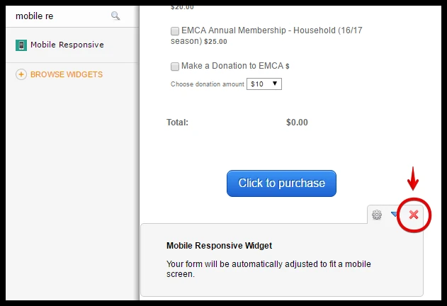
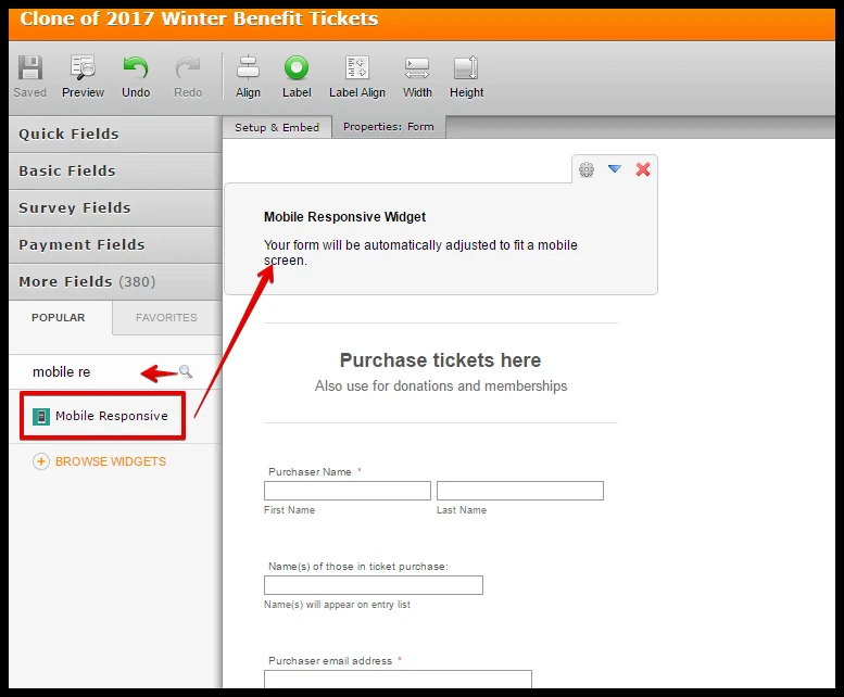
Hope that works. Please try it and let us know how it goes. Thank you.
-
EMCA11939Replied on December 9, 2016 at 6:44 PMPerfect! I learn something from you folks every time. Thank you.
(Now all I need are people to register for the benefit.)
Barb
... -
liyamReplied on December 9, 2016 at 11:41 PM
Thanks for keeping us posted, Barb. And thanks for the kind remark.
Should you have other questions or concerns, please do not hesitate to let us know.
- Templates
- Integrations
- INTEGRATIONS
- See 100+ integrations
- FEATURED INTEGRATIONS
 PayPal
- Slack
- Google Sheets
- Mailchimp
- Zoom
- Dropbox
- Google Calendar
- Hubspot
- Salesforce
- See more Integrations
- Products
- PRODUCTS
- Form Builder
- Jotform Enterprise
- Jotform Apps
- Store Builder
- Jotform Tables
- Jotform Inbox
- Jotform Mobile App
- Jotform Approvals
- Report Builder
- Smart PDF Forms
- PDF Editor
- Jotform Sign
- Jotform for Salesforce Discover Now
- Support

