


-
MomentsDBSAsked on January 11, 2017 at 11:15 AM
Hi there,
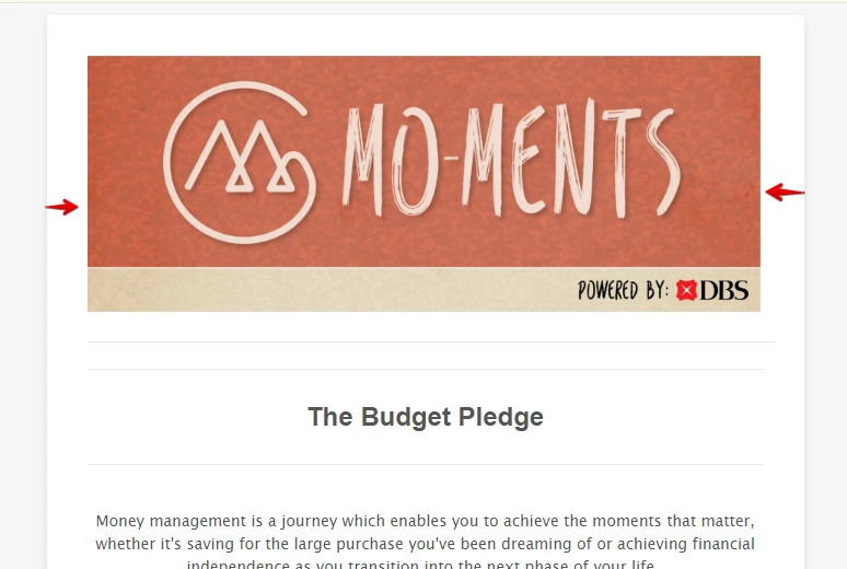
For my form "The Budget Pledge", I am trying to align my header image center but cannot due to the option only allowing my image to align left or right. Could you please advise me on how I may find the central align option? Scoured several help threads and all of them state that I am supposed to have this option available to me. Not sure what I'm missing out.
Thanks for the help!
Marcus

-
JanReplied on January 11, 2017 at 1:13 PM
Upon checking, I can see that the image is already at the center of the form. Here's a screenshot:
It is possible that you were able to resolved this issue by yourself. If you're still having issues, let us know. Thank you.
-
MomentsDBSReplied on January 11, 2017 at 8:09 PM
Thank you for your quick reply.
It aligns on the website, but does not seem to align when viewed on mobile. I've already included the mobile optimisation plugin but it still does not align.
How should I go about resizing this without compromising its layout on web?
Thank you!
-
Özlem JotForm DeveloperReplied on January 12, 2017 at 2:45 AM
Hi,
I have checked your form responsiveness. Responsiveness of other form fields seems good in your form except Header Image. Please have a look at the following video:

To fix this issue, we need to inject some CSS into your form. Please copy and paste the below CSS into your form:
@media only screen and (max-width: 768px) {
/* For mobile phones: */
.header-logo{
width: 100%;
}
img.header-logo-left {
width: 100%;
}
}
Have a look at this guide about How-to-Inject-Custom-CSS-Codes.
As you see above, we used @media query to specify the width of the Header Image for mobile devices.
After this, your form will be seen in mobile devices like below:
You can have a look at the following website for more detailed information about responsive design and media query: http://www.w3schools.com/css/css_rwd_mediaqueries.asp
If you need any other supports, please don't hesitate to contact us.
Thank you.
-
MomentsDBSReplied on January 12, 2017 at 5:06 AM
Dear Olivia,
This works perfectly!
Thank you so much for your help and your prompt assistance.
- Templates
- Integrations
- INTEGRATIONS
- See 100+ integrations
- FEATURED INTEGRATIONS
 PayPal
- Slack
- Google Sheets
- Mailchimp
- Zoom
- Dropbox
- Google Calendar
- Hubspot
- Salesforce
- See more Integrations
- Products
- PRODUCTS
- Form Builder
- Jotform Enterprise
- Jotform Apps
- Store Builder
- Jotform Tables
- Jotform Inbox
- Jotform Mobile App
- Jotform Approvals
- Report Builder
- Smart PDF Forms
- PDF Editor
- Jotform Sign
- Jotform for Salesforce Discover Now
- Support


