


-
Avid_electricalAsked on April 4, 2017 at 4:10 AM
https://www.jotform.com/build/70917245489871/design
The above link is my form. When its viewed on smart phone it shrinks the logo and keeps the phone number and email address quite large. What can I do to fix this?
Thank you
-
BJoannaReplied on April 4, 2017 at 5:38 AM
Please add this CSS code to your form:
@media screen and (max-width: 480px), screen and (max-device-width: 768px) and (orientation: portrait), screen and (max-device-width: 415px) and (orientation: landscape)
{
div.form-header-group.hasImage img {
max-width: 120px;
}}
How to Inject Custom CSS Codes
After you add mentioned CSS code to your form your header should look like this on mobile devices.
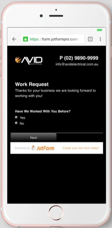
Here is my demo form: https://form.jotformpro.com/70932727279971
Feel free to test it and clone it.
Hope this will help. Let us know if you need further assistance.
-
Avid_electricalReplied on April 4, 2017 at 5:54 AM
Thank you works great now!
- Templates
- Integrations
- INTEGRATIONS
- See 100+ integrations
- FEATURED INTEGRATIONS
 PayPal
- Slack
- Google Sheets
- Mailchimp
- Zoom
- Dropbox
- Google Calendar
- Hubspot
- Salesforce
- See more Integrations
- Products
- PRODUCTS
- Form Builder
- Jotform Enterprise
- Jotform Apps
- Store Builder
- Jotform Tables
- Jotform Inbox
- Jotform Mobile App
- Jotform Approvals
- Report Builder
- Smart PDF Forms
- PDF Editor
- Jotform Sign
- Jotform for Salesforce Discover Now
- Support
