


-
MarianaCCFormAsked on April 4, 2017 at 4:25 PM
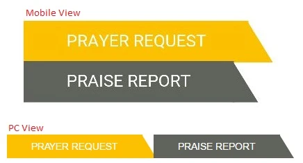
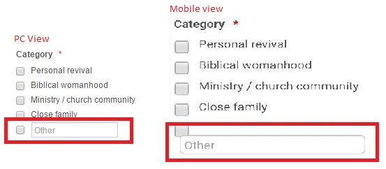
Hi I have a form that looks nice on a laptop or desktop but not looking great on mobile, can you please assist with the following:
1. logo supper small on left

2. tabs not next to each other
3. other option delay not in the correct place
-
Kevin Support Team LeadReplied on April 4, 2017 at 9:03 PM
Please, inject the following CSS code to display the fields as you need:
@media screen and (max-width: 480px){
.form-header-group.hasImage>.header-logo{
display: initial;
}
.tabs-list li{
width: 20%;
height: 42px !important;
}
.tabs-list .liAfter{
border-bottom-width: 54px !important;
}
#form-tab-1 .liAfter{
border-bottom-width: 54px !important;
}
.tabs-list{
margin: 0px !important;
}
#input_36{
width: 85% !important;
}
}
Please, follow this guide in order to inject the code to your form: How-to-Inject-Custom-CSS-Codes
Here's a cloned form of yours where you can see how the code will work: https://form.jotformpro.com/70938338478976
Hope this helps.
- Templates
- Integrations
- INTEGRATIONS
- See 100+ integrations
- FEATURED INTEGRATIONS
 PayPal
- Slack
- Google Sheets
- Mailchimp
- Zoom
- Dropbox
- Google Calendar
- Hubspot
- Salesforce
- See more Integrations
- Products
- PRODUCTS
- Form Builder
- Jotform Enterprise
- Jotform Apps
- Store Builder
- Jotform Tables
- Jotform Inbox
- Jotform Mobile App
- Jotform Approvals
- Report Builder
- Smart PDF Forms
- PDF Editor
- Jotform Sign
- Jotform for Salesforce Discover Now
- Support
