


-
SK LimAsked on April 12, 2017 at 2:16 AM
Hello JotForm Support,
I have created a Jotform - https://www.jotform.com/build/70630657580458The form appears fine on my desktop Chrome browser. But, on an Android Chrome browser and IOS Safari browser, the company logo on the top left corner appears to be very much smaller than its normal size on a desktop browser.See screenshot attached.Can this problem be fixed?Thank you.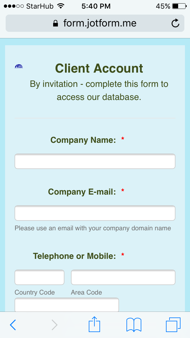
-
SvenReplied on April 12, 2017 at 3:38 AM
Please add the Mobile Responsive widget to your form, and then inject the following CSS in your form builder:
@media screen and (max-width: 480px){
.header-logo-left {
max-width : 100px !important;
}
}
Here's how to inject custom CSS:
How to Inject Custom CSS Codes
Please see this working cloned version of your form:
https://form.jotformpro.com/71012165854956
Thank you.
-
limskReplied on April 12, 2017 at 9:36 PM
Hi Sven,
Your solution is perfect.
Thank you very much.
- Templates
- Integrations
- INTEGRATIONS
- See 100+ integrations
- FEATURED INTEGRATIONS
 PayPal
- Slack
- Google Sheets
- Mailchimp
- Zoom
- Dropbox
- Google Calendar
- Hubspot
- Salesforce
- See more Integrations
- Products
- PRODUCTS
- Form Builder
- Jotform Enterprise
- Jotform Apps
- Store Builder
- Jotform Tables
- Jotform Inbox
- Jotform Mobile App
- Jotform Approvals
- Report Builder
- Smart PDF Forms
- PDF Editor
- Jotform Sign
- Jotform for Salesforce Discover Now
- Support

