


-
SHager2015Asked on May 9, 2017 at 11:13 AM
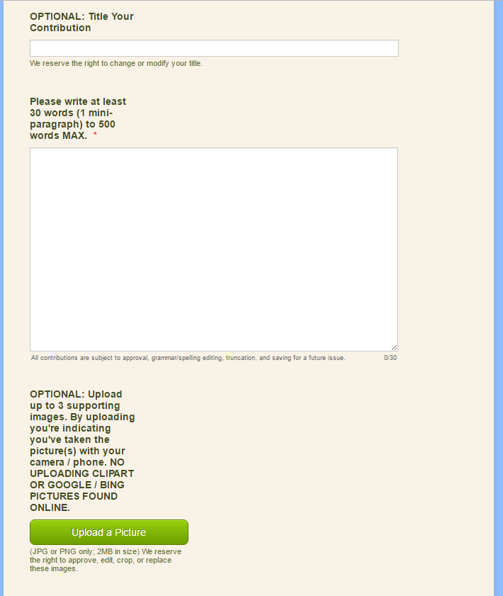
In the Builder, the Question Text reads fine - it goes across the screen -- on longer entries it naturally word-wraps to the next line. :-)
But on the last Preview, and in Chrome, and in IE views, the words in the Question Text field have all scrunched to the the left side as if in a small column. :-( I just tested on FireFox via my iPad with the same results.
Label Alignment is TOP -- I have it set to this as my default.
Is this just a temporary glitch that sometimes happens, or did I do something wrong?
-
AIDANReplied on May 9, 2017 at 12:30 PM
Could you please provide us with the form ID or URL so we can inspect and assist you further? Thank you in advance.
-
SHager2015Replied on May 9, 2017 at 12:32 PM
I'm still tweaking it... but here you go...
[link deleted by user after issue fixed]
-
John_BensonReplied on May 9, 2017 at 1:52 PM
Thank you for providing a screenshot.
Are you referring to the space as shown in the screenshot?

If yes, please try adding this custom CSS code to your form:
.form-label.form-label-top {
width : 500px !important;
}
Here's a guide on: How-to-Inject-Custom-CSS-Codes
Result:

If I have misunderstood your concern or you have any further question, please feel free to contact us anytime. Thank you.
-
SHager2015Replied on May 9, 2017 at 1:56 PM
Awesomesauce!
Yes that was my issue; and the CSS code worked perfectly!
Thank you!
-
SHager2015Replied on May 9, 2017 at 2:34 PM
Oops -- what CSS code would I use then for the sub-labels to stretch out to the 500px too?... it seems that my focus was on the Question Text I forgot about the sub labels. And would I just paste under the first code?
-
John_BensonReplied on May 9, 2017 at 4:25 PM
You're referring to the sub-label of the Upload button, right?
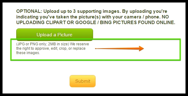
If yes, please add this custom CSS code to your form again to increase the width of the Sub-label:
.form-sub-label {
width: 500px !important;
}
Here's the guide on: How-to-Inject-Custom-CSS-Codes
Result:
Contact us again if you have questions or need further assistance. We'll be glad to help you.
-
SHager2015Replied on May 10, 2017 at 6:54 AM
Thank you -- it worked out well for the sub labels...
However, it did take the Date Picker and put each element (month, day, and year) and place it on a line of its own. ...

-
HelenReplied on May 10, 2017 at 8:13 AM
Hello,
Thank you for contacting us.
You must inject this custom CSS code to your form for correcting this issue. Here:
#cid_16 span.form-sub-label-container {
width : 46px !important;
}
I have cloned your form in order test on my side and injected this CSS code. Your form will be shown like:

Here is a guide may help to you for injecting custom CSS codes: https://www.jotform.com/help/117-How-to-Inject-Custom-CSS-Codes
If you have any questions or issue, please do not hesitate to contact us.
-
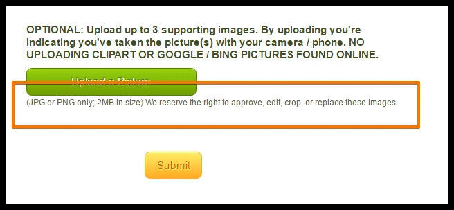
SHager2015Replied on May 10, 2017 at 8:21 AM
I pasted that and got:
then my sub-label on my longest one shrunk up again:
My exact CSS right now is:
.form-label.form-label-top {
width : 500px !important;
}
#cid_16 span.form-sub-label-container {
width : 46px !important;
}
-
HelenReplied on May 10, 2017 at 9:31 AM
Hello again,
I could see that you have deleted this CSS codes to your form, it has to be on your form:
.form-sub-label {
width: 500px !important;
}
Your current custom CSS codes must be like this:
.form-label.form-label-top {
width : 500px !important;
}
.form-sub-label {
width : 500px !important;
}
#cid_16 span.form-sub-label-container {
width : 46px !important;
}
Please inject this all CSS codes and check the result. If you have still a problem, please let us know.
Thank you.
-
SHager2015Replied on May 10, 2017 at 9:37 AM
ahhhh... gotchya... I thought I was replacing the other bit of coding.... Lemme try that...
Argh.
Sub-Labels -- look great!
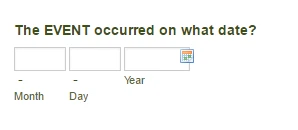
Date Picker -- not so much .. it's weird again... Looks different in Builder verses Preview/Browser, see below...
In Builder:

Preview/Browser:

-
Nik_CReplied on May 10, 2017 at 11:37 AM
Maybe it would work better if you target the individual labels with CSS, that way everything should look properly aligned.
This is what I mean, you remove all previous CSS code and paste the below one:
#label_12 {
width: 500px;
}
#label_16 {
width: 500px;
}
#label_13 {
width: 500px;
}
#label_18 {
width: 500px;
}
#label_14 {
width: 500px;
}
#label_17 {
width: 500px;
}
It will change the width of each label.

You can check my clone of your form as well: https://form.jotformpro.com/71294960792972
And it works the same in the builder:

Could that work for you?
Please let us know.
Thank you!
-
SHager2015Replied on May 11, 2017 at 7:24 AM
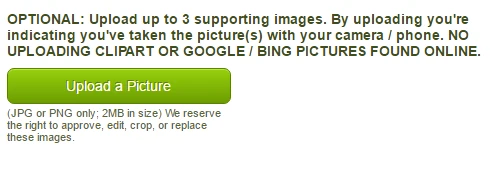
it fixed the date and 99% of the others. My problem-child remains the sub-label under the "Upload a picture" button -- I'd like for it to span the 500px like the others, but apparently it is super stubborn. So it wins, I don't have time to continue playing with it - the rest of the form seems great so I am happy with that :-)
I want to thank everyone on this thread for trying to help me -- we had success and I am grateful for your assistance :-)
-
HelenReplied on May 11, 2017 at 7:28 AM
Hello,
Thank you for your good thought and compliment. We are glad to solve your problem.
Please let us know if you need any further assistance.
Thank you.
- Templates
- Integrations
- INTEGRATIONS
- See 100+ integrations
- FEATURED INTEGRATIONS
 PayPal
- Slack
- Google Sheets
- Mailchimp
- Zoom
- Dropbox
- Google Calendar
- Hubspot
- Salesforce
- See more Integrations
- Products
- PRODUCTS
- Form Builder
- Jotform Enterprise
- Jotform Apps
- Store Builder
- Jotform Tables
- Jotform Inbox
- Jotform Mobile App
- Jotform Approvals
- Report Builder
- Smart PDF Forms
- PDF Editor
- Jotform Sign
- Jotform for Salesforce Discover Now
- Support


