


-
daverthalAsked on June 26, 2017 at 1:42 PM
I've created a table with text entries. It looks fine on my laptop but not on mobile devices. With mobile, the first column is stretched and the text entry columns are squished to one character.
Page URL: https://form.jotform.us/21206629024142 -
BJoannaReplied on June 26, 2017 at 2:53 PM
Please add this CSS code to your form:
@media screen and (max-width: 480px), screen and (max-device-width: 767px) and (orientation: portrait), screen and (max-device-width: 415px) and (orientation: landscape){
.form-matrix-row-headers {
width: 280px!important;
}}
How to Inject Custom CSS Codes
After that your form will look like this.
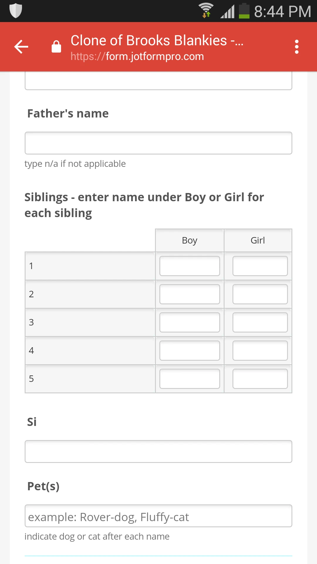
Here is my cloned form: https://form.jotformpro.com/71765745385974
Feel free to test it and clone it.
Hope this will help. Let us know if you need further assistance.
- Templates
- Integrations
- INTEGRATIONS
- See 100+ integrations
- FEATURED INTEGRATIONS
 PayPal
- Slack
- Google Sheets
- Mailchimp
- Zoom
- Dropbox
- Google Calendar
- Hubspot
- Salesforce
- See more Integrations
- Products
- PRODUCTS
- Form Builder
- Jotform Enterprise
- Jotform Apps
- Store Builder
- Jotform Tables
- Jotform Inbox
- Jotform Mobile App
- Jotform Approvals
- Report Builder
- Smart PDF Forms
- PDF Editor
- Jotform Sign
- Jotform for Salesforce Discover Now
- Support

