


-
zoiglobalAsked on July 7, 2017 at 8:12 PM
Can you please tell me why my form is not responding to mobile responsive widget on first page of form? I am using Iframe Embed widget and also, Mobile Responsive Widget placed at bottom of page.
Thank you for your assistance.
Denise
Page URL: https://form.jotform.us/71868671316162 -
jonathanReplied on July 8, 2017 at 12:15 AM
I see the issue as well when I test your form on mobile browser.

Please allow me some more time to check and fix it on your form. I'll be back shortly.
-
jonathanReplied on July 8, 2017 at 1:58 AM
I found that the iframe embed height was the one causing the issue.
Try setting the height property to 285 only.

It work on my test form https://form.jotformpro.com/71881181972969

Let us know if this did not work for you.
-
zoiglobalReplied on July 8, 2017 at 10:07 AM
Thank you. That works great; however, now the computer version is truncated. Check it out! Any way around this?
I appreciate your diligence in helping me solve this issue!
Denise
-
Support_Management Jotform SupportReplied on July 8, 2017 at 4:25 PM
Hello Denise, inject the following CSS codes to the first iFrame Embed Widget on your form's 1st page:
iframe {
height: 504px !important;
}
@media only screen and (min-device-width: 320px) and (max-device-width: 480px) and (-webkit-min-device-pixel-ratio: 2) {
iframe {
height: 285px !important;
}
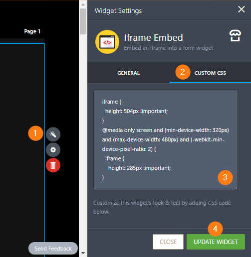
Related guide: How-to-Inject-CSS-Codes-to-Widgets
This should take care of the height for both desktop and mobile.
-
Support_Management Jotform SupportReplied on July 8, 2017 at 4:27 PM
Sorry I missed a closing } bracket. Here's the correct one:
iframe {
height: 504px !important;
}
@media only screen and (min-device-width: 320px) and (max-device-width: 480px) and (-webkit-min-device-pixel-ratio: 2) {
iframe {
height: 285px !important;
}
}
-
John_BensonReplied on July 13, 2017 at 4:06 AM
It seems the reply to this thread didn't reach the Support Forum. For us to view the reply, please open this thread: https://www.jotform.com/answers/1194166 on a browser and post the reply again.
Thank you.
- Templates
- Integrations
- INTEGRATIONS
- See 100+ integrations
- FEATURED INTEGRATIONS
 PayPal
- Slack
- Google Sheets
- Mailchimp
- Zoom
- Dropbox
- Google Calendar
- Hubspot
- Salesforce
- See more Integrations
- Products
- PRODUCTS
- Form Builder
- Jotform Enterprise
- Jotform Apps
- Store Builder
- Jotform Tables
- Jotform Inbox
- Jotform Mobile App
- Jotform Approvals
- Report Builder
- Smart PDF Forms
- PDF Editor
- Jotform Sign
- Jotform for Salesforce Discover Now
- Support


