


-
MaidCrewAsked on July 25, 2017 at 11:37 AM
Hello... I could use some help with CSS on how to properly set up the following:
1. I have 4 fields (3 dropdown & 1 text with a single cell table) set up in a 4 column arrangement.
2. When viewing on a tablet or smart phone, columns do not center.... whether it's the fields rendering 2 over 2 on a tablet or in a single column lay on a smart phone.
How can I get the fields / elements to align to center regardless of device, field or label width, etc.
Thanks in advance.
P.S. I've tried incorporating mobile responsive widget. I've also tried selecting and un-selecting "Enable Form Columns" in the advance designer form layout setting ... not sure exactly what the settings should be or if a CSS solution is the only way to achieve the results I'm looking for.
Page URL: https://form.jotform.us/72054347493156 -
Nik_CReplied on July 25, 2017 at 1:47 PM
Please try inserting the below CSS to your Custom CSS Field:
@media only screen and (max-device-width: 1024px){ul.form-section.page-section {position: fixed!important;left: 17%;}}It should make your form look like this:
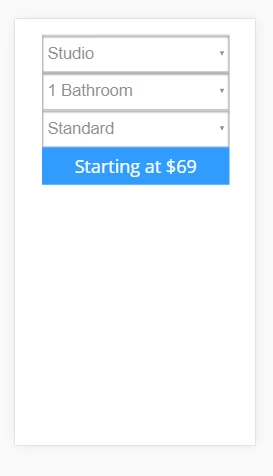
When viewed on phone. I tried to make it work for most devices.
But please try and let us know how it worked for you.
Thank you!
- Templates
- Integrations
- INTEGRATIONS
- See 100+ integrations
- FEATURED INTEGRATIONS
 PayPal
- Slack
- Google Sheets
- Mailchimp
- Zoom
- Dropbox
- Google Calendar
- Hubspot
- Salesforce
- See more Integrations
- Products
- PRODUCTS
- Form Builder
- Jotform Enterprise
- Jotform Apps
- Store Builder
- Jotform Tables
- Jotform Inbox
- Jotform Mobile App
- Jotform Approvals
- Report Builder
- Smart PDF Forms
- PDF Editor
- Jotform Sign
- Jotform for Salesforce Discover Now
- Support

