


-
tesssweetAsked on August 6, 2017 at 3:42 PM
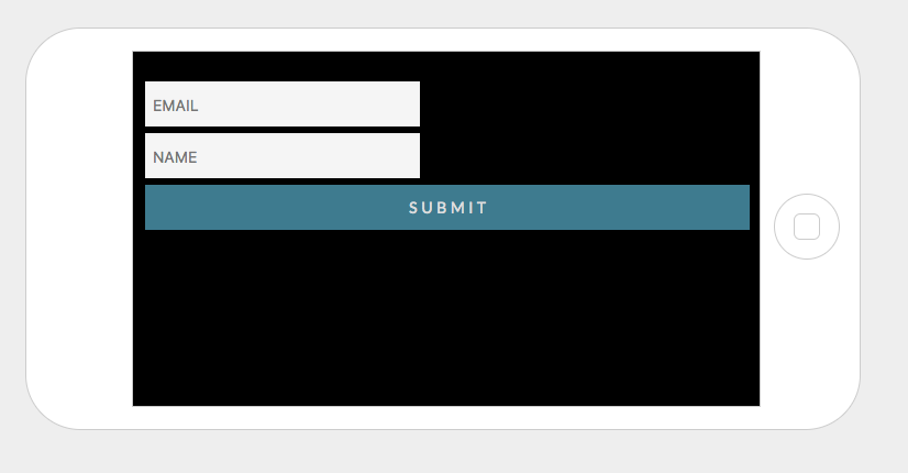
Our SUBMIT button looks like this when the phone is turned sideways:

-
Welvin Support Team LeadReplied on August 6, 2017 at 4:11 PM
Inject the following custom CSS codes to your form:
@media only screen and (min-device-width: 550px) {
button#input_2 {
max-width: 250px !important;
}
}
Or, you may consider adjusting the width of the textboxes to make it 100% responsive. You can inject the following custom CSS codes to do it:
@media only screen and (max-device-width: 768px) {
.form-textbox {
max-width: 100% !important;
}
[data-type="control_email"] .form-input-wide, [data-type="control_textbox"] .form-input-wide {
max-width: 100% !important;
}
}
Please follow the steps on this guide to inject the custom CSS codes:
https://www.jotform.com/help/117-How-to-Inject-Custom-CSS-Codes
-
tesssweetReplied on August 6, 2017 at 5:52 PM
Now this happens:

???
-
Welvin Support Team LeadReplied on August 6, 2017 at 6:01 PM
It's fine here. Please try viewing the form using an actual device instead of the emulator.
- Templates
- Integrations
- INTEGRATIONS
- See 100+ integrations
- FEATURED INTEGRATIONS
 PayPal
- Slack
- Google Sheets
- Mailchimp
- Zoom
- Dropbox
- Google Calendar
- Hubspot
- Salesforce
- See more Integrations
- Products
- PRODUCTS
- Form Builder
- Jotform Enterprise
- Jotform Apps
- Store Builder
- Jotform Tables
- Jotform Inbox
- Jotform Mobile App
- Jotform Approvals
- Report Builder
- Smart PDF Forms
- PDF Editor
- Jotform Sign
- Jotform for Salesforce Discover Now
- Support
