


-
EloineChapAsked on September 14, 2017 at 4:05 PM
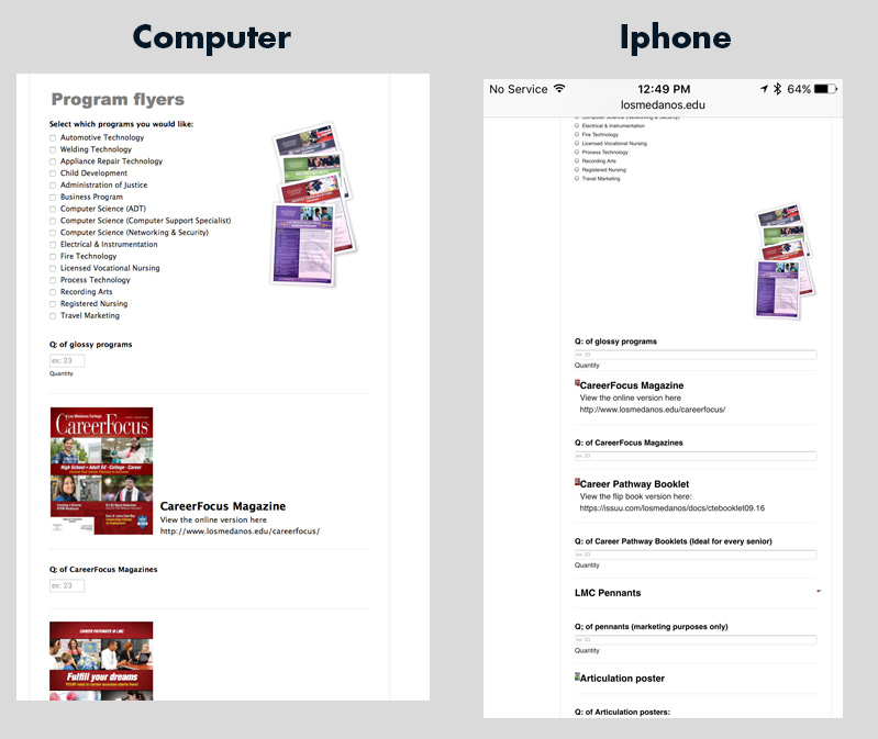
I was asked to create an order form for some marketing materials and they wanted a picture by each item. I have embedded the form on our website and it looks fine on the desktop but when I brought it up on the phone I got drastically different results. The image that I put to the side of the check boxes got push but what is worse is the images that I put with the headlines got super tiny to where you can't even see them. See screen shots to see the difference. what should I do?
-
aubreybourkeReplied on September 14, 2017 at 5:56 PM
The reason for this bad behavior is because you are using a header to display the image.
However, for a quick fix you can try injecting this CSS:
@media only screen and (max-device-width: 540px) {
.header-logo {
width: 50%;
}
}
How to Inject Custom CSS Codes
Note, that a better approach would be to use an image field instead. I see you are using the image field for some fields, which are displaying correctly. So for it to be perfect I would use image fields for all your pictures.
- Templates
- Integrations
- INTEGRATIONS
- See 100+ integrations
- FEATURED INTEGRATIONS
 PayPal
- Slack
- Google Sheets
- Mailchimp
- Zoom
- Dropbox
- Google Calendar
- Hubspot
- Salesforce
- See more Integrations
- Products
- PRODUCTS
- Form Builder
- Jotform Enterprise
- Jotform Apps
- Store Builder
- Jotform Tables
- Jotform Inbox
- Jotform Mobile App
- Jotform Approvals
- Report Builder
- Smart PDF Forms
- PDF Editor
- Jotform Sign
- Jotform for Salesforce Discover Now
- Support
