


-
theMPIAsked on November 30, 2017 at 3:53 PM
Hello,
I noticed that the buttons on my donate form appear differently on mobile than they do on our site. On the site, they are 4 across, but on mobile, the fourth button gets cut off. Is there a way to change the buttons so that they appear smaller on mobile and fit the width better?
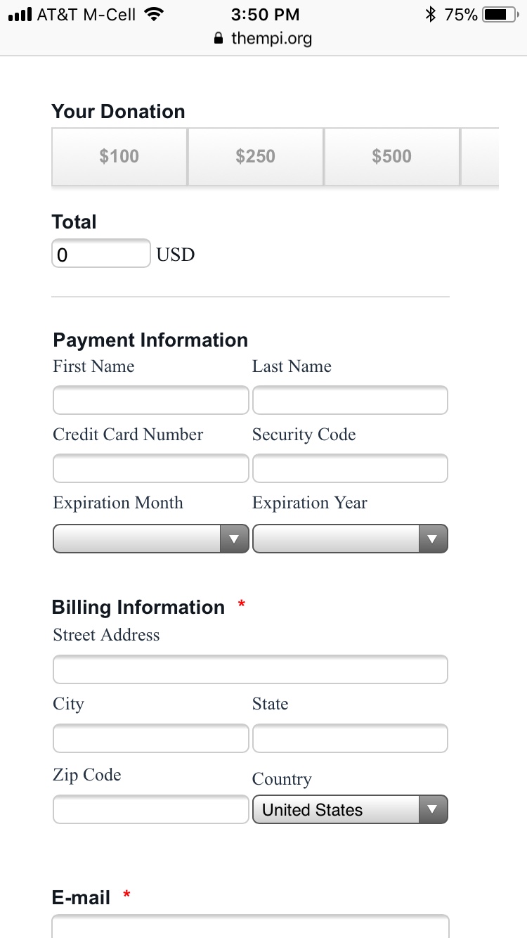 Page URL: https://www.thempi.org/support/
 -
Kevin Support Team LeadReplied on November 30, 2017 at 7:11 PM
I have tested this and found the widget displays responsive on Android:

The issue only seems to happen when you load the form on iPhone devices, but injecting the following code to the widget should fix the problem:
@media only screen and (max-device-width: 550px){
.rowButtonRadio{
width: 90%;
height: 100%;
}
.wrapperButtonRadio{
width: 100% !important;
}
.radios input + label{
width: 100% !important;
}
}
This guide will help you injecting the code to the widget: https://www.jotform.com/help/428-How-to-Inject-CSS-Codes-to-Widgets
I hope this helps.
-
theMPIReplied on November 30, 2017 at 7:32 PM
Wow! Worked like a charm. Thanks so much for your help!
- Templates
- Integrations
- INTEGRATIONS
- See 100+ integrations
- FEATURED INTEGRATIONS
 PayPal
- Slack
- Google Sheets
- Mailchimp
- Zoom
- Dropbox
- Google Calendar
- Hubspot
- Salesforce
- See more Integrations
- Products
- PRODUCTS
- Form Builder
- Jotform Enterprise
- Jotform Apps
- Store Builder
- Jotform Tables
- Jotform Inbox
- Jotform Mobile App
- Jotform Approvals
- Report Builder
- Smart PDF Forms
- PDF Editor
- Jotform Sign
- Jotform for Salesforce Discover Now
- Support


