
-
danboAsked on December 12, 2017 at 3:20 PM
I have been trying to get iframe responsive on iPhone but it only works on desktop
website is http://www.duny.ca/home/contact-us/request-a-quote.php
Please help.
-
Richie JotForm SupportReplied on December 12, 2017 at 4:07 PM
I have checked your form in your website, and the IFrame is mobile responsive. But the layout of your art-layout and footer are blocking the IFrame.
Kindly ask your web developer to edit some changes in your css.
You can add the css of your website to fix the issue.
Getting the whole value of the footer for the IFrame.
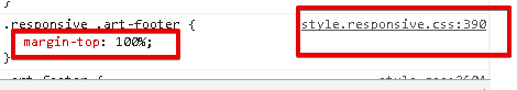
and moving the art-menu block out of screen to view totally the form.
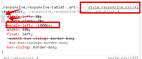
All the css highlighted are from your website, and not from your form.
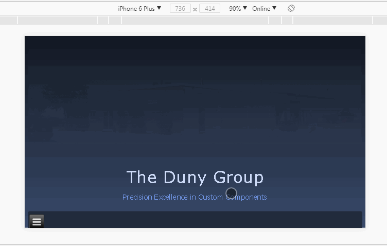
Here is the final output if changes would be done. Viewed on an emulator for iPone6 plus.

Please let us know if we can be of further assistance. -
danboReplied on December 13, 2017 at 9:29 AM
Ritchie,
Thank you for your help. I have added made the changes to my responsive CSS file and it appears to be working somewhat.I am testing on an iPhone 6. The bottom of the form is cut off in Landscape mode. The form is overlapping the menu in portrait mode (see screenshot)

http://www.duny.ca/home/contact-us/request-a-quote.php
Dan
-
John_BensonReplied on December 13, 2017 at 10:39 AM
Hi Dan,
Please try re-embedding the form using this guide: https://www.jotform.com/help/34-Adding-a-Form-to-a-Web-Page
If the issue still persists, please use this iFrame code to embed your form to your website:
<iframe
id="JotFormIFrame-70093290133246"
onDISABLEDload="window.parent.scrollTo(0,0)"
allowtransparency="true"
src="https://form.jotform.com/70093290133246"
frameborder="0"
style="width: 1px;
min-width: 100%;
height:1287px;
border:none;"
scrolling="no">
</iframe>
I hope this works. Let us know how it goes.
-
danboReplied on December 13, 2017 at 10:50 AM
John,
The code you posted above is identical to what's on my site right now. How would this make things different?
Dan
-
Nik_CReplied on December 13, 2017 at 12:44 PM
I checked your website and if you look closely the form is actually perfectly responsive. The text that appears on top of the form is the text of your links from the right-hand-side:

And you can see that in this screencast:

So the code we provide for embedding a form cannot do much, the issue is outside of that div.
Precisely, the issue is related to this classes: .art-layout-cell.art-sidebar1
So, you can try inserting the below CSS code to your website (no to your form):
@media only screen
and (min-device-width: 320px)
and (max-device-width: 950px) {
.art-layout-cell.art-sidebar1 {
margin-top: 1200px!important;
}
}
And it should look like this:

When viewed on mobile.
Please try and let us know how it worked.
Thank you!
-
danboReplied on December 13, 2017 at 3:00 PM
do i put it in the style.css or style.responsive.css?
also the other info that Ritchie had me put in. do I take that out?
-
Nik_CReplied on December 13, 2017 at 4:13 PM
Since I checked that on your website as it is, you don't need to do any further adjustments.
You can put the code in either one, I see that both are included in the head part of your website.
Let us know how it worked.
Thank you!
-
danboReplied on December 14, 2017 at 11:37 AM
Nik,
Thank you for your help. The form is not cut off on mobile when looking at it in landscape mode. However, it is still overlapping the menu when viewing in portrait mode. I am using an iPhone 6 to test.
Thanks,
Dan
-
John_BensonReplied on December 14, 2017 at 1:18 PM
I opened the link using iPhone 6 Portrait mode and I was able to replicate it.
Please try adjusting the margin-top and see if that works.
@media only screen
and (min-device-width: 320px)
and (max-device-width: 950px) {
.art-layout-cell.art-sidebar1 {
margin-top: 1200px !important;
}
}
I checked the iFrame code on your website and you remove the "script" part which helps auto-resizing the form. You can try embedding the form using the Complete iFrame code method. Here's a guide: https://www.jotform.com/help/148-Getting-the-Form-iFrame-Code
Let us know how it goes. Thank you.
-
danboReplied on December 14, 2017 at 3:18 PM
John,
Thank you!!!! adjusting the margin-top made everything fit properly!! :)
Thank guys for all your help!!
Dan
- Templates
- Integrations
- INTEGRATIONS
- See 100+ integrations
- FEATURED INTEGRATIONS
 PayPal
- Slack
- Google Sheets
- Mailchimp
- Zoom
- Dropbox
- Google Calendar
- Hubspot
- Salesforce
- See more Integrations
- Products
- PRODUCTS
- Form Builder
- Jotform Enterprise
- Jotform Apps
- Store Builder
- Jotform Tables
- Jotform Inbox
- Jotform Mobile App
- Jotform Approvals
- Report Builder
- Smart PDF Forms
- PDF Editor
- Jotform Sign
- Jotform for Salesforce Discover Now
- Support