


-
EliteInsitesAsked on February 20, 2018 at 10:16 AM
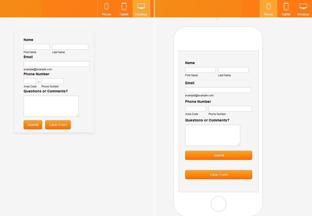
Why, why, why do you have to change the form layout from desktop to mobile? You make these weird changes (full width buttons???) with ridiculous amounts of space between above and below, making it impossible to have a consistent experience from desktop to mobile. Is there some way to completely disable the CSS your program uses on mobile page sizes?
-
David JotForm SupportReplied on February 20, 2018 at 11:27 AM
Forms are mobile responsive by default, we are not making any changes to your form. Most forms are not created to fit specifically with mobile layouts so forms adjust automatically to fit different screen sizes. This is standard functionality and has been the case for quite some time now. Similar responses have been given in your other threads regarding this topic:
https://www.jotform.com/answers/1259870
https://www.jotform.com/answers/1260717The width of the buttons can be changed on mobile by adding the following CSS:
@media screen and (max-width: 480px), screen and (max-device-width: 767px) and (orientation: portrait), screen and (max-device-width: 415px) and (orientation: landscape) {
.form-buttons-wrapper button {
width: 45% !important;
}
}Adjust the percentage value or replace it with a pixel value to set a specific width.
-
EliteInsitesReplied on February 20, 2018 at 7:16 PM
"we are not making any changes to your form."
Except you are. You are injecting screen-size specific CSS which is not adjustable through your advanced designer unless you actually publish a form, and then use a utility like Firebug to identify the classes, and then add custom CSS (like you've suggested above.) It's a tedious process to have to do this on every form. The buttons shouldn't be changing width in the first place. There should be a simply way to keep the layout EXACTLY the same across all viewports. -
Elton Support Team LeadReplied on February 21, 2018 at 1:14 AM
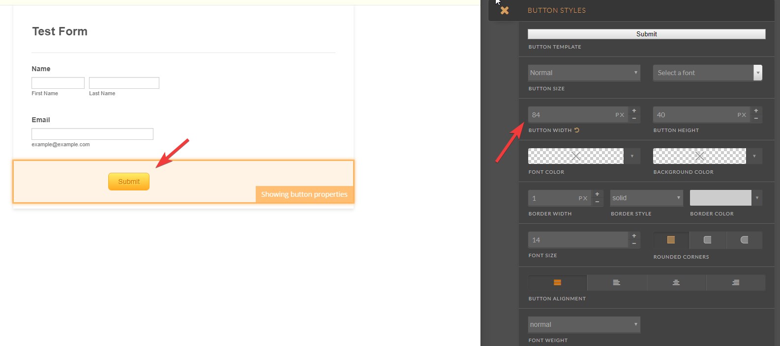
You can adjust the CSS code under custom CSS tab in the advanced designer.
If you don't want the buttons to adapt the responsive layout, just change the default button width in the button style panel when you click it in the advanced designer. This adds a fixed button width so the button won't adjust across all viewports.
Example:
- Templates
- Integrations
- INTEGRATIONS
- See 100+ integrations
- FEATURED INTEGRATIONS
 PayPal
- Slack
- Google Sheets
- Mailchimp
- Zoom
- Dropbox
- Google Calendar
- Hubspot
- Salesforce
- See more Integrations
- Products
- PRODUCTS
- Form Builder
- Jotform Enterprise
- Jotform Apps
- Store Builder
- Jotform Tables
- Jotform Inbox
- Jotform Mobile App
- Jotform Approvals
- Report Builder
- Smart PDF Forms
- PDF Editor
- Jotform Sign
- Jotform for Salesforce Discover Now
- Support


