


-
jgrooverAsked on April 9, 2018 at 7:56 PM
Hi JotForm,
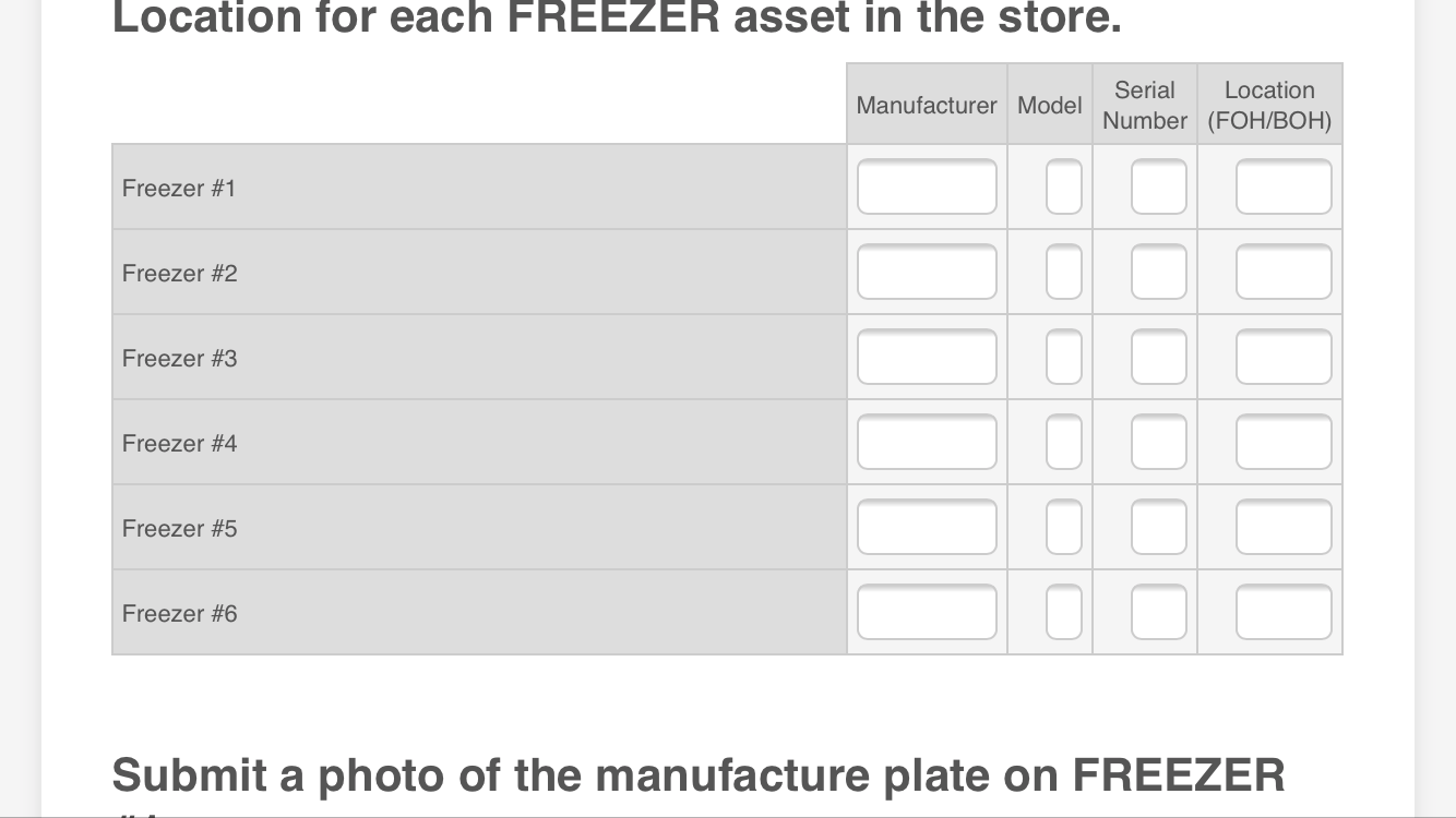
I'm having an issue with the Width of Text Box Tables in my survey, particularly on mobile version. Is there an easy way to specify a set width for every Text Box within a Table? E.g. set every Text Box field to show 10 characters of width.
My surveyors will be taking down long Serial Numbers on equipment, and they need to be able to see the whole number in one view to be able to verify that the information they entered is correct.
Please see the below examples. On mobile, the fields still don't widen any if you turn your mobile device to Landscape.


-
John_BensonReplied on April 9, 2018 at 9:50 PM
We can add a custom CSS code to adjust the width of the Text Box. Could you please provide the form link so we can check it further?
You can also try adjusting the width in the Options Properties page. Here's a screenshot:

We'll wait for your reply. Thank you.
-
jgrooverReplied on April 10, 2018 at 11:03 AM
Hi John,
I tried Column Width and it doesn't seem to affect the text box itself. It will make the column bigger, but the text box still stays the same size within the column.
Here is my survey:
https://form.jotform.com/jgroover/sbuxsurvey3
Unfortunately the survey is very long with many Text Box Tables. So I'm hoping there's a quick, easy solution to lock every text box to a set width.
-
John_BensonReplied on April 10, 2018 at 11:43 AM
Hi,
I need more time checking your form. It is very long form and it is lagging on my end. I will contact you again on this thread once I have any updates.
Thank you.
-
jgrooverReplied on April 18, 2018 at 8:51 PM
Hello,
Any update you can provide here?
-
John_BensonReplied on April 18, 2018 at 10:46 PM
Please accept my apologies, I thought I have already replied to this thread. It looks like it didn't go through.
Here's the custom CSS code that you need to insert into your form so it will be responsive when it is viewed on iPad/Mobile Devices Landscape.
@media screen and (max-width: 480px), screen and (max-device-width: 767px) and (orientation: portrait), screen and (max-device-width: 415px) and (orientation: landscape)
.form-matrix-row-headers {
width: 10% !important;
}
@media screen and (max-device-width: 40em)
.form-matrix-row-headers {
width: 10% !important;
}
Here's a guide: https://www.jotform.com/help/117-How-to-Inject-Custom-CSS-Codes
Here's the result of my test form:

I hope this helps. If you have any questions, please contact us again. Thank you.
- Templates
- Integrations
- INTEGRATIONS
- See 100+ integrations
- FEATURED INTEGRATIONS
 PayPal
- Slack
- Google Sheets
- Mailchimp
- Zoom
- Dropbox
- Google Calendar
- Hubspot
- Salesforce
- See more Integrations
- Products
- PRODUCTS
- Form Builder
- Jotform Enterprise
- Jotform Apps
- Store Builder
- Jotform Tables
- Jotform Inbox
- Jotform Mobile App
- Jotform Approvals
- Report Builder
- Smart PDF Forms
- PDF Editor
- Jotform Sign
- Jotform for Salesforce Discover Now
- Support


