


-
AdminRSCMAsked on April 12, 2018 at 1:44 PM
How can I make all my form fields the same width on this form for all screen sizes?
https://form.jotform.com/81003694658158
-
Brody_SReplied on April 12, 2018 at 2:10 PM
Hello,
Please add the following CSS into your Form Designer's Custom CSS Field (quick guide on how):
@media screen and (max-width: 980px) and (min-width: 641px) {
.form-line-column.form-col-4,
.form-line-column.form-col-2 {
padding-left: 36px !important;
padding-right: 18px !important;
width: 100% !important;
}
}
Please let us know if you require any more assistance with this, or any other matter!
Best regards.
-
Scott JotForm DeveloperReplied on April 12, 2018 at 2:33 PM
Hey guys,
I was looking into this problem also.
@AdminRSCM My answer is not so different my colleague's but IMO a lower width limit handles an edge case.
Here is my two cents:
@media only screen
and (min-device-width: 480px)
and (max-device-width: 980px)
and (-webkit-min-device-pixel-ratio: 1){
.form-line {
padding : 10px 35px !important;
}
}
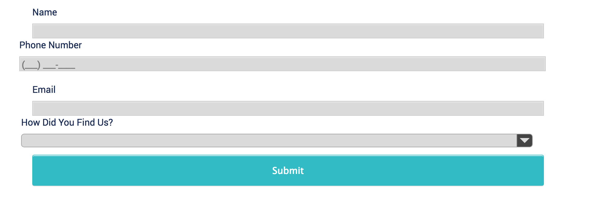
And here it is in action:

- Templates
- Integrations
- INTEGRATIONS
- See 100+ integrations
- FEATURED INTEGRATIONS
 PayPal
- Slack
- Google Sheets
- Mailchimp
- Zoom
- Dropbox
- Google Calendar
- Hubspot
- Salesforce
- See more Integrations
- Products
- PRODUCTS
- Form Builder
- Jotform Enterprise
- Jotform Apps
- Store Builder
- Jotform Tables
- Jotform Inbox
- Jotform Mobile App
- Jotform Approvals
- Report Builder
- Smart PDF Forms
- PDF Editor
- Jotform Sign
- Jotform for Salesforce Discover Now
- Support


