


-
stpksAsked on July 29, 2018 at 2:09 AM
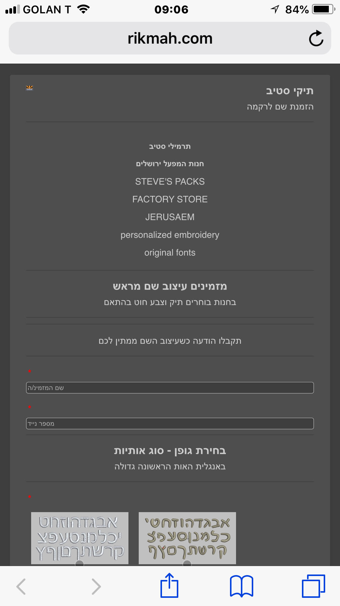
logo, text & input fields all tiny.
was OK before, don't know what changed.
-
Mike_G JotForm SupportReplied on July 29, 2018 at 2:22 AM
We would like to apologize for any inconvenience.
We will be glad to help you with your concern.
We just need to know the following information so we can test and reproduce the issue on our end.
May we know what type of iPhone were you using in the screenshot you provided?
Also, may we know what browser in that iPhone was used?
Does it only happen on a specific iPhone? (if, in any case, you have a different iPhone to test it).
Have you tried using a different browser on that same iPhone where you are experiencing the issue?
We will wait for your response.
-
stpksReplied on July 29, 2018 at 3:49 AM
That was 6s+/ Same on 4s. On Android the headers are slightly bigger, everything else the same.
-
Kiran Support Team LeadReplied on July 29, 2018 at 4:41 AM
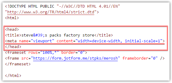
As we check the form using the direct URL on an iPhone emulator, it seems to be displaying correctly. However, as we check the web page where the form is embedded, it seems to be displaying odd. Please try adding the following meta tag to the <head></head> section of the web page so that the form should be displaying correctly.
<meta name="viewport" content="width=device-width, initial-scale=1">
Please get back to us if you need any further assistance. We will be happy to help.
-
stpksReplied on July 29, 2018 at 4:43 AMThat was 6s+/ Same on 4s. On Android the headers are slightly bigger,
everything else the same.
... -
Kiran Support Team LeadReplied on July 29, 2018 at 5:04 AM
Adding the provided meta tag information to the web page should work on all devices. I have cloned your JotForm and embedded it on two different web pages with and without metatag.
Please try loading the following links on your mobile device to see the difference.
With Meta Tag
http://shots.jotform.com/kiran/test/iphoneembed.html

Without Meta Tag:
http://shots.jotform.com/kiran/test/iphoneembednometa.html
.jpg)
Please try adding the provided meta tag script to your webpage within the head section and let us know if you need any further assistance.
Thanks!
-
stpksReplied on July 29, 2018 at 5:20 AM"adding the following meta tag to the <head></head> section of the web page"please tell me where to find the <head></head> section of the web pageby add to you mean append (add on at the end)?
-
stpksReplied on July 29, 2018 at 5:22 AM
your link with the meta tag works fine. I don't know where to add it myself.
-
stpksReplied on July 29, 2018 at 5:43 AM"adding the following meta tag to the section of the web page"
please tell me where to find the section of the web page
by add to you mean append (add on at the end)?
... -
MikeReplied on July 29, 2018 at 5:43 AM
Here is a current source code of your web page. The viewport tag is missing.
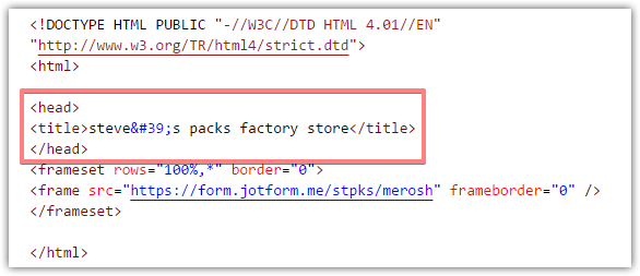
The solution is to add the viewport tag within the head section (top or bottom positioning does not matter).
The editing of the web page depends on your website builder software. If you cannot find where to edit the source code of the web page, please contact the support of your website builder software, they should be able to help.
-
stpksReplied on July 29, 2018 at 6:18 AM
Thanks, but: what do I do / where do I look in order to see and revise the source code for the web page?
-
Victoria_KReplied on July 29, 2018 at 6:34 AM
Hi,
I am not sure, but, from the source code of your web page, it seems that you have used some kind of vanity URL services to hide form's direct URL. Unfortunately, we do not have control under 3rd party embedding options. As explained by my colleagues, current method is not mobile responsive, but our forms through their direct URLs are.
I can suggest to use one of recommended embedding codes. You can take a look through our guide here: Which-Form-Embed-Code-Should-I-Use
Also you may contact the support team of the service you have used to check if they provide mobile responsive solutions.
We will gladly assist if you need more help.
-
stpksReplied on July 29, 2018 at 6:34 AM
This may be relevant: I am forwarding from a URL using Godaddy and chose forward with masking...?
-
Victoria_KReplied on July 29, 2018 at 6:38 AM
Yes, this is what I have suggested with my previous reply. You can try checking with Godaddy support for possible options, but as far as I know, masked URLs are not mobile responsive. You may consider creating a real web page and embed a form using one of our embedding codes: Which-Form-Embed-Code-Should-I-Use
Let us know how it goes.
-
stpksReplied on July 29, 2018 at 6:44 AM
I cancelled the masking and the form looks fine. I researched and found that am not the first to encounter this difficulty with Godaddy's default masking mechanism. It looks as if I would need to build a tiny web page myself to make it work properly and be able to insert html. Please let me know if you find out more about this.
- Templates
- Integrations
- INTEGRATIONS
- See 100+ integrations
- FEATURED INTEGRATIONS
 PayPal
- Slack
- Google Sheets
- Mailchimp
- Zoom
- Dropbox
- Google Calendar
- Hubspot
- Salesforce
- See more Integrations
- Products
- PRODUCTS
- Form Builder
- Jotform Enterprise
- Jotform Apps
- Store Builder
- Jotform Tables
- Jotform Inbox
- Jotform Mobile App
- Jotform Approvals
- Report Builder
- Smart PDF Forms
- PDF Editor
- Jotform Sign
- Jotform for Salesforce Discover Now
- Support


.jpg)

