


-
JonWAVElectricAsked on September 10, 2018 at 4:23 PM
Hello,
We are having an issue with the form we have created not looking like the preview on as shown on the desktop. The mobile view is extremely smaller on some boxes and not on others. For example the "Job" box is huge and doesn't need to be but the "name" box is smaller where we need more room.
Thank you.
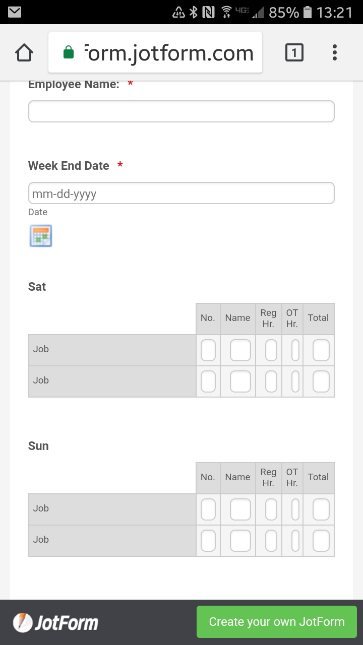 Page URL: https://form.jotform.com/82340784020146
 -
John_BensonReplied on September 10, 2018 at 5:23 PM
Please add this custom CSS code to your form:
@media screen and (max-width: 480px), screen and (max-device-width: 767px) and (orientation: portrait), screen and (max-device-width: 415px) and (orientation: landscape)
.form-matrix-row-headers {
width: 5% !important;
word-break: break-all;
min-width: 20px;
}
Here's a guide: How-to-Inject-Custom-CSS-Codes
-
JonWAVElectricReplied on September 10, 2018 at 5:43 PMThat worked!! Thanks.
Sincerely,
Jon Pastiak
WAV Electric, LLC.
Email: jon@wav-electric.com
Office: 623.398.6644
Cell: 602.391.4833
...
- Templates
- Integrations
- INTEGRATIONS
- See 100+ integrations
- FEATURED INTEGRATIONS
 PayPal
- Slack
- Google Sheets
- Mailchimp
- Zoom
- Dropbox
- Google Calendar
- Hubspot
- Salesforce
- See more Integrations
- Products
- PRODUCTS
- Form Builder
- Jotform Enterprise
- Jotform Apps
- Store Builder
- Jotform Tables
- Jotform Inbox
- Jotform Mobile App
- Jotform Approvals
- Report Builder
- Smart PDF Forms
- PDF Editor
- Jotform Sign
- Jotform for Salesforce Discover Now
- Support

