


-
actecmarketingAsked on September 21, 2018 at 8:33 AM
https://form.jotform.com/82624853962163
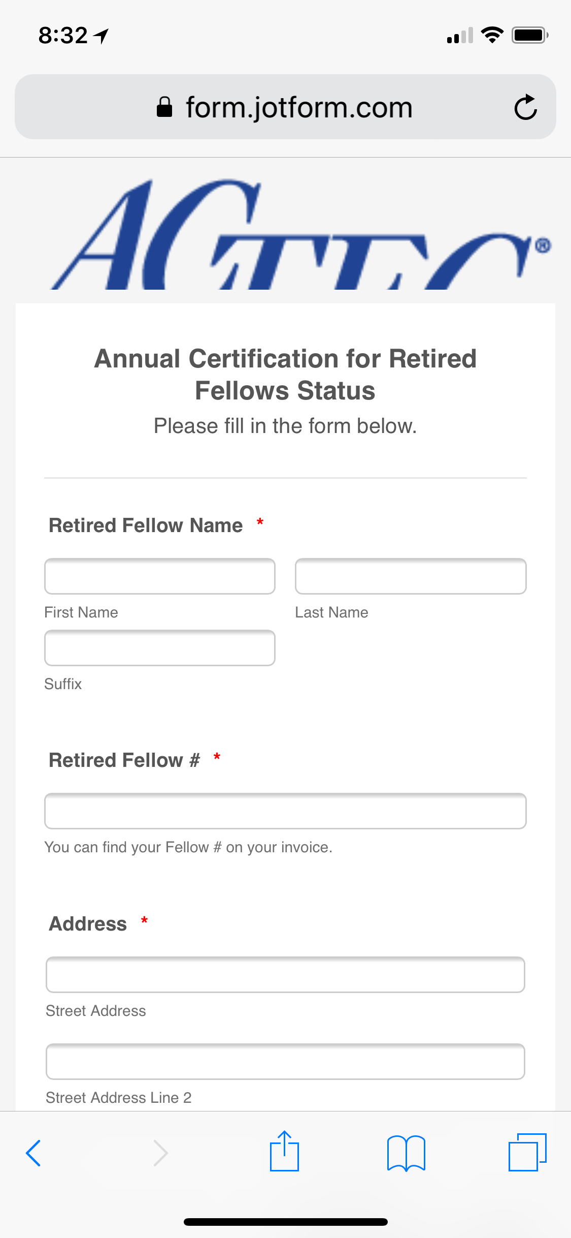
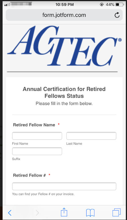
How can I get our logo to look right on mobile devices?
 Page URL: https://form.jotform.com/82624853962163
 -
Richie JotForm SupportReplied on September 21, 2018 at 11:00 AM
You can try these custom CSS to make your logo mobile responsive.
@media (max-width: 600px) {
.form-all:before {
height: 150px;
top: -160px;
background-size: contain;
}
.form-all {
margin-top: 150px !important;
}
}
Guide:https://www.jotform.com/help/117-How-to-Inject-Custom-CSS-Codessample screenshot:
Thank you.
-
actecmarketingReplied on September 21, 2018 at 11:51 AM
Thank you Richie. That works great with vertical mobile and on iPad. The horizontal mobile is still a bit off but it is greatly improved and I can live with it if there's no other piece of code to add. ;-)
-
Richie JotForm SupportReplied on September 21, 2018 at 12:22 PM
You can add these CSS code to adjust the logo in landscape view.
@media screen and (min-device-width: 375px)
and (max-device-width: 667px)
and (-webkit-min-device-pixel-ratio: 2)
and (orientation: landscape) {
.form-all:before {
height: 230px;
top: -230px;
background-size: contain;
}
.form-all {
margin-top: 250px !important;
}
}}
- Templates
- Integrations
- INTEGRATIONS
- See 100+ integrations
- FEATURED INTEGRATIONS
 PayPal
- Slack
- Google Sheets
- Mailchimp
- Zoom
- Dropbox
- Google Calendar
- Hubspot
- Salesforce
- See more Integrations
- Products
- PRODUCTS
- Form Builder
- Jotform Enterprise
- Jotform Apps
- Store Builder
- Jotform Tables
- Jotform Inbox
- Jotform Mobile App
- Jotform Approvals
- Report Builder
- Smart PDF Forms
- PDF Editor
- Jotform Sign
- Jotform for Salesforce Discover Now
- Support

