


-
kristinemusaracaAsked on September 24, 2018 at 1:33 PM
I'm not seeing anything in the CSS causing this. How do I decrease the vertical spacing without adding a bunch of ID-specific custom CSS?
Also, I have not seen the live chat option for a week. Is that feature no longer offered?
 Page URL: https://www.jotform.com/82651016564152
 -
Nik_CReplied on September 24, 2018 at 2:33 PM
You can use the below CSS, just insert it in your Custom CSS field:
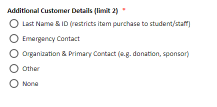
.form-radio-item {
margin-bottom: -5px!important;
}
That will make the fields look like this:

Chat option is available depending on how busy our Forum is, it is not available all the time.
Let us know how the above worked for you.
Thank you!
-
kristinemusaracaReplied on September 24, 2018 at 2:39 PM
That worked great! What about the check boxes? Apparently those are styled to resemble radio buttons, and have the vertical spacing issue, as well.
-
kristinemusaracaReplied on September 24, 2018 at 2:45 PM
I was able to find the check box variant.
How do make the header image adjust to the width of the viewing screen?
-
Nik_CReplied on September 24, 2018 at 2:50 PM
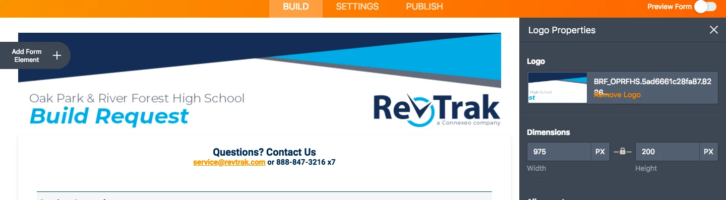
You can reduce the header size by clicking on it in the form builder and reducing the width/height directly there:
Let us know if that is what you had in mind.
Thank you!
-
kristinemusaracaReplied on September 24, 2018 at 2:54 PM
I was thinking something responsive - if view is x-width, scale down header to fit?
-
Nik_CReplied on September 24, 2018 at 3:32 PM
I'm not sure on which device(s) you're viewing your form, but I tested on iPhone and it looked fine:

Anyhow, there is a CSS code you can use to adapt certain element(s) in your form when viewed on different devices.
For example:
@media only screen
and (min-device-width : 375px)
and (max-device-width : 667px) {
.form-all:before {
background-size: 50%;
}
That will adapt header to 50% of its size when vewed on iPhone 6,7,8.
That code should be inserted in Custom CSS of your form.
Let us know if that works for you.
Thank you!
-
kristinemusaracaReplied on September 24, 2018 at 4:18 PM
Great, thank you! No more questions!
- Templates
- Integrations
- INTEGRATIONS
- See 100+ integrations
- FEATURED INTEGRATIONS
 PayPal
- Slack
- Google Sheets
- Mailchimp
- Zoom
- Dropbox
- Google Calendar
- Hubspot
- Salesforce
- See more Integrations
- Products
- PRODUCTS
- Form Builder
- Jotform Enterprise
- Jotform Apps
- Store Builder
- Jotform Tables
- Jotform Inbox
- Jotform Mobile App
- Jotform Approvals
- Report Builder
- Smart PDF Forms
- PDF Editor
- Jotform Sign
- Jotform for Salesforce Discover Now
- Support


