


-
aprilOMRIAsked on November 2, 2018 at 4:56 PM
Why did the mobile site form change all of the sudden, regarding the logo on top? The logo is larger and doesn't appear fully. (please see screenshot below) The version in JotForm looks the way it should. (please see url below)
Thank you for your help!
April
PS. there was only one request during October on the Mobile site. Was the JotForm being worked on?
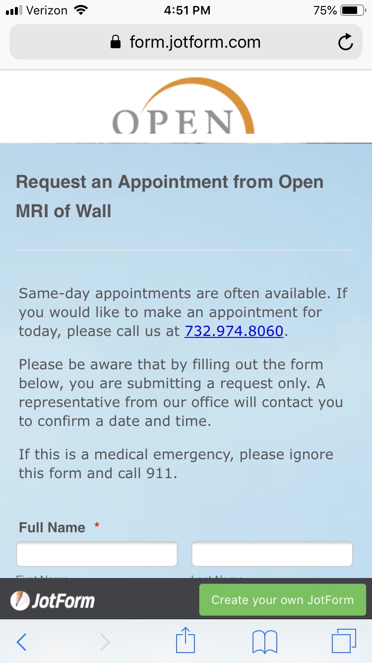 Page URL: https://form.jotform.com/62096101446147
 -
Jed_CReplied on November 2, 2018 at 7:39 PM
Please try to inject the CSS code below. It should adjust the size of the logo when viewed on mobile browser.
@media screen and (max-device-width: 40em){
h2#header_21 {
padding-top: 20px;
}
.form-all:before {
height: 150px;
}
}
Another option is to used the code below if you want the image to be on the upper right instead of center.
@media screen and (max-device-width: 40em){
div.form-all:before {
background-size: 40% auto;
}
}
I hope this helps. Let us know how it goes.
-
aprilOMRIReplied on November 8, 2018 at 3:43 PMHello Jed_C,
I entered the supplied code but it didn't work. I uploaded a new logo, the
same width as the background & added margin to the bottom in the advanced
CSS. So far, so good.
Thank you so much for your help, Jed!
April
*April Lippet-Faczak*
*Graphic Artist*
*Social Media Strategist/Content Curator*
*WebMaster*
*Open MRI and Diagnostic Imaging of Wall*
1975 Highway 34 South
Wall Circle Park
O 732 974 8060
C 848 468 0439
F 732 974 0001
... -
Jed_CReplied on November 8, 2018 at 4:51 PM
I no longer see the logo on this form https://form.jotform.com/62096101446147? Please upload the new logo and we'll provide you with the CSS code that adjust to mobile browser view.
Looking forward for your response.
- Templates
- Integrations
- INTEGRATIONS
- See 100+ integrations
- FEATURED INTEGRATIONS
 PayPal
- Slack
- Google Sheets
- Mailchimp
- Zoom
- Dropbox
- Google Calendar
- Hubspot
- Salesforce
- See more Integrations
- Products
- PRODUCTS
- Form Builder
- Jotform Enterprise
- Jotform Apps
- Store Builder
- Jotform Tables
- Jotform Inbox
- Jotform Mobile App
- Jotform Approvals
- Report Builder
- Smart PDF Forms
- PDF Editor
- Jotform Sign
- Jotform for Salesforce Discover Now
- Support
